

stack:将多个child相对于其框的边缘定位,多用于以简单的方式重叠children。类似于framelayout。Stack的布局行为,根据child是positioned还是non-positioned来区分。 对于positioned的子节点,它们的位置会根据所设置的top、bottom、right以及left属性来确定,这几个值都是相对于Stack的左上角; 对于non-positioned的子节点,它们会根据Stack的aligment来设置位置。
Stack({
  Key key,
  this.alignment = AlignmentDirectional.topStart,
  this.textDirection,
  this.fit = StackFit.loose,
  this.overflow = Overflow.clip,
  List<Widget> children = const <Widget>[],
}) : super(key: key, children: children);
alignment:设置未定位的以及部分定位的子widget的对齐方式,默认的是AlignmentDirectional.topStart,也就是从左上角开始堆叠child
textDirection:设置与alignment相关的文字方向。
fit:用来确定未定位children的大小,主要有三个值
- loose:子节点宽松的取值,可以从min到max的尺寸;
- expand:子节点尽可能的占用空间,取max尺寸;
- passthrough:不改变子节点的约束条件。
overflow:超过部分是否裁掉(clip)
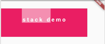
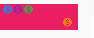
下面我们设置一下alignment为bottomLeft
class StackDemo extends StatelessWidget {
  @override
  Widget build(BuildContext context) {
    // TODO: implement build
    return Scaffold(
      body: Padding(
        padding: EdgeInsets.only(top: 40.0),
        child: Column(
          children: <Widget>[
            Container(
              alignment: Alignment.center,
              margin:  EdgeInsets.only(top: 10.0, bottom: 10.0),
              width: 300.0,
              height: 100.0,
              color: Color(0xffe91e63),
              child: defaultStack(context),
            )
          ],
        ),
      ),
    );
  }
}

Widget defaultStack(BuildContext context) {
  return Column(
    children: <Widget>[
      Stack(
        fit: StackFit.loose,
        overflow: Overflow.clip,
        textDirection: TextDirection.ltr,
        alignment: Alignment.bottomLeft,
        children: <Widget>[
          Container(
            color: Color(0xfff48fb1),
            width: 100.0,
            height: 50.0,
          ),
          Text("stack demo",
              textDirection: TextDirection.ltr,
              style: TextStyle(
                  fontSize: 20.0,
                  fontWeight: FontWeight.bold,
                  letterSpacing: 5.0,
                  color: Colors.white))
        ],
      )
    ],
  );
}
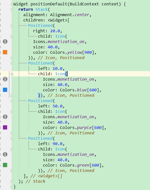
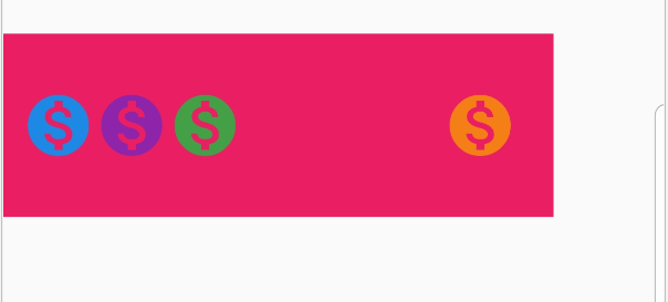
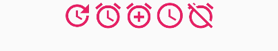
const Positioned({
  Key key,
  this.left,
  this.top,
  this.right,
  this.bottom,
  this.width,
  this.height,
  @required Widget child,
})
left、top 、right、 bottom分别代表离Stack左、上、右、底四边的距离。width和height用于指定需要定位元素的宽度和高度。注意,Positioned的width、height 和其它地方的意义稍微有点区别,此处用于配合left、top 、right、 bottom来定位组件,举个例子,在水平方向时,你只能指定left、right、width三个属性中的两个,如指定left和width后,right会自动算出(left+width),如果同时指定三个属性则会报错,垂直方向同理。
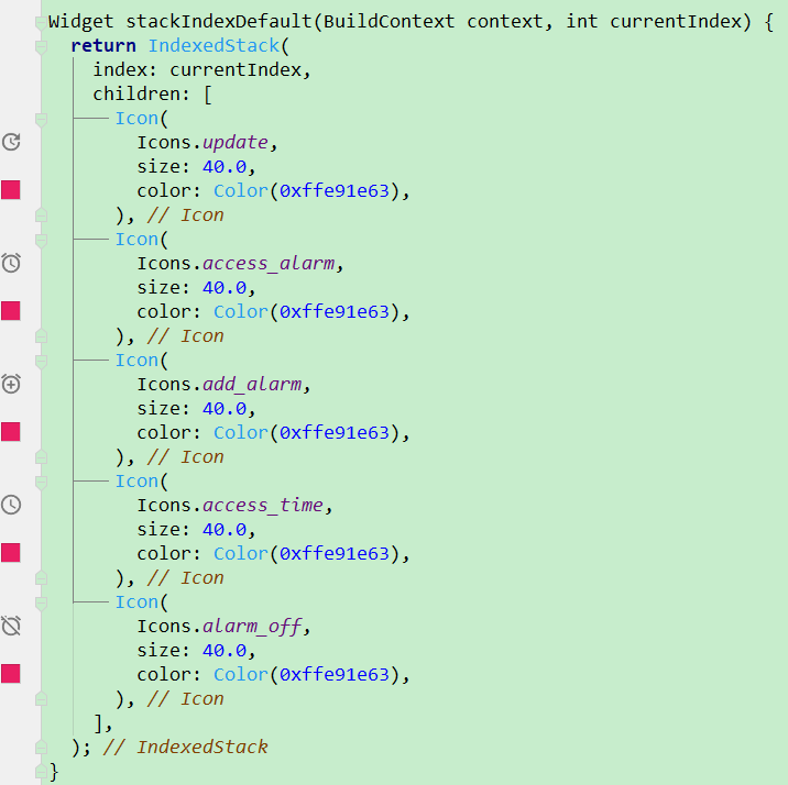
Row(
  mainAxisAlignment: MainAxisAlignment.center,
  children: <Widget>[
    stackIndexDefault(context,0),
    stackIndexDefault(context,1),
    stackIndexDefault(context,2),
    stackIndexDefault(context,3),
    stackIndexDefault(context,4),
  ],
)
