

Row是一个将其child显示在水平数组的widget。他有几个比较重要的属性 mainAxisAlignment:在主轴方向如何摆放子控件,比如这里声明了一个row,其中包括四个色块
Widget defaultRow(BuildContext context , MainAxisAlignment alignment){
  return  Row(
    mainAxisAlignment: alignment,
    children: <Widget>[
      Container(
        margin:  EdgeInsets.only(top: 20.0, bottom: 20.0),
        color: Color(0xfffce4ec),
        width: 60.0,
        height: 50.0,
      ),
      Container(
        margin:  EdgeInsets.only(top: 20.0, bottom: 20.0),
        color: Color(0xfff8bbd0),
        width: 60.0,
        height: 50.0,
      ),
      Container(
        margin:  EdgeInsets.only(top: 20.0, bottom: 20.0),
        color: Color(0xfff48fb1),
        width: 60.0,
        height: 50.0,
      ),
      Container(
        margin:  EdgeInsets.only(top: 20.0, bottom: 20.0),
        color: Color(0xfff06292),
        width: 60.0,
        height: 50.0,
      ),
    ],
  );
}
我们只改变他的mainAxisAlignment属性
defaultRow(context, MainAxisAlignment.start),
SizedBox(height: 10,),
defaultRow(context, MainAxisAlignment.end),
SizedBox(height: 10,),
defaultRow(context, MainAxisAlignment.center),
SizedBox(height: 10,),
defaultRow(context, MainAxisAlignment.spaceEvenly),
SizedBox(height: 10,),
defaultRow(context, MainAxisAlignment.spaceAround),
SizedBox(height: 10,),
defaultRow(context, MainAxisAlignment.spaceBetween),
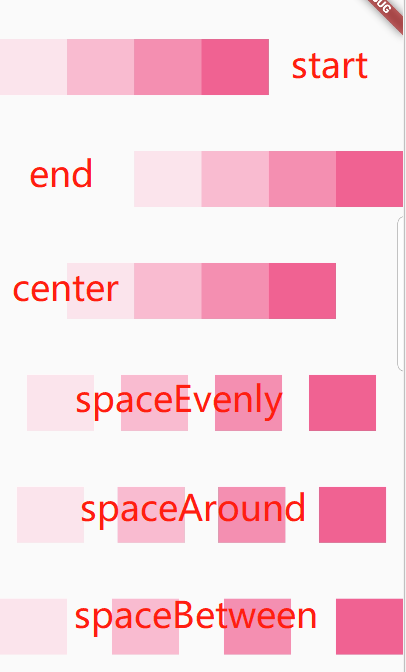
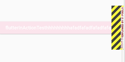
其中start、end、center是控制子view开始显示的位置,并且是连在一起,而剩下的spaceXXX则是控制主轴剩余空间如何分配。evenly则是平均分配所有剩余空间,around则是第一个元素的前面space与最后一个后面的space是中间所有space的一半,between则是第一个前面与最后一个后面无空隙。 如果你只有一个child,只需要考虑使用对其或者中间位置,如果多个child,注意扩展水平空间(Expanded),可以将child封装在一个扩展部件里面。当我们看到行有黄色和黑色条纹警告时候,说明行已经溢出,当行溢出,行之间空间将没有任何空间可供扩展。举例说明,比如row中有三个flatButton,如果不用expand包裹的话,也就是下面代码的第一个RaisedButton
Widget rowExpanded(BuildContext context) {
  return Row(
    children: <Widget>[
      ////填充数据
//      Expanded(
//        flex: 2,
//        child: new RaisedButton(
//            onPressed: () {},
//            color: Color(0xfffce4ec),
//            child: new Text(
//              'flutterInActionTesthhhhhhhhhafadfafadfafadfafadfasdfasfaf',
//              style: TextStyle(color: Colors.white),
//            )),
//      ),
//      new Text('flutterInActionTesthhhhhhhhhafadfafadfafadfafadfasdfasfaf',style: TextStyle(color: Colors.black),),
      new RaisedButton(
          onPressed: () {},
          color: Color(0xfffce4ec),
          child: new Text(
            'flutterInActionTesthhhhhhhhhafadfafadfafadfafadfasdfasfaf',
            style: TextStyle(color: Colors.white),
          )),
      Expanded(
        child: new RaisedButton(
            onPressed: () {},
            color: Color(0xfff8bbd0),
            child: new Text(
              'Expanded',
              style: TextStyle(color: Colors.white),
            )),
      ),
      Expanded(
        child: new RaisedButton(
            onPressed: () {},
            color: Color(0xfff48fb1),
            child: new Text(
              'flutter',
              style: TextStyle(color: Colors.white),
            )),
      ),
    ],
  );
}
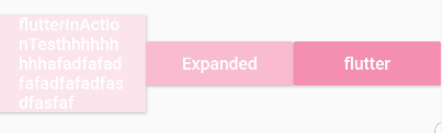
可以看到在主轴方向均分了,这是因为expand中的属性flex值为1,类似于LinearLayout的weight,我们再把第一个按钮的flex设置为2
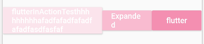
可以看到他们三个在主轴方向上的比例为2:1:1,另外关于expand
const Expanded({
  Key key,
  int flex = 1,
  @required Widget child,
}) : super(key: key, flex: flex, fit: FlexFit.tight, child: child);
这个只能在Row、Column以及Flex中使用,而且他的child只能是StatelessWidget或者是StatefullWidget,不能是其他的widget(比如RenderObjectWidget等)
另外一个重要的属性就是MainAxisSize:它是用来确定在主轴上占据多少空间,默认为max,即占据整个空间(match_parent),另一个则是min,其实就是wrap_content,所以只有为max时之前的MainAxisAlignment才会起作用。 至于Column则跟Row完全一样,只不过是纵向的,类似于LinearLayout的orientation=vertical(Row则为Horizontal)
Flex则是Row和Colunm的父组件
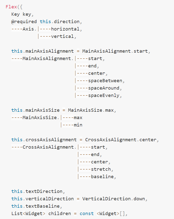
Wrap其实就是流式布局(类似于Android中的标签流)
Wrap({
  ...
  this.direction = Axis.horizontal,
  this.alignment = WrapAlignment.start,
  this.spacing = 0.0,
  this.runAlignment = WrapAlignment.start,
  this.runSpacing = 0.0,
  this.crossAxisAlignment = WrapCrossAlignment.start,
  this.textDirection,
  this.verticalDirection = VerticalDirection.down,
  List<Widget> children = const <Widget>[],
})
我们可以看到Wrap的很多属性在Row(包括Flex和Column)中也有,如direction、crossAxisAlignment、textDirection、verticalDirection等,这些参数意义是相同的,我们不再重复介绍,读者可以查阅前面介绍Row的部分。读者可以认为Wrap和Flex(包括Row和Column)除了超出显示范围后Wrap会折行外,其它行为基本相同。下面我们看一下Wrap特有的几个属性:
-
spacing:主轴方向子widget的间距
-
runSpacing:纵轴方向的间距
-
runAlignment:纵轴方向的对齐方式
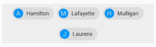
Wrap(
  spacing: 8.0, // 主轴(水平)方向间距
  runSpacing: 4.0, // 纵轴(垂直)方向间距
  alignment: WrapAlignment.center, //沿主轴方向居中
  children: <Widget>[
    new Chip(
      avatar: new CircleAvatar(backgroundColor: Colors.blue, child: Text('A')),
      label: new Text('Hamilton'),
    ),
    new Chip(
      avatar: new CircleAvatar(backgroundColor: Colors.blue, child: Text('M')),
      label: new Text('Lafayette'),
    ),
    new Chip(
      avatar: new CircleAvatar(backgroundColor: Colors.blue, child: Text('H')),
      label: new Text('Mulligan'),
    ),
    new Chip(
      avatar: new CircleAvatar(backgroundColor: Colors.blue, child: Text('J')),
      label: new Text('Laurens'),
    ),
  ],
)
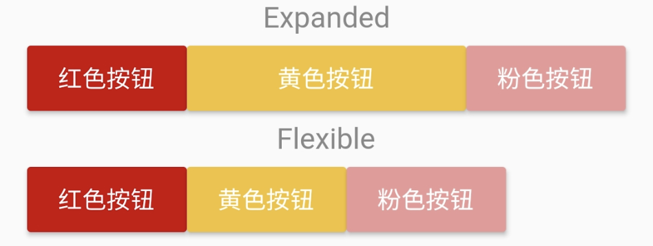
除了上面介绍的Expanded之外,在Row、Column以及Flex中还可以使用Flexible来使得child空间可扩展,它与Expanded的区别就在于不强制child占满整个主轴
