

flutter中的button有八种,先来看其中的四种RaisedButton、FlatButton、OutlineButton,IconButton。
- RaisedButton :凸起的按钮,其实就是Android中的Material Design风格的Button ,继承自MaterialButton
- FlatButton :扁平化的按钮,继承自MaterialButton
- OutlineButton :带边框的按钮,继承自MaterialButton
- IconButton :图标按钮,继承自StatelessWidge
MaterialButton的属性有以下
const MaterialButton({
  Key key,
  @required this.onPressed,
  this.onHighlightChanged,
  this.textTheme,
  this.textColor,
  this.disabledTextColor,
  this.color,
  this.disabledColor,
  this.focusColor,
  this.hoverColor,
  this.highlightColor,
  this.splashColor,
  this.colorBrightness,
  this.elevation,
  this.focusElevation,
  this.hoverElevation,
  this.highlightElevation,
  this.disabledElevation,
  this.padding,
  this.shape,
  this.clipBehavior = Clip.none,
  this.focusNode,
  this.autofocus = false,
  this.materialTapTargetSize,
  this.animationDuration,
  this.minWidth,
  this.height,
  this.child,
})
常用的属性有
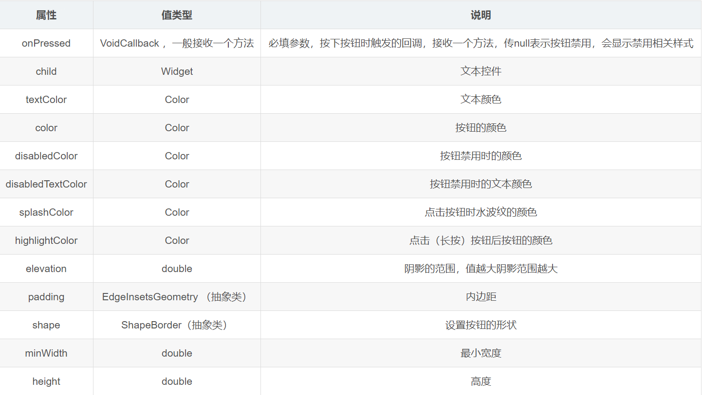
FlatButton(
    // 文本内容
    child: const Text('默认按钮', semanticsLabel: 'FLAT BUTTON 1'),
    onPressed: isDisabled ? () {} : null)
这就类似于Android中直接插入一个button,同时根据isDisabled设置onClickListener,这时候的button时是系统默认样式,往往不符合要求,这时候我们需要修改样式,比如在文本左侧显示图标,这时候可以使用如下方式设置。
FlatButton.icon(
    // 文本内容
    icon: Icon(Icons.android,
        size: 25.0, color: Color.fromARGB(255, 255, 0, 0)),
    label: Text('默认按钮', semanticsLabel: 'FLAT BUTTON 2'),
    onPressed: isDisabled ? () {} : null)
class FlatButtonCustom extends StatelessWidget {
  final String txt;
  final Color color;
  final ShapeBorder shape;
  final VoidCallback onPressed;

  const FlatButtonCustom(
      [this.txt = '自定义按钮',
      this.color = Colors.blueAccent,
      this.shape,
      this.onPressed])
      : super();

  @override
  Widget build(BuildContext context) {
    final _onPressed = onPressed;
    return FlatButton(
        // 文本内容
        child: Text(txt, semanticsLabel: 'FLAT BUTTON 2'),
        // 按钮颜色
        color: color,
        // 按钮亮度
        colorBrightness: Brightness.dark,
        // 高亮时的背景色
        //highlightColor: Colors.yellow,
        // 失效时的背景色
        disabledColor: Colors.grey,
        // 该按钮上的文字颜色,但是前提是不设置字体自身的颜色时才会起作用
        textColor: Colors.white,
        // 按钮失效时的文字颜色,同样的不能使用文本自己的样式或者颜色时才会起作用
        disabledTextColor: Colors.grey,
        // 按钮主题,主要用于与ButtonTheme和ButtonThemeData一起使用来定义按钮的基色,RaisedButton,FlatButton,OutlineButton,它们是基于环境ButtonTheme配置的
        //ButtonTextTheme.accent,使用模版颜色的;ButtonTextTheme.normal,按钮文本是黑色或白色取决于。ThemeData.brightness;ButtonTextTheme.primary,按钮文本基于。ThemeData.primaryColor.
        textTheme: ButtonTextTheme.normal,
        // 按钮内部,墨汁飞溅的颜色,点击按钮时的渐变背景色,当你不设置高亮背景时才会看的更清楚
        splashColor: Colors.deepPurple,
        // 抗锯齿能力,抗锯齿等级依次递增,none(默认),hardEdge,antiAliasWithSaveLayer,antiAlias
        clipBehavior: Clip.antiAlias,
        padding:
            EdgeInsets.only(bottom: 5.0, top: 5.0, left: 30.0, right: 30.0),
        shape: (shape is ShapeBorder)
            ? shape
            : Border.all(
                // 设置边框样式
                color: Colors.grey,
                width: 2.0,
                style: BorderStyle.solid,
              ),
        // FlatButton 的点击事件
        onPressed: () {
          // Perform some action
          if (_onPressed is VoidCallback) {
            _onPressed();
          }
        },
        // 改变高亮颜色回掉函数,一个按钮会触发两次,按下后改变时触发一次,松手后恢复原始颜色触发一次
        // 参数 bool,按下后true,恢复false
        onHighlightChanged: (isClick) {
          print(isClick);
        });
  }
}
显示出的样子为
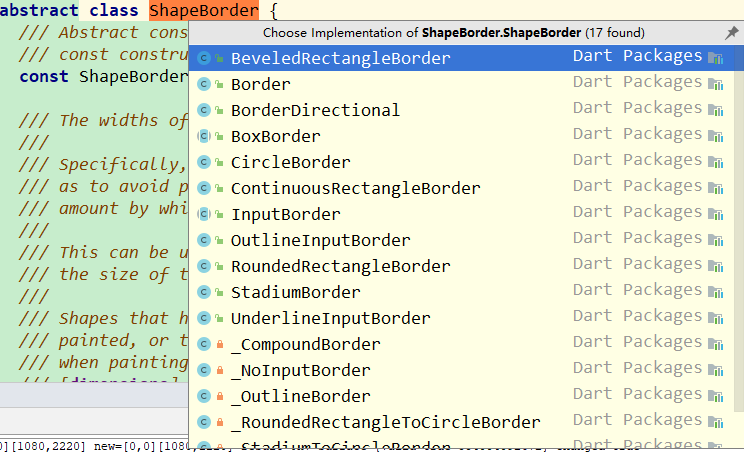
- BeveledRectangleBorder: 带斜角的长方形边框
- CircleBorder: 圆形边框
- RoundedRectangleBorder: 圆角矩形
- StadiumBorder: 两端是半圆的边框
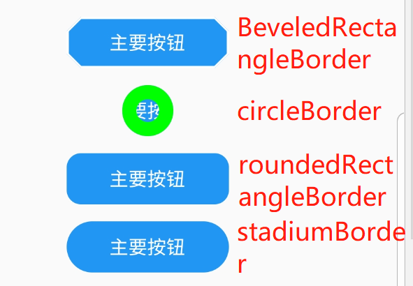
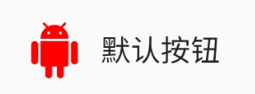
FlatButtonCustom(
'主要按钮',
Colors.blue,
BeveledRectangleBorder(
side: BorderSide(
color: Colors.white,
),
borderRadius: BorderRadius.all(Radius.circular(10)))),
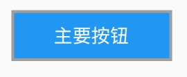
FlatButtonCustom(
"主要按钮",
Colors.blue,
CircleBorder(
side: BorderSide(
color: Color.fromARGB(255, 0, 255, 0), width: 10.0))),
FlatButtonCustom(
'主要按钮',
Colors.blue,
RoundedRectangleBorder(
borderRadius: BorderRadius.all(Radius.circular(10)))),
FlatButtonCustom('主要按钮', Colors.blue, StadiumBorder()),
上述有两个属性得说一下,borderSide和borderRadius,side是用来设置边线样式(宽度,颜色),radius用来设置圆角
const BorderSide({
  this.color = const Color(0xFF000000),
  this.width = 1.0,
  this.style = BorderStyle.solid,
}) : assert(color != null),
     assert(width != null),
     assert(width >= 0.0),
     assert(style != null);
从构造函数中可以看出,只需传入color、width,以及style borderRadius:他一共有五个值
- all: 配置所有方向
- cricular: 环形配置,跟all效果差不多,直接接收double类型的值
- horizontal: 只配置左右方向
- only: 可选左上,右上,左下,右下配置
- vertical: 只配置上下方向 可以看到上面我们选用的是all,其中的具体的值通过Radius.circular或者Radius.elliptical,这两者之间的区别就是前者设置的事圆形,后者是椭圆。 RaisedButton则比flatbutton多了一个阴影,其功能及用法差不多 OutlineButton则是只有边框,背景透明的button,按下时背景变得不透明
const IconButton({
  Key key,
  this.iconSize = 24.0,
  this.padding = const EdgeInsets.all(8.0),
  this.alignment = Alignment.center,
  @required this.icon,
  this.color,
  this.focusColor,
  this.hoverColor,
  this.highlightColor,
  this.splashColor,
  this.disabledColor,
  @required this.onPressed,
  this.focusNode,
  this.autofocus = false,
  this.tooltip,
}) : assert(iconSize != null),
     assert(padding != null),
     assert(alignment != null),
     assert(autofocus != null),
     assert(icon != null),
     super(key: key);
其中的icon和onPressed是必填,一般我们在icon中传入的widget为Icon(也可以是其他的widget),这里的tooltip则是长按按钮时显示的提示性文字
比如创建一个iconButton
IconButton(
  icon: Icon(Icons.android),
  onPressed: _log,
  color: Colors.blueAccent,
  highlightColor: Colors.red,
)
flutter中除了之前的四种:还有PopupMenuButton,FloatingActionButton,RawMaterialButton,DropDownButton这四种。
PopupMenuButton是一种提供菜单弹出对话框的按钮,它和PopMenuItem一起配合使用
const PopupMenuButton({
Key key,
//为popupMenuItem
@required this.itemBuilder,
//设置的初始值
this.initialValue,
//选中时的回调
this.onSelected,
//取消时的回调
this.onCanceled,
//长按提示
this.tooltip,
this.elevation,
this.padding = const EdgeInsets.all(8.0),
//widget通常为Text
this.child,
//Icon他与上面的child属性不能共存
this.icon,
this.offset = Offset.zero,
this.enabled = true,
this.shape,
//整个menu的背景色
this.color,
this.captureInheritedThemes = true,
}) : assert(itemBuilder != null),
assert(offset != null),
assert(enabled != null),
assert(captureInheritedThemes != null),
assert(!(child != null && icon != null)), // fails if passed both parameters
super(key: key);
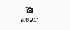
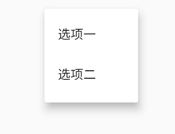
这里生成了两个widget
Widget default3(BuildContext context) {
return PopupMenuButton(
child: Text('点我试试'),// child 和 icon 不能同时用
// icon: Icon(Icons.menu),
onSelected: (String value) {},
itemBuilder: (BuildContext context) => <PopupMenuItem<String>>[
PopupMenuItem(value: "选项一的内容", child: Text("选项一")),
PopupMenuItem(value: "选项二的内容", child: Text("选项二"))
]);
}
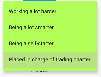
Widget default1(BuildContext context) {
return PopupMenuButton<WhyFarther>(
//child: Text('点我试试'),
icon: Icon(Icons.add_a_photo),
color: Colors.lightGreenAccent,
initialValue: WhyFarther.tradingCharter,
onSelected: (WhyFarther result) {
print("result = " + result.toString());
// setState(() { _selection = result; });
},
itemBuilder: (BuildContext context) => <PopupMenuEntry<WhyFarther>>[
const PopupMenuItem<WhyFarther>(
value: WhyFarther.harder,
child: Text('Working a lot harder'),
),
const PopupMenuItem<WhyFarther>(
value: WhyFarther.smarter,
child: Text('Being a lot smarter'),
),
const PopupMenuItem<WhyFarther>(
value: WhyFarther.selfStarter,
child: Text('Being a self-starter'),
),
const PopupMenuItem<WhyFarther>(
value: WhyFarther.tradingCharter,
child: Text('Placed in charge of trading charter'),
),
],
);
}
显示的样式为
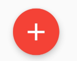
FloatingActionButton:FloatingActionButton 按钮是一个圆形图标按钮,悬停在内容上以提升应用程序中的主要操作。浮动操作按钮最常用于Scaffold.floatingActionButton字段中;一般用来处理界面中最常用,最基础的用户动作。它一般出现在屏幕内容的前面,通常是一个圆形,中间有一个图标。 FAB有三种类型:regular, mini, extended。不要强行使用FAB,只有当使用场景符合FAB功能的时候使用才最为恰当;
class FloatingActionButtonDefault extends StatelessWidget {
  final bool isDisabled;

  const FloatingActionButtonDefault([ this.isDisabled = true])
      : assert(isDisabled != null),
        super();

  @override
  Widget build(BuildContext context) {
    return FloatingActionButton(
        // 文本内容
        backgroundColor:Colors.red,
        child: const Icon(Icons.add),
        heroTag: null, // 不加这个参数会黑屏...
        onPressed: isDisabled ? () {} : null);
  }
}
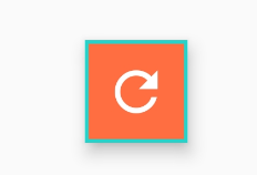
// OutlineButton 自定义的实例
class FloatingActionButtonCustom extends StatelessWidget {
  final String txt;
  final Color color;
  final ShapeBorder shape;
  final VoidCallback onPressed;

  const FloatingActionButtonCustom(
      [ this.txt = '自定义按钮',
       this.color = Colors.orange,
       this.shape,
       this.onPressed])
      : super();

  @override
  Widget build(BuildContext context) {
    final _onPressed = (onPressed is Function) ? onPressed : ()=>{};
    return  FloatingActionButton(
      // 子视图,一般为Icon,不推荐使用文字
      child: const Icon(Icons.refresh),
      // FAB的文字解释,FAB被长按时显示,也是无障碍功能
      tooltip: txt,
      // 前景色
      foregroundColor: Colors.white,
      // 背景色
      backgroundColor: color,
     // hero效果使用的tag,系统默认会给所有FAB使用同一个tag,方便做动画效果,简单理解为两个界面内拥有同样tag的元素在界面切换过程中,会有动画效果,是界面切换不再那么生硬。
      heroTag: null,
      // 未点击时阴影值,默认6.0
      elevation: 7.0,
      // 点击时阴影值,默认12.0
      highlightElevation: 14.0,
      // 点击事件回调
      onPressed: () {
        Scaffold.of(context).showSnackBar( SnackBar(
          content: Text("FAB is Clicked"),
        ));
        _onPressed();
      },
      // 是否为“mini”类型,默认为false,FAB 分为三种类型:regular, mini, and extended
      mini: false,
      // 定义FAB的shape,设置shape时,默认的elevation将会失效,默认为CircleBorder
      //shape: CircleBorder(),
      shape: shape,
      // 是否为”extended”类型
      isExtended: true
    );
  }
}
// OutlineButton 自定义的实例2
class FloatingActionButtonCustom2 extends StatelessWidget {
final String txt;
final Color color;
final ShapeBorder shape;
final VoidCallback onPressed;
const FloatingActionButtonCustom2(
[ this.txt = '自定义按钮',
this.color = Colors.orange,
this.shape,
this.onPressed])
: super();
@override
Widget build(BuildContext context) {
final _onPressed = onPressed;
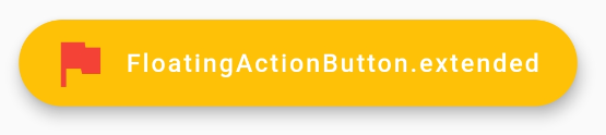
return FloatingActionButton.extended(
onPressed: () {
print('button click');
_onPressed();
},
foregroundColor: Colors.white,
backgroundColor: Colors.amber,
//如果不手动设置icon和text颜色,则默认使用foregroundColor颜色
icon: Icon(Icons.flag,color: Colors.red),
label: Text('FloatingActionButton.extended', maxLines: 1),
);
}
}
最后这种的官方解释如下
/// Creates a wider [StadiumBorder]-shaped floating action button with
/// an optional [icon] and a [label].
/// The [label], [autofocus], and [clipBehavior] arguments must not be null.
/// Additionally, [elevation], [highlightElevation], and [disabledElevation]
/// (if specified) must be non-negative.
RawMaterialButton:其实就是不带背景色的button,类似于在Android中使用TextView当button用。
class RawMaterialButtonCustom extends StatelessWidget {
  final String txt;
  final Color color;
  final ShapeBorder shape;
  final VoidCallback onPressed;

  const RawMaterialButtonCustom(
      [ this.txt = '自定义按钮',
       this.color = Colors.blueAccent,
       this.shape,
       this.onPressed])
      : super();

  @override
  Widget build(BuildContext context) {
    final _onPressed = onPressed;
    final _fontSize = (Random.secure().nextInt(10)+15).toDouble();
    return RawMaterialButton(
        // 使用Material.textStyle为按钮的子项定义默认文本样式。
        textStyle:TextStyle(color: _randomColor(),fontSize: _fontSize),
        // 定义形状和高程的动画更改的持续时间
        animationDuration:Duration(seconds: 1),
        // 文本内容
        child: Text(txt, semanticsLabel: 'FLAT BUTTON 2'),
        // 高亮时的背景色
        highlightColor: Colors.yellow,
        // 按钮内部,墨汁飞溅的颜色,点击按钮时的渐变背景色,当你不设置高亮背景时才会看的更清楚
        splashColor: _randomColor(),
        // 抗锯齿能力,抗锯齿等级依次递增,none(默认),hardEdge,antiAliasWithSaveLayer,antiAlias
        clipBehavior: Clip.antiAlias,
        padding:  EdgeInsets.only(bottom: 5.0, top: 5.0, left: 30.0, right: 30.0),
        //高亮时候的阴影
        highlightElevation: 10.0,
        // 按钮材质的形状
        // shape: shape,
        // RawMaterialButton 的点击事件
        onPressed: () {
          // Perform some action
          if (_onPressed is VoidCallback) {
            _onPressed();
          }
        });
  }
}
DropDownButton:类似于Android中的spinner,他与DropdownMenuItem一起使用。
class DropdownButtonCustom extends StatelessWidget {
  final widget;
  final parent;

  const DropdownButtonCustom([this.widget, this.parent]) : super();

  @override
  Widget build(BuildContext context) {
    return DropdownButton(
      items: getListData(),
      //当没有默认值的时候可以设置的提示
      hint: Text('下拉选择你想要的数据'),
      //下拉菜单选择完之后显示给用户的值
      value: selectItemValue,
      //下拉菜单item点击之后的回调
      onChanged: (T) {
        if (parent.mounted) {
          parent.setState(() {
            selectItemValue = T;
          });
        }
      },
      //设置阴影的高度
      elevation: 24,
      style: TextStyle(
          //设置文本框里面文字的样式
          color: Colors.red),
      // isDense: true,//减少按钮的高度。默认情况下,此按钮的高度与其菜单项的高度相同。如果isDense为true,则按钮的高度减少约一半。 这个当按钮嵌入添加的容器中时,非常有用
      // 将下拉列表的内部内容设置为水平填充其父级
      isExpanded: true,
      iconSize: 50.0, //设置三角标icon的大小
    );
  }
}

List<DropdownMenuItem> getListData() {
  List<DropdownMenuItem> items = List();
  DropdownMenuItem dropdownMenuItem1 = DropdownMenuItem(
    child: Text('1'),
    value: '1',
  );
  items.add(dropdownMenuItem1);
  DropdownMenuItem dropdownMenuItem2 = DropdownMenuItem(
    child: Text('2'),
    value: '2',
  );
  items.add(dropdownMenuItem2);
  DropdownMenuItem dropdownMenuItem3 = DropdownMenuItem(
    child: Text('3'),
    value: '3',
  );
  items.add(dropdownMenuItem3);
  DropdownMenuItem dropdownMenuItem4 = DropdownMenuItem(
    child: Text('4'),
    value: '4',
  );
  items.add(dropdownMenuItem4);
  DropdownMenuItem dropdownMenuItem5 = DropdownMenuItem(
    child: Text('5'),
    value: '5',
  );
  items.add(dropdownMenuItem5);
  DropdownMenuItem dropdownMenuItem6 = DropdownMenuItem(
    child: Text('6'),
    value: '6',
  );
  items.add(dropdownMenuItem6);
  DropdownMenuItem dropdownMenuItem7 = DropdownMenuItem(
    child: Text('7'),
    value: '7',
  );
  items.add(dropdownMenuItem7);
  DropdownMenuItem dropdownMenuItem8 = DropdownMenuItem(
    child: Text('8'),
    value: '8',
  );
  items.add(dropdownMenuItem8);
  DropdownMenuItem dropdownMenuItem9 = DropdownMenuItem(
    child: Text('9'),
    value: '9',
  );
  items.add(dropdownMenuItem9);
  DropdownMenuItem dropdownMenuItem10 = DropdownMenuItem(
    child: Text('10'),
    value: '10',
  );
  items.add(dropdownMenuItem10);
  return items;
}
