

这里介绍一下motionLayout与现有控件结合使用
- 与CoordinateLayout一起使用: 与其说是与coordinateLayout一起使用,倒不如说是与APPBarLayout一起使用,因为他是充当coordinateLayout中的header的,比如如下
<androidx.coordinatorlayout.widget.CoordinatorLayout
    xmlns:android="http://schemas.android.com/apk/res/android"
    android:id="@+id/motionLayout"
    android:layout_width="match_parent"
    android:layout_height="match_parent"
    android:fitsSystemWindows="false"
    android:background="@color/contentBackground">

    <com.google.android.material.appbar.AppBarLayout
        android:id="@+id/app_bar"
        android:layout_width="match_parent"
        android:layout_height="@dimen/app_bar_height"
        android:theme="@style/AppTheme.AppBarOverlay">

        <include layout="@layout/motion_09_coordinatorlayout_header"/>

    </com.google.android.material.appbar.AppBarLayout>

    <include layout="@layout/content_scrolling" />

</androidx.coordinatorlayout.widget.CoordinatorLayout>
然后看这个include的布局
<com.google.androidstudio.motionlayoutexample.utils.CollapsibleToolbar xmlns:android="http://schemas.android.com/apk/res/android"
xmlns:app="http://schemas.android.com/apk/res-auto"
android:id="@+id/motionLayout"
app:layoutDescription="@xml/scene_09"
android:layout_width="match_parent"
android:layout_height="match_parent"
android:minHeight="50dp"
android:fitsSystemWindows="false"
app:layout_scrollFlags="scroll|enterAlways|snap|exitUntilCollapsed">
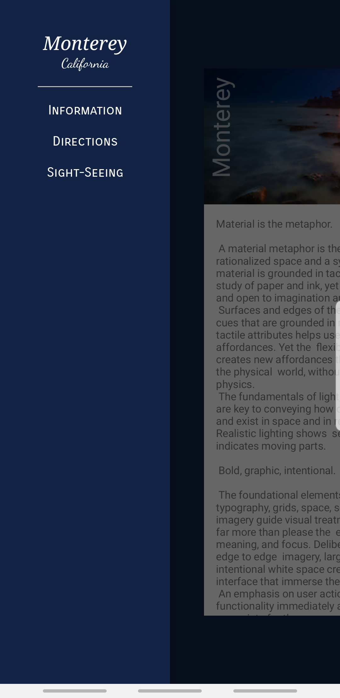
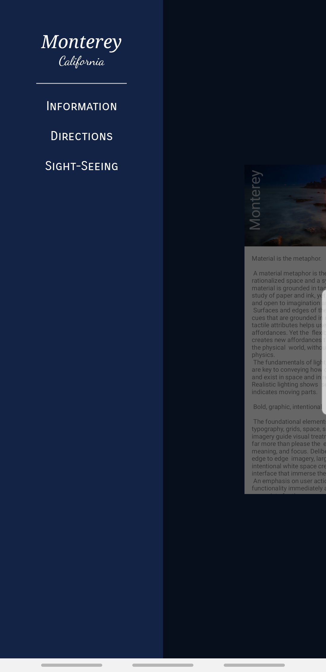
<ImageView
android:id="@+id/background"
android:layout_width="match_parent"
android:layout_height="200dp"
android:background="@color/colorAccent"
android:scaleType="centerCrop"
android:src="@drawable/monterey"/>
<TextView
android:id="@+id/label"
android:layout_width="wrap_content"
android:layout_height="wrap_content"
android:transformPivotX="0dp"
android:transformPivotY="0dp"
android:text="Monterey"
android:textColor="#FFF"
android:textSize="32dp" />
</com.google.androidstudio.motionlayoutexample.utils.CollapsibleToolbar>
这里的根布局是一个自定义的view,在这里面有两个view,同时在根节点声明了layoutDescription这个属性,大致可以判断这个根view是MotionLayout的子类,那么我们仔细看一下
class CollapsibleToolbar @JvmOverloads constructor(
        context: Context, attrs: AttributeSet? = null, defStyleAttr: Int = 0
) : MotionLayout(context, attrs, defStyleAttr), AppBarLayout.OnOffsetChangedListener {

    override fun onOffsetChanged(appBarLayout: AppBarLayout?, verticalOffset: Int) {
        progress = -verticalOffset / appBarLayout?.totalScrollRange?.toFloat()!!
    }

    override fun onAttachedToWindow() {
        super.onAttachedToWindow()
        (parent as? AppBarLayout)?.addOnOffsetChangedListener(this)
    }
}
这里不仅是MotionLayout的子类,他还实现了APPBarLayout的接口,在它setOffsetChange中通过motionLayout的setProgress方法把当前动画完成度传递给MotionLayout。至于这里的动画,motionScene倒是挺简单
<MotionScene
    xmlns:android="http://schemas.android.com/apk/res/android"
    xmlns:motion="http://schemas.android.com/apk/res-auto">

    <Transition
        motion:constraintSetStart="@+id/start"
        motion:constraintSetEnd="@+id/end"
        motion:duration="1000"
        motion:motionInterpolator="linear">
        <OnSwipe
            motion:touchAnchorId="@+id/background"
            motion:touchAnchorSide="bottom"
            motion:dragDirection="dragUp" />

        <ConstraintSet android:id="@+id/end">
            <Constraint
                android:id="@id/background"
                android:layout_width="match_parent"
                android:layout_height="match_parent"
                android:alpha="0.2"
                motion:layout_constraintBottom_toBottomOf="parent"/>
            <Constraint
                android:id="@id/label"
                android:layout_width="wrap_content"
                android:layout_height="wrap_content"
                android:layout_marginStart="8dp"
                android:layout_marginBottom="8dp"
                android:rotation="0.0"
                motion:layout_constraintBottom_toBottomOf="@+id/background"
                motion:layout_constraintStart_toStartOf="parent" />
        </ConstraintSet>

        <ConstraintSet android:id="@+id/start">
            <Constraint
                android:id="@+id/background"
                android:layout_width="match_parent"
                android:layout_height="match_parent"
                android:alpha="1.0"
                motion:layout_constraintBottom_toBottomOf="parent"/>
            <Constraint
                android:id="@+id/label"
                android:layout_width="wrap_content"
                android:layout_height="wrap_content"
                android:rotation="-90.0"
                motion:layout_constraintBottom_toBottomOf="@+id/background"
                motion:layout_constraintStart_toStartOf="parent"/>
        </ConstraintSet>
    </Transition>

</MotionScene>
- 与DrawerLayout一起使用:与DrawerLayout一起使用既可以是content中有动画,也可以使menu中有动画
<androidx.drawerlayout.widget.DrawerLayout
    xmlns:android="http://schemas.android.com/apk/res/android"
    android:layout_width="match_parent"
    android:layout_height="match_parent"
    android:id="@+id/motionLayout"
    android:background="@color/colorPrimaryDark">

    <include layout="@layout/motion_12_drawerlayout_content"/>

    <include layout="@layout/motion_12_drawerlayout_menu"/>

</androidx.drawerlayout.widget.DrawerLayout>
两个include分别为content和menu,首先看content中的动画
<com.google.androidstudio.motionlayoutexample.utils.DrawerContent
    xmlns:android="http://schemas.android.com/apk/res/android"
    android:layout_width="match_parent"
    android:layout_height="match_parent"
    xmlns:app="http://schemas.android.com/apk/res-auto"
    app:layoutDescription="@xml/scene_12_content">

    <include layout="@layout/activity_scrolling"/>

</com.google.androidstudio.motionlayoutexample.utils.DrawerContent>
从这里可以看出根布局的自定义view同样是MotionLayout的子类
class DrawerContent @JvmOverloads constructor(
        context: Context, attrs: AttributeSet? = null, defStyleAttr: Int = 0
) : MotionLayout(context, attrs, defStyleAttr), DrawerLayout.DrawerListener {
    override fun onDrawerStateChanged(newState: Int) {
    }

    override fun onDrawerSlide(drawerView: View, slideOffset: Float) {
        progress = slideOffset
    }

    override fun onDrawerClosed(drawerView: View) {
    }

    override fun onDrawerOpened(drawerView: View) {
    }

    override fun onAttachedToWindow() {
        super.onAttachedToWindow()
        (parent as? DrawerLayout)?.addDrawerListener(this)
    }
}
通过这个可以看出来是将DrawerLayout的slideOffset值通过MotionLayout的setProgress传递给MotionLayout,从而达到动画效果,比如这里的动画为改变content的大小及margin
<MotionScene
    xmlns:android="http://schemas.android.com/apk/res/android"
    xmlns:motion="http://schemas.android.com/apk/res-auto">

    <Transition
        motion:constraintSetStart="@+id/start"
        motion:constraintSetEnd="@+id/end"
        motion:duration="250"
        motion:motionInterpolator="linear">

        <ConstraintSet android:id="@+id/start">
            <Constraint
                android:id="@id/content"
                android:layout_width="0dp"
                android:layout_height="match_parent"
                motion:layout_constraintWidth_default="percent"
                motion:layout_constraintWidth_percent="1"
                motion:layout_constraintLeft_toRightOf="@+id/button"
                motion:layout_constraintTop_toTopOf="parent"/>
        </ConstraintSet>

        <ConstraintSet android:id="@+id/end">
            <Constraint
                android:id="@id/content"
                android:layout_width="0dp"
                android:layout_height="match_parent"
                motion:layout_constraintWidth_default="percent"
                motion:layout_constraintWidth_percent="1"
                android:scaleX="0.8"
                android:scaleY="0.8"
                android:layout_marginLeft="180dp"
                motion:layout_constraintLeft_toLeftOf="parent"
                motion:layout_constraintTop_toTopOf="parent"/>
        </ConstraintSet>
    </Transition>

</MotionScene>
这里的0.8最终效果为
- 与viewPager一起使用:其实就是viewpager的滑动决定MotionLayout的动画执行度,也就是viewPager的onPageScrolled中将值传递给MotionLayout,所以定义一个view如下
class ViewpagerHeader @JvmOverloads constructor(
        context: Context, attrs: AttributeSet? = null, defStyleAttr: Int = 0
) : MotionLayout(context, attrs, defStyleAttr), ViewPager.OnPageChangeListener {

    override fun onPageScrollStateChanged(state: Int) {
    }

    override fun onPageScrolled(position: Int, positionOffset: Float, positionOffsetPixels: Int) {
        val numPages = 3
        progress = (position + positionOffset) / (numPages - 1)
    }

    override fun onPageSelected(position: Int) {
    }
}
这里写死三页,接下来看整体布局
<androidx.constraintlayout.widget.ConstraintLayout xmlns:android="http://schemas.android.com/apk/res/android"
    android:layout_width="match_parent"
    android:layout_height="match_parent"
    xmlns:app="http://schemas.android.com/apk/res-auto">

    <include layout="@layout/motion_15_parallax" />

    <com.google.android.material.tabs.TabLayout
        android:id="@+id/tabs"
        android:layout_width="match_parent"
        android:layout_height="wrap_content"
        app:layout_constraintTop_toBottomOf="@+id/motionLayout">

    </com.google.android.material.tabs.TabLayout>

    <androidx.viewpager.widget.ViewPager
        xmlns:android="http://schemas.android.com/apk/res/android"
        android:id="@+id/pager"
        android:layout_width="match_parent"
        android:layout_height="0dp"
        app:layout_constraintTop_toBottomOf="@+id/tabs"
        app:layout_constraintBottom_toBottomOf="parent"/>

</androidx.constraintlayout.widget.ConstraintLayout>
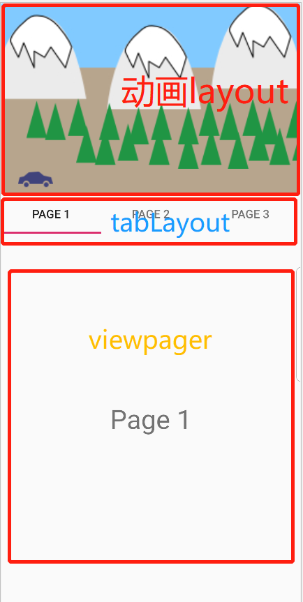
<com.google.androidstudio.motionlayoutexample.utils.ViewpagerHeader xmlns:android="http://schemas.android.com/apk/res/android"
    xmlns:tools="http://schemas.android.com/tools"
    xmlns:app="http://schemas.android.com/apk/res-auto"
    android:id="@+id/motionLayout"
    app:layoutDescription="@xml/scene_15"
    android:layout_width="match_parent"
    android:layout_height="230dp">

    <ImageView
        android:id="@+id/mountains"
        android:layout_width="wrap_content"
        android:layout_height="wrap_content"
        android:scaleType="centerCrop"
        android:src="@drawable/mountains" />

    <ImageView
        android:id="@+id/trees1"
        android:layout_width="wrap_content"
        android:layout_height="wrap_content"
        android:src="@drawable/trees"
        tools:layout_editor_absoluteX="23dp"
        tools:layout_editor_absoluteY="130dp" />

    <ImageView
        android:id="@+id/trees2"
        android:layout_width="wrap_content"
        android:layout_height="wrap_content"
        android:src="@drawable/trees"
        tools:layout_editor_absoluteX="7dp"
        tools:layout_editor_absoluteY="98dp" />

    <ImageView
        android:id="@+id/car"
        android:layout_width="wrap_content"
        android:layout_height="wrap_content"
        android:src="@drawable/car"
        tools:layout_editor_absoluteX="7dp"
        tools:layout_editor_absoluteY="194dp" />

</com.google.androidstudio.motionlayoutexample.utils.ViewpagerHeader>
至于动画的实现就是几个view的移动,就省略了,然后在activity中关联这个viewPager
if (motionLayout != null) {
    pager.addOnPageChangeListener(motionLayout as ViewPager.OnPageChangeListener)
}
