

一.水平居中
将一个元素水平居中很简单,可以考虑以下几种情况
1. 当元素是inline或者inline-*元素(例如文本元素或者a元素)
当行内元素其父元素为块级元素时,可以在父元素上使用text-align属性使得元素水平居中。
css样式
    * {
        margin: 0;
        padding: 0;
    }
    body {
        background-color: #f06d06;
    }
    header{
       text-align: center;
       background-color: white;
       margin-top: 20px;
   }
   nav{
       background-color: white;
       margin-top: 50px;
       padding: 10px;
       text-align: center;
   }
   nav a{
       text-decoration: none;
       background-color: black;
   }

text-align属性对于inline,inline-block,inline-table等元素都将起作用
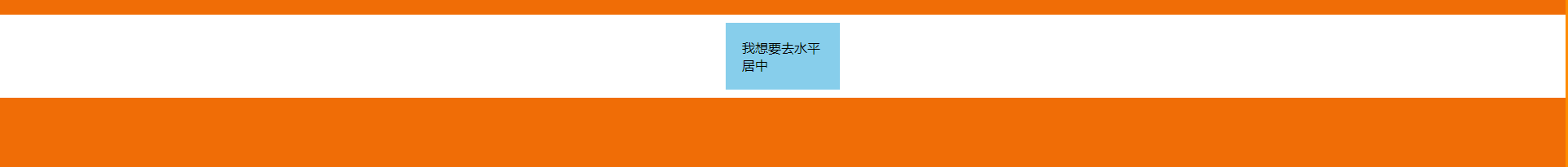
2. 当元素为块级元素时
当你想要居中的元素为块级元素时,可以在该元素上将margin-left和margin-right设置为auto,元素通常设有一个宽度。当没有设置宽度时,元素默认是充满的,也就不需要设置水平居中了
css样式
    * {
        margin: 0;
        padding: 0;
    }
    body {
        background-color: #f06d06;
    }
    header{
       background-color: white;
       margin-top: 20px;
       padding: 10px;
    }
    header p {
        width: 100px;
        padding: 20px;
        background-color: skyblue;
        margin: 0 auto;
    }
二.垂直居中
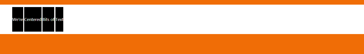
1.当元素是inline或者inline-*元素(例如文本元素或者a元素),有且只有一行时。
1.1 可以将行内元素/文本元素的上下padding设置成相等即可。
css样式
    * {
        margin: 0;
        padding: 0;
    }

    body {
        background: #f06d06;
    }

    main {
        background: white;
        margin: 20px 0;
        padding: 50px;
    }

    main a {
        background: black;
        color: white;
        padding: 40px 0;
        text-decoration: none;
    }
1.2 当你的文本不需要换行(nowrap)时,可以将文本元素的父元素的height与line-hieght设置成一样,即可垂直居中文本。
css样式
    main{
        background-color: black;
    }
    main div{
        background-color: skyblue;
        height: 100px;
        line-height: 100px;
        white-space: nowrap;
    }

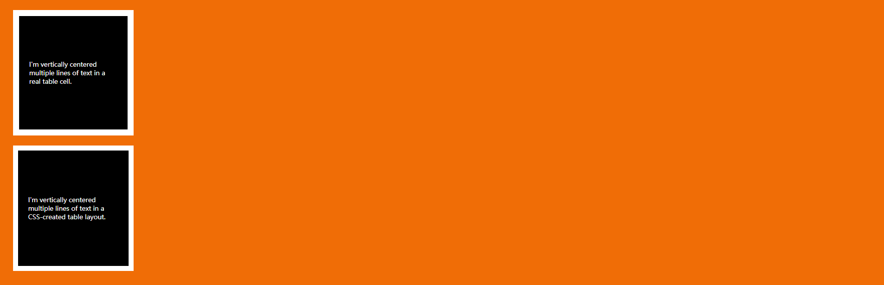
2.当元素是inline或者inline-*元素(例如文本元素或者a元素),有多行时。
在这种情况你也可以设置上内边距和下内边距相等,但有时候包含文本的元素是table cell时将不会起作用。在这种情况下需要用到vertical-align属性,该属性用于行内元素在其父容器内的垂直对齐方式。
以下两种情况中第二种情况所设置的padding将不会起作用,需要用到vertical-align属性
    body {
        background: #f06d06;
    }

    table {
        background: white;
        width: 240px;
        border-collapse: separate;
        margin: 20px;
        height: 250px;
    }

    table td {
        background: black;
        color: white;
        padding: 20px;
        border: 10px solid white;
        /* 默认vertical-align为middle; */
    }

    .center-table {
        display: table;
        height: 250px;
        background: white;
        width: 240px;
        margin: 20px;
    }

    .center-table p {
        display: table-cell;
        margin: 0;
        background: black;
        color: white;
        padding: 20px;
        border: 10px solid white;
        vertical-align: middle;
    }
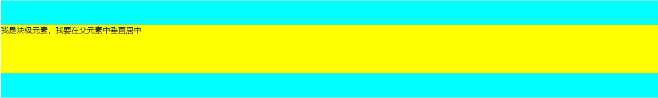
3. 当元素为块级元素时
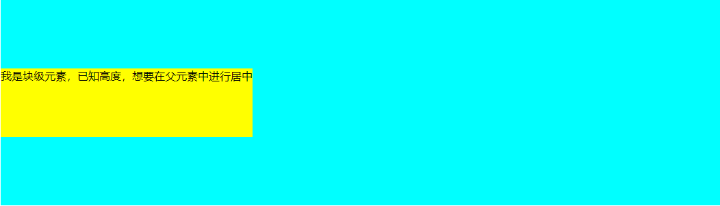
3.1 当元素为块级元素时,并且它的高度已知,那么只要在父元素上将上下padding都设置成父元素的高度减去子元素的高度的一半即可,并将父元素的盒模型设置成border-box即可。
css样式
    .parent{
        height: 250px;
        box-sizing: border-box;
        background-color: aqua;
        /*padding的上下边距都设置成(250-100)/2即75px*/
        padding: 75px 0;
    }
    .child{
        height: 100px;
        background-color: yellow;
    }
3.2 当元素为块级元素时,并且它的高度知道,也可以使用以下方法。
css样式
    .parent{
        height: 300px;
        background-color: aqua;
        position: relative;
    }
    .parent .child{
        height: 100px;
        background-color: yellow;
        position: absolute;
        top: 50%;
        margin-top: -50px;
       /* 或者使用transform: translateY(-50%); */
    }
3.3 当元素为块级元素时,并且它的高度不知道,在元素上使用translate来代替margin。下列结果与上述例子一样。
css样式
    .parent{
        height: 300px;
        background-color: aqua;
        position: relative;
    }
    .parent .child{
        background-color: yellow;
        position: absolute;
        top: 50%;
       或者使用transform: translateY(-50%);
    }
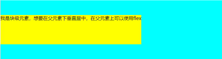
3.4 可以在父元素上使用flexbox
css样式
    .parent{
        background-color: aqua;
        height: 200px;
        display: flex;
        align-items: center;
    }
    .child{
        background-color: yellow;
    }
三.垂直水平居中
1.当元素的宽高确定时
    .parent{
        height: 200px;
        background-color: brown;
        position: relative;
    }
    .child{
        width: 200px;
        height: 100px;
        background-color: aqua;
        position: absolute;
        left: 50%;
        top: 50%;
        /* margin设置为宽高的一半 */
        margin-left: -100px;
        margin-top: -50px;
    }

2.当元素的宽高不确定时,元素身上使用translate的百分比形式,百分比形式是基于元素自身的宽高的,以此来代替上述例子中的margin。
    .parent{
        height: 200px;
        background-color: brown;
        position: relative;
    }
    .child{

        background-color: aqua;
        position: absolute;
        left: 50%;
        top: 50%;
        transform: translate(-50%,-50%);
    }

3.在元素的父元素使用flexbox
    .parent{
        height: 200px;
        background-color: brown;
        display: flex;
        justify-content: center;
        align-items: center;
    }
    .child{
        background-color: aqua;
    }

