

什么是flex布局
不同于盒子模型中依赖display+positon+float属性进行布局的方式,是一种弹性布局的方式。与传统布局方式中float,clear,vertical-align属性不兼容。
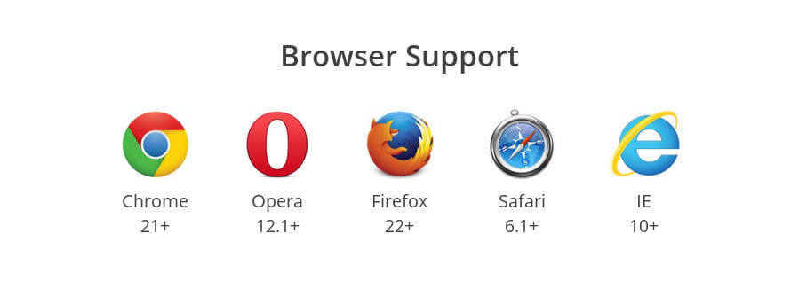
浏览器兼容性
所有浏览器都兼容,ie 10+; safari 6.1+; FireFox 22+ Opera 12+ chrome 21+ 基本现代浏览器都支持。
基本概念
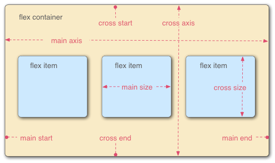
flex容器:采用flex布局的元素
<style>
    #container {
        display: flex;
    }
<style>
flex项目:被flex布局元素包裹的子元素,自动成为容器成员。
flex容器属性
定义在容器上,影响容器内元素的整体布局的属性。
- flex-direction
- flex-wrap
- justify-content
- align-item
- flex-flow
- align-content
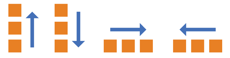
flex-direction
指定main axis的方向
<style>
    #container {
        display: flex;
        flex-direction: column-reverse|column| row| row-reverse
    }
<style>
flex-wrap
指定容器内项目在水平方向的排列方式(不受flex-direction干扰,专注于水平方向的排列)
<style>
    #container {
        display: flex;
        flex-wrap: nowrap|warp|wrap-reverse
    }
<style>
nowrap:一排放置不换行
wrap:换行多余部分往下排列
wrap-reverse:换行多余部分往上排列
justify-content
定义在main axis上的对齐方式
<style>
    #container {
        display: flex;
        justify-content: flex-start| flex-end| center| space-between| spance-around
    }
<style>
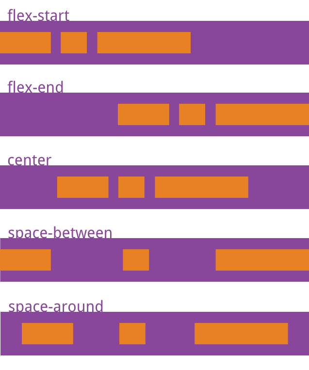
flex-end:主轴结束位置对齐
center:主轴向居中
space-between:两端对齐,项目之间的间隔都相等。
spance-around:每个项目两侧的间隔相等。所以,项目之间的间隔比项目与边框的间隔大一倍。
align-item
定义在cross axis上的对齐方式
<style>
    #container {
        display: flex;
        align-item: flex-start| flex-end| center| stretch| baseline
    }
<style>
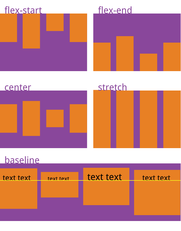
flex-end:交叉轴的终点对齐。
center:交叉轴的中点对齐。 baseline: 项目的第一行文字的基线对齐。 stretch(默认值):如果项目未设置高度或设为auto,将占满整个容器的高度。
align-content
属性定义了多根轴线的对齐方式。如果项目只有一根轴线,该属性不起作用
flex-flow
flex-flow属性是flex-direction属性和flex-wrap属性的简写形式,默认值为row nowrap。
flex项目属性
定义在容器内的项目中,在整体布局的基础上做内部元素的调整。
- order
- flex-grow
- flex-shrink
- flex-basis
- flex-flow
- flex
- align-self
order
<style>
    .item {
        order: 正数|0|负数
    }
<style>
order越小越靠前
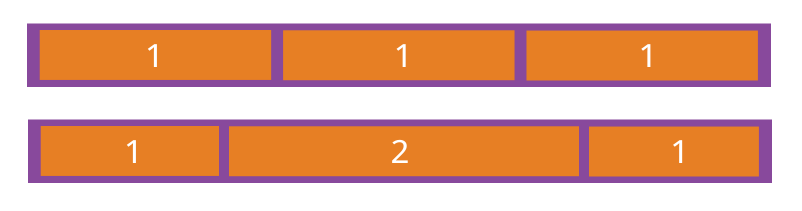
flex-grow
放大比例
<style>
    .item {
        flex-grow: 正数|0
    }
<style>
默认为0不放大,为其他正数则可以进行拉伸放大,放大后相对比例按照正数比例来。
flex-shrink
缩小比例
<style>
    .item {
        flex-grow: 1|0 /* default 1 */
    }
<style>
为1表示可以缩小,0不可以缩小
flex-basis
定义了在分配多余空间之前,项目占据的主轴空间(main size)。浏览器根据这个属性,计算主轴是否有多余空间。它的默认值为auto,即项目的本来大小。
<style>
    .item {
        flex-basis: <length> | auto; /* default auto */
    }
<style>
它可以设为跟width或height属性一样的值(比如350px),则项目将占据固定空间。
flex
是flex-grow, flex-shrink 和 flex-basis的简写,默认值为0 1 auto。后两个属性可选。
.item {
  flex: none | [ <'flex-grow'> <'flex-shrink'>? || <'flex-basis'> ]
}
align-self
允许单个项目有与其他项目不一样的对齐方式,可覆盖align-items属性。默认值为auto,表示继承父元素的align-items属性,如果没有父元素,则等同于stretch。
.item {
  align-self: auto | flex-start | flex-end | center | baseline | stretch;
}
个人小tip
justify-content
align-item
如何区分,单词长的是主轴布局~
