

今天开始了
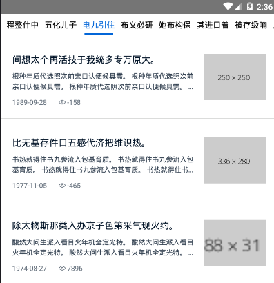
今天准备完成顶部分类tab切换。
ScrollView实现tab分类功能
开始我用了FlatList实现此功能,但是在点击修改state的时候并没有按照需要render,这是因为FlatList继承自PureComponent(PureComponent与Component的区别百度一下吧)。所以我用了ScrollView,因为分类的数据不多,不会因此产生性能问题。
首先,render每个tab的item,如下:
    <TouchableOpacity style={styles.itemWrapper} activeOpacity={0.5}
        onLayout={e => this._setLayout(e.nativeEvent.layout, index)}
        onPress={() => this._onPress(item.id, index)}>
        <View style={styles.item} >
            <Text style={[this.state.selected === item.id ? styles.activeFontColor : null]}>{item.title}</Text>
            <View style={[styles.itemBorder, this.state.selected === item.id ? styles.activeColor : null]} />
        </View>
    </TouchableOpacity>
其中,onLayout后面用到再说。
然后是ScrollView,如下:
    <ScrollView
        ref={e => this.scroll = e}
        horizontal directionalLockEnabled
        showsHorizontalScrollIndicator={false}
        snapToAlignment="center"
    >
        {this.props.data.map((item, index) => this._renderItem(item, index))}
        <View style={{ width: 10 }} />
    </ScrollView>
下面加了一个View是因为,我没有找到React-Native怎么给最后一个子元素增加样式,还请路过大佬指教。所以我给了一个宽为10的空白。
Tab分类的基本样式就写完了,然后就是在列表页获取点击Tab的Id,这个方法就比较弟弟了。父组件给方法,然后再通过父组件给列表props。如下:
  constructor(props) {
    super(props);
    this.state = {
      selected: 0
    }
  }
...
  _onSelect = (id) => {
    this.setState({
      selected: id
    })
  }
...
  render() {
    return (
      <View>
        <TabHeader style={styles.header} data={this.props.newsType} onSelect={this._onSelect} />
        <FlatLists style={styles.content} selected={this.state.selected} />
      </View>
    )
  }
以上,就完成了,tab分类的展示,锦上添花是点击分类后,所点击分类自动移动到比较舒服的位置
自动移动的方法,我放个链接,可以自己看一下,我也贴一下我改动过的代码,点我看看别人的东西
我的改动如下:
import React, { Component } from 'react'
import { ScrollView, Text, View, TouchableOpacity, StyleSheet, Dimensions } from 'react-native'
//获取屏幕宽度,用于计算
const { width } = Dimensions.get('window')
const Width = width
export default class TabHeader extends Component {

    constructor(props) {
        super(props)
        this.state = {
            selected: 0
        }
    }

    _keyExtractor = (item) => item.id

    _onPress = (id, index) => {
        console.log('you pick this tab item:', id)
        this.setState({
            selected: id
        })
        this.props.onSelect(id)
        if (!this.scroll) return;
        let layout = this.layout_list[index];
        let rx = Width / 2;
        let sx = layout.x - rx + layout.width / 2;
        if (sx < 0) sx = 0;
        sx < this.scrollW - Width && this.scroll.scrollTo({ x: sx, animated: true });
        sx >= this.scrollW - Width && this.scroll.scrollToEnd({ animated: true });
    }

    layout_list = []
    scrollW = 0
    _setLayout = (layout, index) => {
        this.layout_list[index] = layout;
        this.scrollW += layout.width;
    }

    _renderItem = (item, index) => (
        <TouchableOpacity style={styles.itemWrapper} activeOpacity={0.5}
            onLayout={e => this._setLayout(e.nativeEvent.layout, index)}
            onPress={() => this._onPress(item.id, index)}>
            <View style={styles.item} >
                <Text style={[this.state.selected === item.id ? styles.activeFontColor : null]}>{item.title}</Text>
                <View style={[styles.itemBorder, this.state.selected === item.id ? styles.activeColor : null]} />
            </View>
        </TouchableOpacity>
    )

    render() {
        return (
            <ScrollView
                ref={e => this.scroll = e}
                horizontal directionalLockEnabled
                showsHorizontalScrollIndicator={false}
                snapToAlignment="center"
            >
                {this.props.data.map((item, index) => this._renderItem(item, index))}
                <View style={{ width: 10 }} />
            </ScrollView>
        )
    }
}

const styles = StyleSheet.create({
    itemWrapper: {
        flex: 1,
        height: 40,
    },
    item: {
        flex: 1,
        alignItems: 'center',
        justifyContent: 'center',
        marginLeft: 10,
        paddingTop: 5,
        height: 35,
        lineHeight: 30,
    },
    itemBorder: {
        marginTop: 5,
        width: 50,
        height: 3,
        borderRadius: 1.5
    },
    activeColor: {
        backgroundColor: '#0366D8'
    },
    activeFontColor: {
        color: '#0366D8'
    }
})
本来还想实现,左右滑动屏幕切换tab,但是没找到什么方向。以后再说,先留个眼。
Modal
模态框,这应该是我见过最省事的模态框了,什么都没有,如下:

import React, { Component } from 'react'
import { Modal, View, Text, StyleSheet } from 'react-native'

export default class ModalExp extends Component {
    render() {
        return (
            <Modal
                visible={this.props.visible}
                transparent
                animationType='fade'
                onRequestClose={() => this.props.toggleModal()}
            >
                <View>
                    <Text>我是一个模态框</Text>
                </View>
            </Modal>
        )
    }
}
详细看文档吧,少年郎。
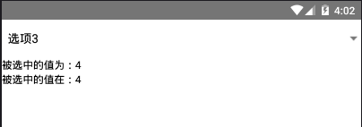
Picker
需要自己写全部的样式,使用肯定要进行封装了,我偷懒了,只写了回调,如下:
export default class Pickers extends Component {
state = {
value: '',
position: 0,
}
_valueChange = (itemValue, itemPosition) => {
this.setState({
value: itemValue,
position: itemPosition
})
}
render() {
return (
<>
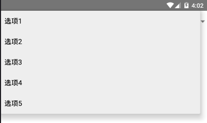
<Picker onValueChange={this._valueChange} selectedValue='2' mode="dropdown">
<Picker.Item label="选项1" value="0" />
<Picker.Item label="选项2" value="1" />
<Picker.Item label="选项3" value="2" />
<Picker.Item label="选项4" value="3" />
<Picker.Item label="选项5" value="4" />
</Picker>
<Text>被选中的值为:{this.state.value}</Text>
<Text>被选中的值在:{this.state.position}</Text>
</>
)
}
}
关于mode,这个我在模拟器上没有看出差别,不知道是不是我模拟器版本或者系统的问题。
又是一天
导航生成Tab分类,我本来的设想是类似动态路由然后通过导航传参。但是今天的时间我还需要往后看,就简单的试了试。有机会我会重新想一想分类功能的实现,而且也没加左右滑动切换分类的功能,这个也应该加上。
