

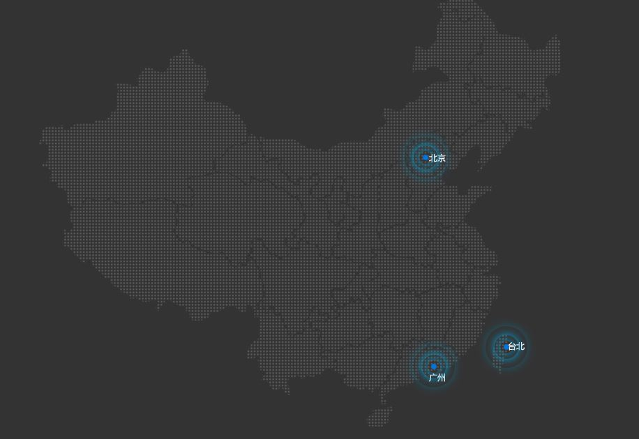
实现效果
其实实现效果是动图的,哪个大佬能教我怎么才能把网页实现的动画效果显示出来!
css3中有三种动画的属性,transform, transition, animation。
transform描述的是元素的静态样式。比如transform:rotate(180deg)效果是直接显示转完180度的样式。加上transition过渡属性才能让它从一种状态转变为另一种状态。transition需要触发一个事件来发生变换。一般用:hoveranimation不需要触发事件就可以随着时间的变换来改变元素的css样式。
实现步骤
- 创建动画
//关键帧 定义动画在不同阶段的状态
@keyframes 动画名称{
from{}  //开始状态,0%
  to{}  //结束状态,100%
}
//百分比代表一个动画周期对应的某个时间。
- 绑定动画
把创建好的动画通过animation属性绑定到一个选择器上,否则就不会有效果
比如我把动画p绑定到.p1,.p2,.p3上
.p1,.p2,.p3{
            position: absolute;
            top:50%;
            left: 50%;
            transform: translate(-50%,-50%);
            width: 8px;
            height: 8px;
            border-radius: 50%;
            box-shadow: 0 0 12px #009fd9;
            animation: p 1.2s linear infinite;//动画名 动画时长
            //linear:匀速播放 infinite:播放次数为无限播放
        }
实现居中效果:
* 写法一:
position: //先让其左上角居中
            absolute;
            top:50%;
            left: 50%;
            //translate:移动,百分比是自身元素的宽度和高度的百分比
            transform: translate(-50%,-50%);
* 写法二:
position:
            absolute;
            top:50%;
            left: 50%;
            //根据元素的宽度和高度用margin调整位置,这种情况当元素宽高度修改,margin也要跟着修改
           margin-top: px;
           margin-left: px ;
- animation-delay:三个圆不同时间开始可让他们在同一时间大小不一致实现波纹效果。
实现热点图全部代码
<!DOCTYPE html>
<html lang="en">
<head>
    <meta charset="UTF-8">
    <title>Title</title>
    <style>
        body{
         background-color:#333333 ;
        }
        .map{
            width: 747px;
            height: 617px;
            margin: 0 auto;
            background: url("map.png");
        }
        .city{
            position: absolute;
            top:235px;
            right:535px;

        }
        .taibei{

            top:507px;
            right: 419px;
        }
        .guangzhou{
            top:535px;
            right: 523px;
        }
        .dotted{
            width: 8px;
            height: 8px;
            border-radius: 50px;
            background-color: #0074D9;
        }
        .p1,.p2,.p3{
            position: absolute;
            top:50%;
            left: 50%;
            transform: translate(-50%,-50%);
            width: 8px;
            height: 8px;
            border-radius: 50%;
            box-shadow: 0 0 12px #009fd9;
            animation: p 1.2s linear infinite;
        }
        .p2{
            animation-delay: 0.4s;/*何时开始*/
        }
        .p3{
            animation-delay:0.8s ;
        }
        @keyframes p {
            70%{
                width: 40px;
                height: 40px;
                opacity: 1;//透明度
            }
            100%{
                width: 70px;
                height: 70px;
                opacity: 0;
            }
        }
    </style>
</head>
<body>
    <div class="map">


        <div class="city">
            <div class="dotted"></div>
            <div class="p1"></div>
            <div class="p2"></div>
            <div class="p3"></div>
        </div>
        <div class="city taibei">
            <div class="dotted"></div>
            <div class="p1"></div>
            <div class="p2"></div>
            <div class="p3"></div>
        </div>
        <div class="city guangzhou">
            <div class="dotted"></div>
            <div class="p1"></div>
            <div class="p2"></div>
            <div class="p3"></div>
        </div>
    </div>
</body>
</html>
