


包括以下 widget:
TextField- 输入框Switch- 选择切换Radio- 单选按钮组Checkbox- 多选按钮组- ``
- ``
- ``
- ``
- ``
TextField
网上的资料包括官方文档都是一上来一大堆属性列出来,输入框可设置的属性太多了,这样的话很难看的,很劝退的,所以我努力把这些属性分门别类按照几个大的范围整理下,以往能看的顺眼
属性大全
  // 虽然不想写,但是还是写上吧
  const TextField({
    Key key,
    this.controller,    //编辑框的控制器,跟文本框的交互一般都通过该属性完成,如果不创建的话默认会自动创建
    this.focusNode,  //用于管理焦点
    this.decoration = const InputDecoration(),   //输入框的装饰器,用来修改外观
    TextInputType keyboardType,   //设置输入类型,不同的输入类型键盘不一样
    this.textInputAction,   //用于控制键盘动作(一般位于右下角,默认是完成)
    this.textCapitalization = TextCapitalization.none,
    this.style,    //输入的文本样式
    this.textAlign = TextAlign.start,   //输入的文本位置
    this.textDirection,    //输入的文字排列方向,一般不会修改这个属性
    this.autofocus = false,   //是否自动获取焦点
    this.obscureText = false,   //是否隐藏输入的文字,一般用在密码输入框中
    this.autocorrect = true,   //是否自动校验
    this.maxLines = 1,   //最大行
    this.maxLength,   //能输入的最大字符个数
    this.maxLengthEnforced = true,  //配合maxLength一起使用,在达到最大长度时是否阻止输入
    this.onChanged,  //输入文本发生变化时的回调
    this.onEditingComplete,   //点击键盘完成按钮时触发的回调,该回调没有参数,(){}
    this.onSubmitted,  //同样是点击键盘完成按钮时触发的回调,该回调有参数,参数即为当前输入框中的值。(String){}
    this.inputFormatters,   //对输入文本的校验
    this.enabled,    //输入框是否可用
    this.cursorWidth = 2.0,  //光标的宽度
    this.cursorRadius,  //光标的圆角
    this.cursorColor,  //光标的颜色
    this.keyboardAppearance,
    this.scrollPadding = const EdgeInsets.all(20.0),
    this.dragStartBehavior = DragStartBehavior.down,
    this.enableInteractiveSelection,
    this.onTap,    //点击输入框时的回调(){}
    this.buildCounter,
  })
键盘控制
1. 键盘样式
Flutter 内置了不少种键盘样式的,有的我也没搞明白,就这么看吧
TextInputType.text- 普通完整键盘TextInputType.number- 数字键盘TextInputType.emailAddress- 带有“@”的普通键盘TextInputType.datetime- 带有“/”和“:”的数字键盘)TextInputType.multiline- 带有选项以启用有符号和十进制模式的数字键盘url- 会显示“/ .”phone- 会弹出数字键盘并显示"* #"
 TextField(
   keyboardType: TextInputType.datetime,
 )
2. 大小写控制
TextCapitalization.none- 全部小写TextCapitalization.words- 每个单词的首字母大写TextCapitalization.sentences- 每个句子的首字母大写TextCapitalization.characters- 每个字每大写
我试了试,有的键盘貌似不管用,大家还是自己靠正则或是校验来控制输入吧,感觉这个设置不靠谱
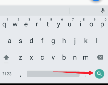
3. 修改键盘动作按钮样式
关键词是 textInputAction,改变的是键盘右下角那个按钮的样式,根据安装的输入法的不同,有的显示的是文字,有的显示的是图标。Flutter 内置了不少样式,可惜没有预览,只能看英文自己猜了
TextField(
  textInputAction: TextInputAction.search,
),
4. 键盘动作按钮点击响应 - 无参的
回调是 onEditingComplete,注意是没有返回值的
TextField(
  onEditingComplete: (){
    print("AA");
  },
),
5. 键盘动作按钮点击响应 - 有参的
回调是 onSubmitted,这次是有返回值的,也就是你输入的数据
TextField(
  onSubmitted: (inputValue){
    print("输入数据位: ${inputValue}");
  },
),
监听事件
onChanged- 当用户输入就会触发回调,我们从中可以拿到用户输入值,经过测试,每次拿到的都是用户所有的输入值
TextField(
  keyboardType: TextInputType.datetime,
    onChanged: (inputValue) {
      print("input:${inputValue}");
    },
)
TextEditingController- 官文档描述为:文本控制器,目前发现也就是 TextEditingController.text 拿到输入的内容,Flutter widget 一般都不要用 对象.属性的去写,所以提供了这么一个东西。我们要 new 一个 TextEditingController 出来,传给 TextField
class TestWidgetState extends State<TestWidget> {
  var editContore = TextEditingController();

  @override
  Widget build(BuildContext context) {
    return Column(
      children: <Widget>[
        Container(
          width: 200,
          child: TextField(
            keyboardType: TextInputType.datetime,
            onChanged: (inputValue) {
              print("input:${inputValue}");
            },
            controller: editContore,
          ),
        ),
        RaisedButton(
          child: Text("请点击"),
          onPressed: () {
            print("输入内容:${editContore.text}");
          },
        ),
      ],
    );
  }
}
onTap- 在按下开始输入的那一瞬间触发,每次输入只触发一次
TextField(
  keyboardType: TextInputType.datetime,
    onTap: (){
      print("tap...");
    },
)
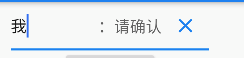
onEditingComplete- 键盘完成按钮响应 - 无参数的onSubmitted- 键盘完成按钮响应 - 有参数的实现右边图标点击- 默认没有回调,需要我们自己写
class TestWidgetState extends State<TestWidget> {
  var isCan = true;

  @override
  Widget build(BuildContext context) {
    return Column(
      children: <Widget>[
        Container(
          width: 200,
          child: TextField(
            decoration: InputDecoration(
              suffixIcon: isCan
                  ? GestureDetector(
                      child: Icon(Icons.clear),
                      onTap: () {
                        print("AAAAAA");
                      },
                    )
                  : null,
              suffixText: isCan ? ":请确认" : null,
              suffixStyle: TextStyle(fontSize: 16),
            ),
          ),
        ),
      ],
    );
  }
}
输入框样式
Flutter 里修改样式啥的基本都是 decoration,contain 里是 BoxDecoration,TextField 的则是 InputDecoration,这部分内容也是相当多的,我拆开来说,我喜欢分门别类
1. 提示文字:
labelText/labelStyle- 输入框标题吧,在输入内容的上面,在我们输入之后,labelText 会有一个缩放的动画的,style 是文字样式,注意这个文字样式只能在输入之前管事helperText/helperStyle- 输入内容下部的提示文字errorText/errorStyle- 错误提示文字,也是在输入内容下部hintText/hintStyle- 默认提示文字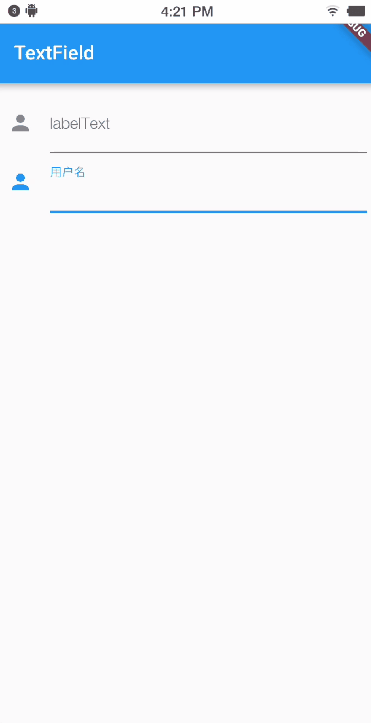
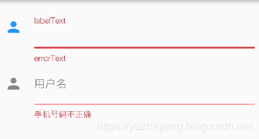
TextField(
  labelText: "姓名:",
  labelStyle: TextStyle(
    fontSize: 22,
  ),
  helperText: '请输入你的真实姓名',
  helperStyle: TextStyle(
    fontSize: 8,
  ),
  errorText: "请重新输入",
  errorStyle: TextStyle(
    fontSize: 12,
  ),
  hintText: "请输入文字",
  hintStyle: TextStyle(
    fontSize: 12,
  ),
)
2. 左右提示和图片
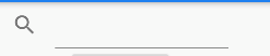
prefixIcon/prefixText/prefixStyle- 左边的图标和文字,样式看下面图样,提示文字不会进入到输入内容的,这个测试过了suffixIcon/suffixText/suffixStyle- 右边的图标和文字prefix/suffix- 或者直接自己给一个 widget 也可以icon- 左边的图标,但是图标在输入栏的外面,样子看下面注意点- 这里的提示文字是只有在输入框拿到焦点时才会显示,否则只会显示 hint 文字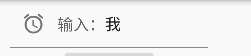
suffix 点击- 默认没提供相关回调,我们自己套一个GestureDetector就行啦,测试过没问题的,并且不会和onTap冲突的
class TestWidgetState extends State<TestWidget> {
var editContore = TextEditingController();
var isCan = true;
@override
Widget build(BuildContext context) {
return Column(
children: <Widget>[
Container(
width: 200,
child: TextField(
decoration: InputDecoration(
icon: Icon(Icons.search),
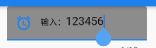
prefixIcon: isCan ? Icon(Icons.access_alarm) : null,
prefixText: isCan ? "输入:" : null,
prefixStyle: TextStyle(fontSize: 12),
suffixIcon: isCan
? GestureDetector(
child: Icon(Icons.clear),
onTap: () {
print("AAAAAA");
},
)
: null,
suffixText: isCan ? ":请确认" : null,
suffixStyle: TextStyle(fontSize: 16),
),
),
),
],
);
}
}
3. 右小角统计数字
这个具体的文字样式是自己做的,假如想要 6/10 这种样式的,需要自己 setState 去修改文字
counterText- 文字counterStyle- 文字样式counter- 自定义 widget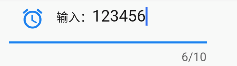
- 要是想达到图中的效果:
var count = 0;

TextField(
  decoration: InputDecoration(
    counterText: "${count}/10",
  ),
  onChanged: (inputValue) {
    setState(() {
      count = inputValue.length;
    });
  },
)
4. 改颜色
filled/fillColor- 修改输入框背景色,filled 是个 boolean 值,用来控制颜色显示的
TextField(
  decoration: InputDecoration(
    filled: true,
    fillColor: Colors.grey,
  ),
)
5. 修改边框
边框有3种:
InputBorder.none- 没有边框,此模式下连下面的线都没有了OutlineInputBorder- 4面边框,可以设置圆角
TextField(
  decoration: InputDecoration(
    enabledBorder: OutlineInputBorder(
      borderRadius: BorderRadius.all(
      Radius.circular(30), //边角为30
      ),
      borderSide: BorderSide(
        color: Colors.amber, //边线颜色为黄色
        width: 2, //边线宽度为2
      ),
    ),
)
UnderlineInputBorder- 底边线,一样可以设置圆角,不过不好看
TextField(
  decoration: InputDecoration(
    enabledBorder: UnderlineInputBorder(
      borderRadius: BorderRadius.all(
        Radius.circular(30), //边角为30
      ),
      borderSide: BorderSide(
        color: Colors.amber, //边线颜色为黄色
        width: 2, //边线宽度为2
      ),
    ),
)
输入验证
就是 TextInputFormatter 这个东西啦,他是一个抽象接口,具体实现有以下几种:
WhitelistingTextInputFormatter- 白名单校验,也就是只允许输入符合规则的字符BlacklistingTextInputFormatter- 黑名单校验,除了规定的字符其他的都可以输入LengthLimitingTextInputFormatter- 长度限制,跟maxLength作用类似
效果呢就是输入无效,你输入的非法字符既无法显示,也不被算作输入之内
inputFormatters: [WhitelistingTextInputFormatter(RegExp("[a-z]"))],
inputFormatters 的特点呢,就是可以接受多个格式验证啦
- 首先
inputFormatters接受的是[]集合参数 - 再者其实现类,像
WhitelistingTextInputFormatter他们接受的是Pattern类型的数据,而正则RegExp恰恰就实现了Pattern,所以本质上接受的就是正则表达式
当然了,使用 inputFormatters 的话是没办法和 errorText 联动的啦,如果要有这样的效果,那么就得自己在 onChange 中自己做正则判断啦
Switch
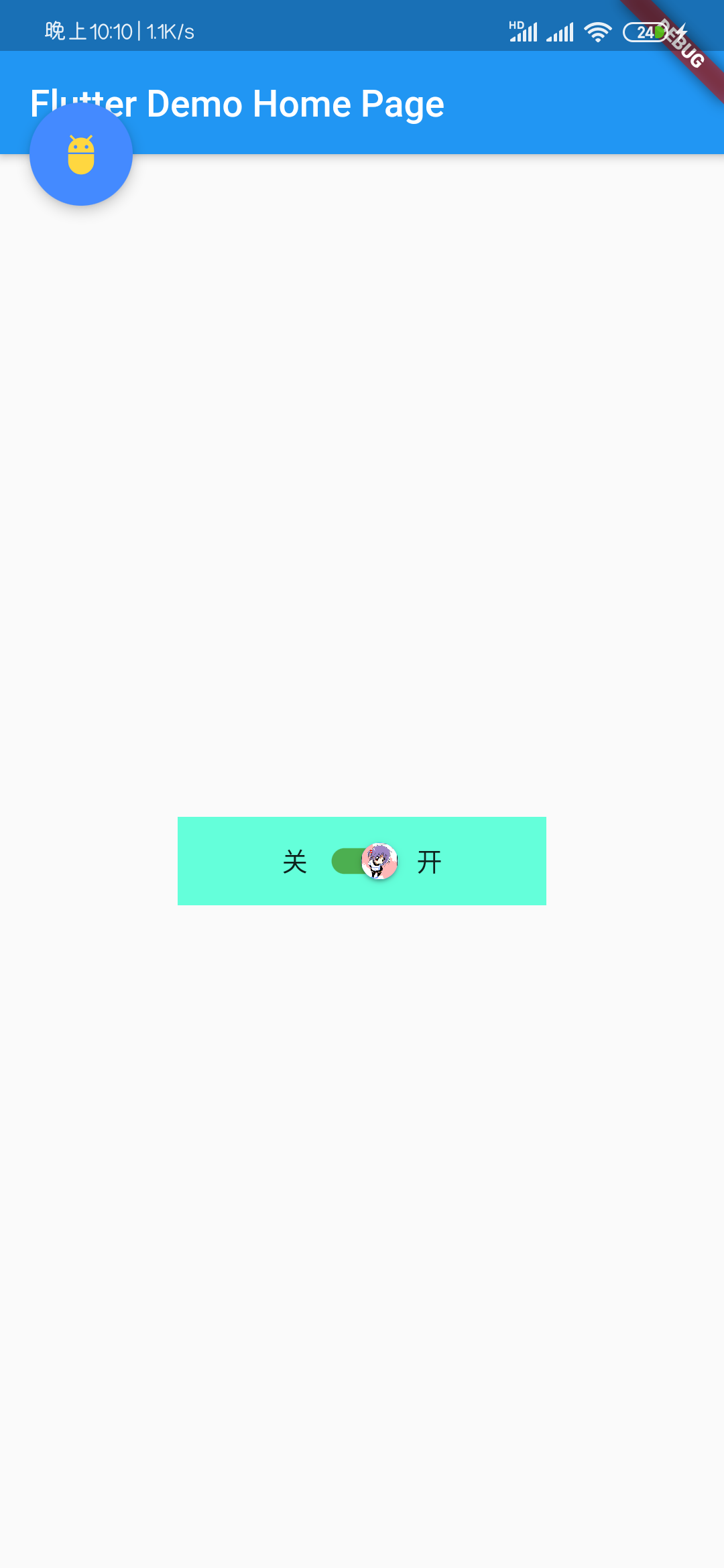
Switch 不多做介绍,大家都知道的,flutter 的这个 Switch 可以设置选中时按钮的颜色,图标,横条的颜色:
activeColor- 选中时按钮的颜色activeThumbImage- 选中时按钮的图标activeTrackColor- 选中时和横条的颜色inactiveThumbColor- 不选时按钮的颜色inactiveTrackColor- 不选时横条的颜色inactiveThumbImage- 不选时按钮的图标onChanged- 点击影响value- 当前值,这个必须一开始就写上哈
Switch 在这里的最大问题就是此存有点小,大家看下图,这是相对整个屏幕的大小,而且 Switch 本身还不支持大小调整
class TestWidgetState extends State<TestWidget> {
  bool _value = false;

  @override
  Widget build(BuildContext context) {
    // TODO: implement build
    return Container(
      width: 200,
      decoration: BoxDecoration(
        color: Colors.tealAccent,
      ),
      child: Row(
        mainAxisAlignment: MainAxisAlignment.center,
        children: <Widget>[
          Text('关'),
          Switch(
            value: _value,
            activeColor: Colors.blue,
            activeTrackColor: Colors.green,
            activeThumbImage: AssetImage(('assets/icons/icon_1.gif')),
            inactiveThumbColor: Colors.red,
            inactiveThumbImage: AssetImage(('assets/icons/icon_2.jpg')),
            inactiveTrackColor: Colors.grey,
            onChanged: (newValue) {
              setState(() {
                _value = newValue;
              });
            },
          ),
          Text('开'),
        ],
      ),
    );
  }
}
Radio
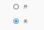
Radio 是单选按钮,我总是和多选混。Flutter 的单选按钮设计挺简单的,使用 groupValue 参数表示一组单选按钮的统一 ID,用相同 groupValue 的单选按钮就算一组的,比在外面再加一层容器的思路灵活多了,这样页面好写多了
value- 单选按钮值,这里值是无实际意义,此值就是表示用户点个哪个按钮,配合枚举会好用很多groupValue- 单选按钮组统一 IDonChanged- 回调activeColor- 选中时候的颜色
class TestWidgetState extends State<TestWidget> {
  String _value = '1';
  @override
  Widget build(BuildContext context) {
    return Column(
      mainAxisAlignment: MainAxisAlignment.center,
      crossAxisAlignment: CrossAxisAlignment.center,
      children: <Widget>[
        Row(
          mainAxisAlignment: MainAxisAlignment.center,
          children: <Widget>[
            Radio(
                value: 'a',
                activeColor: Colors.blue,
                groupValue: _value,
                onChanged: (newValue) {
                  setState(() {
                    print("a:${newValue}");
                    _value = newValue;
                  });
                }
            ),
            Text('开')
          ],
        ),
        Row(
          mainAxisAlignment: MainAxisAlignment.center,
          children: <Widget>[
            Radio(
                value: 'b',
                activeColor: Colors.blue,
                groupValue: _value,
                onChanged: (newValue) {
                  setState(() {
                    print("b:${newValue}");
                    _value = newValue;
                  });
                }
            ),
            Text('关')
          ],
        )
      ],
    );
  }
}
Checkbox
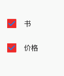
Checkbox Flutter 的一贯设计:书写简洁、设计简单,多选按钮组也是没有外层容器那一说了,而是采用有多少个按钮选项就配合多少个 boolean 参数的思路,配合上表驱动法的思路,很 Nice
value- true 选中,fasle 不选中activeColor- 选中时填充颜色checkColor- 选中时 Icon 颜色
class TestWidgetState extends State<TestWidget> {
  var _isBook = false;
  var _isPrice = false;

  @override
  Widget build(BuildContext context) {
    return Column(
      children: <Widget>[
        Row(
          mainAxisAlignment: MainAxisAlignment.start,
          children: <Widget>[
            Checkbox(
              value: _isBook,
              onChanged: (newValue) {
                print('book:$newValue');
                setState(() {
                  _isBook = newValue;
                });
              },
              activeColor: Colors.red,
              checkColor: Colors.blue,
            ),
            Text("书"),
          ],
        ),
        Row(
          mainAxisAlignment: MainAxisAlignment.start,
          children: <Widget>[
            Checkbox(
              value: _isPrice,
              onChanged: (newValue) {
                print('price:$newValue');
                setState(() {
                  _isPrice = newValue;
                });
              },
              activeColor: Colors.red,
              checkColor: Colors.blue,
            ),
            Text("价格"),
          ],
        )
      ],
    );
  }
}
