所用Css3知识点:
animation动画
transform旋转变化
transtion动画
box-shadow 阴影
flex布局
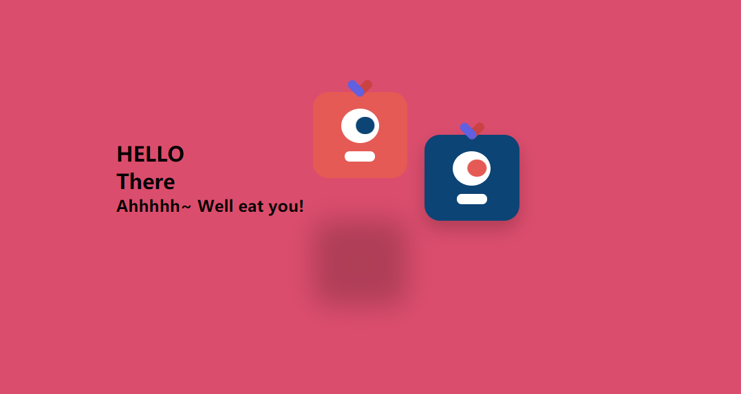
静态效果展示:
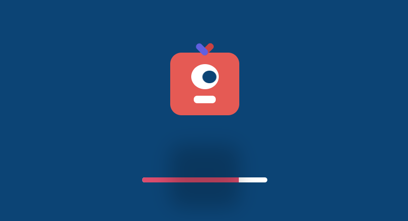
进入页面动画:
主页动画:
代码展示:
html:
<div class="container">
    <!-- 文字 -->
    <div class="title">
        <h2>Hello! Everyone</h2>
        <h2>There!!!</h2>
        <h2>Ahhhhh~ I Will Eat you</h2>
    </div>
    <!-- 实体1 -->
    <div class="content red">
        <div class="eye">
            <div class="ball"></div>
        </div>
        <div class="mouth"></div>
    </div>
    <!-- 实体2 -->
    <div class="content blue">
        <div class="eye">
            <div class="ball"></div>
        </div>
        <div class="mouth"></div>
    </div>
</div>
<!-- 进入页面动画 -->
<div class="page">
    <div class="content red">
        <div class="eye">
            <div class="ball"></div>
        </div>
        <div class="mouth"></div>
    </div>
    <!-- 进度条 -->
    <div class="bar">
        <div class="loading"></div>
    </div>
</div>
css:
* {
    margin: 0;
    padding: 0;
}
html,
body {
    width: 100%;
    height: 100%;
    background: #db4d6d;
    display: flex;
    justify-content: center;
    align-items: center;
}
.container {
    display: flex;
    justify-content: center;
    align-items: center;
}
.container .title h2 {
    margin: 10px 0px;
}
.content {
    width: 110px;
    height: 100px;
    border-radius: 20px;
    position: relative;
    margin: 0 20px;
    background: #f1524c;

    /* 让眼居中 */
    display: flex;
    justify-content: center;
    align-items: center;

    /* 让眼睛和嘴垂直排列 */
    flex-direction: column;

    /* 阴影 */
    box-shadow: 0 10px 20px rgba(0, 0, 0, 0.2);

    /* 运动 */
    animation: jump 1s infinite;

}
.content::before,
.content::after {
    content: "";
    display: block;
    width: 30%;
    height: 10px;

    border-radius: 20px;
    position: absolute;
    top: -10px;
    left: 50%;
}

.content::after {
    transform: translateX(-70%) rotate(45deg);
    background: rgb(197, 220, 97);
}

.content::before {
    transform: translateX(-30%) rotate(-45deg);
    background: rgb(231, 105, 105);
}

/* eye */
.content .eye {
    width: 40%;
    height: 40%;
    background: #fff;
    border-radius: 50%;

    /* 让眼球居中 */
    display: flex;
    justify-content: center;
    align-items: center;
}

.content .eye .ball {
    width: 50%;
    height: 50%;
    background: #0c4475;
    border-radius: 50%;
    animation: move 1s infinite alternate;

}

.content .mouth {
    width: 30%;
    height: 12px;
    background: #fff;
    margin-top: 10px;
    border-radius: 12px;
}

.content.blue {
    background: #0d5390;
    animation-delay: 0.5s;
}

.content.blue .eye .ball {
    background: #dd443f;
}
/* 实体的动画 */
@keyframes jump {
    0% {
        top: 0;
        box-shadow: 0 10px 20px rgba(0, 0, 0, 0.2);
    }

    50% {
        top: -50px;
        box-shadow: 0 80px 20px rgba(0, 0, 0, 0.2);
    }

    100% {
        top: 0;
        box-shadow: 0 10px 20px rgba(0, 0, 0, 0.2);
    }
}
/* 眼睛的动画 */
@keyframes move {
    0% {
        transform: translateX(50%);
    }

    100% {
        transform: translateX(-50%);
    }
}
/* 正页 */
.page {
    width: 100%;
    height: 100%;
    background: #0c4475;
    position: fixed;
    display: flex;
    justify-content: center;
    align-items: center;
    flex-direction: column;
    transition: opacity 1s;
}

.page .bar {
    width: 200px;
    height: 8px;
    background: #fff;
    border-radius: 20px;
    margin-top: 44px;
    overflow: hidden;
}

.page .bar .loading {
    width: 50%;
    height: 100%;
    background: #db4d6d;
}

/* page消失 */
.page.vanish {
    opacity: 0;
}

.page.vanish .content {
    transform: scale(0.01) rotate(720deg);
    transition: all 0.5s;
}
js:
<script>
    var time = 0
    var loading = document.querySelector('.loading')
    var page = document.querySelector('.page')
    var timer = setInterval(function () {
        loading.style.width = time + '%'
        time += 1
        if (time > 100) {
            clearInterval(timer)
            page.classList.add('vanish')
        }
    }, 40)
</script>

