

一、环境的配置
1.新建一个文件夹
mkdir eassyui
2.使用npm作为包管理工具
npm init -y
3.使用parcel实现模块化导出与导入文件
npm i -D parcel
4.下载vue的包
npm i vue
现在目录如下
.
├── LICENSE
├── node_modules
├── package-lock.json
└── package.json
5.在根目录下新建一个src文件夹与一个index.html
6.在src文件夹下新建一个app.js文件,作为入口文件
7.在index.html引入app.js
<script src="./src/app.js"></script>
8.app.js中创建 vue 实例
import Vue from 'vue'
 new Vue({
     el:'#app'
 })
二、确定基本样式
使用css全局变量和:root伪类来设定全局基本样式
//index.html
<style>
   :root{
       --primary-color: #1890ff;                         // 全局主色
       --link-color: #1890ff;                            // 链接色
       --success-color: #52c41a;                         // 成功色
       --warning-color: #faad14;                         // 警告色
       --error-color: #f5222d;                           // 错误色
       --font-size-base: 14px;                           // 主字号
       --heading-color: rgba(0, 0, 0, .85);              // 标题色
       --text-color: rgba(0, 0, 0, .65);                 // 主文本色
       --text-color-secondary : rgba(0, 0, 0, .45);      // 次文本色
       --disabled-color : rgba(0, 0, 0, .25);            // 失效色
       --border-radius-base: 4px;                        // 组件/浮层圆角
       --border-color-base: #d9d9d9;                     // 边框色
       --box-shadow-base: 0 2px 8px rgba(0, 0, 0, .15);  // 浮层阴影
       --button-height:32px;
   }
</style>
css变量的使用
body{
    color:var(--primary-color)
}
关于css伪元素:root和变量名的使用,具体可以看下面的连接
https://developer.mozilla.org/zh-CN/docs/Web/CSS/var ---var
https://developer.mozilla.org/zh-CN/docs/Web/CSS/:root ---root
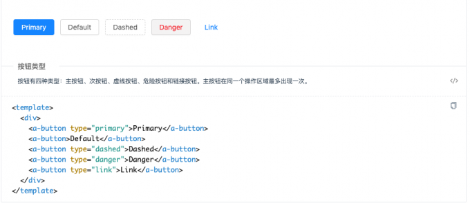
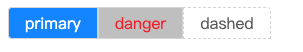
三、使用插槽和props来实现四种基本按钮
在src目录下新建button.vue文件
<template>
	<button class='h-button'>
    <slot></slot>
  </button>
</template>
<script>
 export default {
    props:{
      type:{
        type:String,
      	dafault:'defult',
        validator:(value)=>{
          //如果传入的参数不是以下四种则在控制台报错
          return ['primay','dashed','danger','link'].indexOf(value)!=-1
        }
      }
    }
  }
</script>
<style lang='scss'></style>
为四种button写四种类名的样式,将传进来的type赋值给类名
<template>
  <button class="h-button" :class="{[`h-button-${type}`]:true}">
    <slot></slot>
  </button>
</template>
<style>
  .h-button{
    &.h-button-primary{}
    ...
  }
</style>
在app.js中将button注册为全局组件
import Vue from 'vue'
import Button from './src/button'
Vue.component('h-button',Button)
在index.html中去使用
<div id='app'>
  <h-button>按钮</h-button>
</div>
在终端跳转至项目文件夹下,执行npx parcel --no-cache index.html.便会将相关的依赖下载。
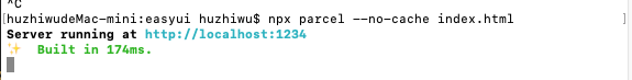
然后在浏览器里打开locahost:1234,如果出现下面的错误信息
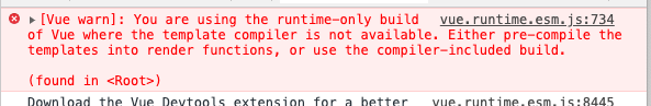
则在package.json中增加下面的内容
"alias": {
  "vue": "./node_modules/vue/dist/vue.common.js"
},
四、button-group的实现
在外层套一层div来实现对内部组件的排序约束
在src文件夹下新建一个button-group.vue的文件
<template>
    <div class="h-button-group">
        <slot></slot>
    </div>
</template>
按钮组中只有两边的按钮的边框是有角度的
.h-button-group{
        display: inline-flex;
        >.h-button{
            border-radius:0;
            &:first-child{
                border-top-left-radius:var(--border-radius-base);
                border-bottom-left-radius:var(--border-radius-base);
            }
            &:last-child{
                border-top-right-radius:var(--border-radius-base);
            }
        }
    }
然后会有一个问题,button之间的border连在了一起
//将不是第一个子元素的button左移一像素
.h-button-group{
  >.h-button{
    &:not(:first-child){
      margin-left:-1px
    }
  }
}
但是这样子,当我们的鼠标移到第一个button上时,他右边的border就会被左移的button所覆盖,只能看到三边border
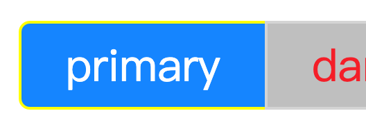
我们可以给hover状态的button加一个相对定位,并让其层级上升
.h-button{
  &:hover{
    position:relative;
    z-index:1;
  }
}
接着我们要考虑一个问题,如果用户没有按要求进行嵌套button的话,可能会出现一些样式上的问题,所以我们可以在vue进行渲染前,加一个判断
// button-group组件
<script>
  export default{
    mounted(){
  		//遍历该组件的子元素
      for(let node of this.$el.children){
        let name = node.nodeNmae.toLowerCase();
        if(name!=='button'){
          console.warn(`h-button-group的子元素应该是button,而你却写了${name}`)
        }
      }
    }
  }
</script>
如此,只要用户使用button-group时,内部不是嵌套button的话,就会在控制台出现警告
同样最后要在app.js中去注册该button-group的全局组件
import Vue from 'vue'
import ButtonGroup from './src/button-group'
Vue.component('h-button-group',ButtonGrouop)
五、添加icon组件
1.使用iconfront.cn
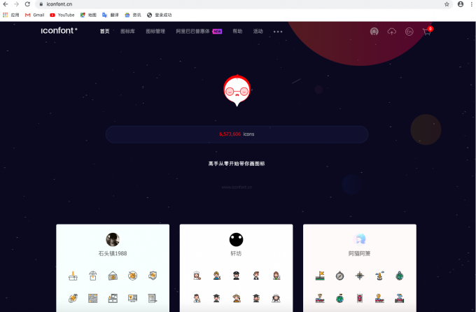
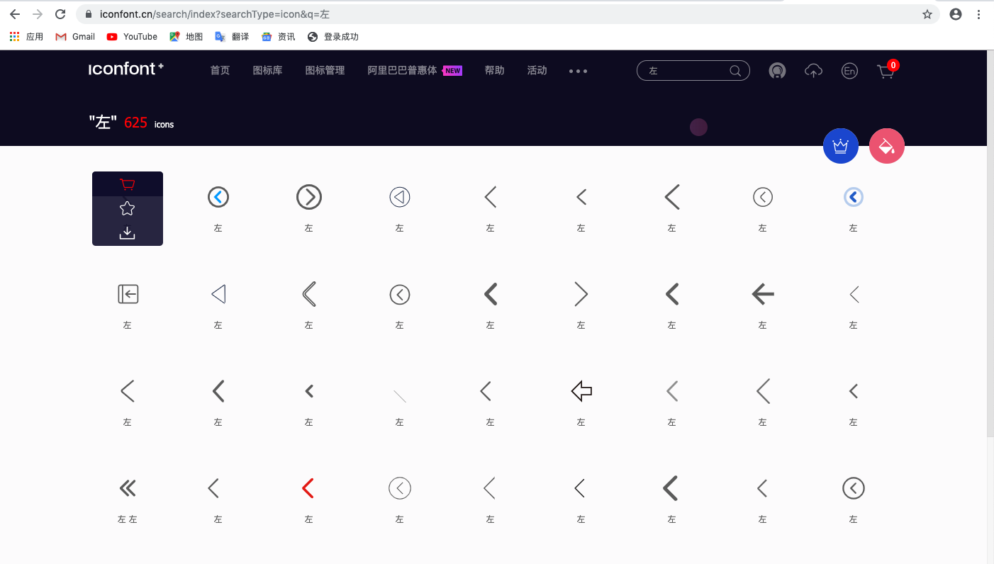
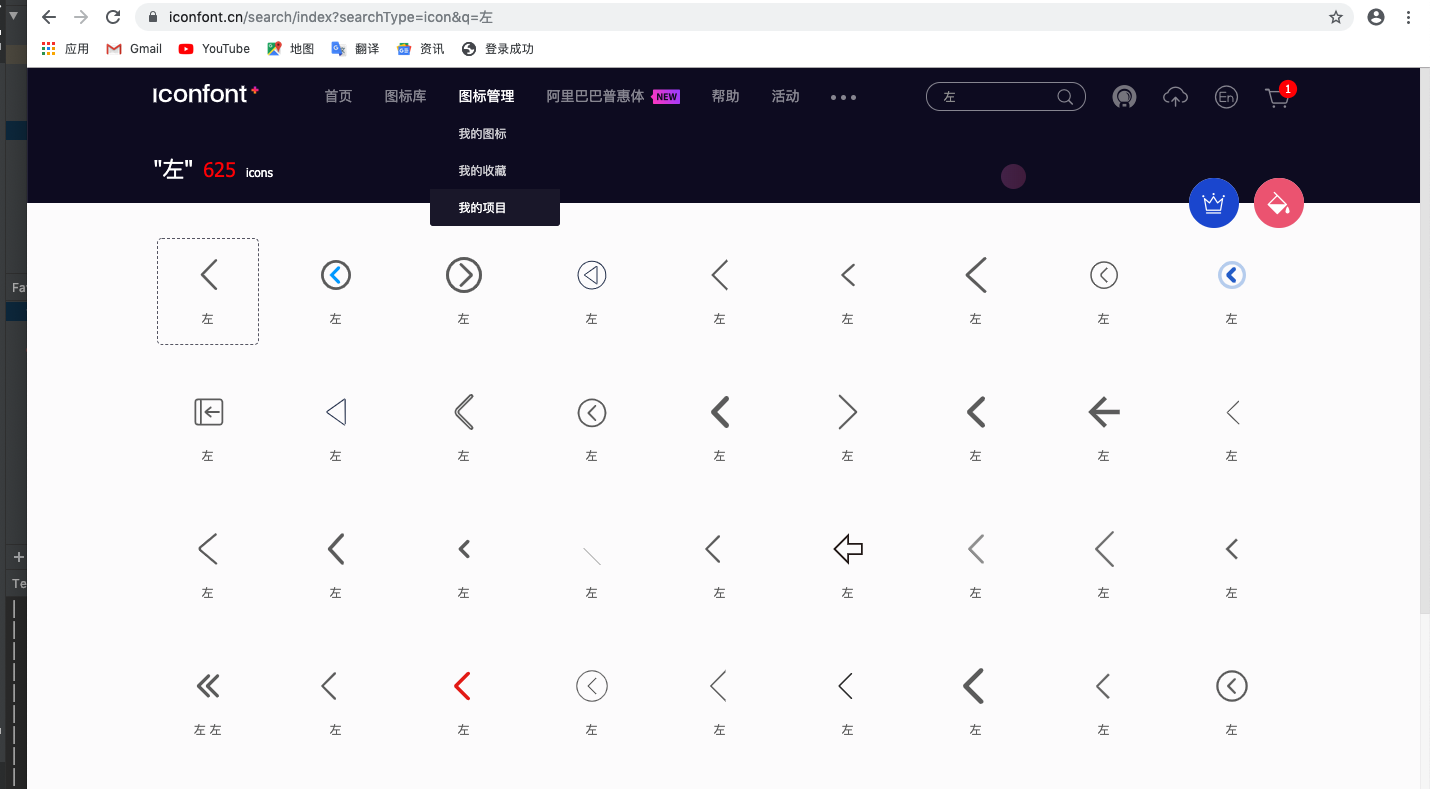
我们可以在阿里的开源的icon的网站 iconfont.cn里找我们喜欢的icon
输入关键词找到我们需要的icon,将其添加至购物车
添加完后,点击右上角的购物车,
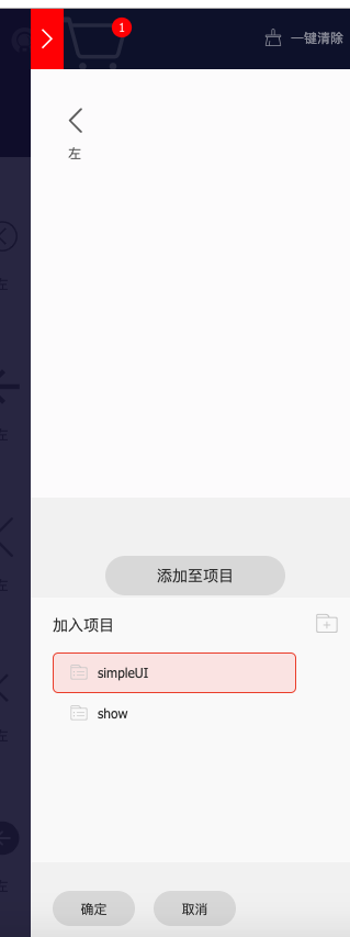
添加至项目,没有项目的,则新建一个
然后点击我的项目
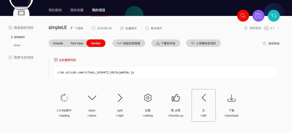
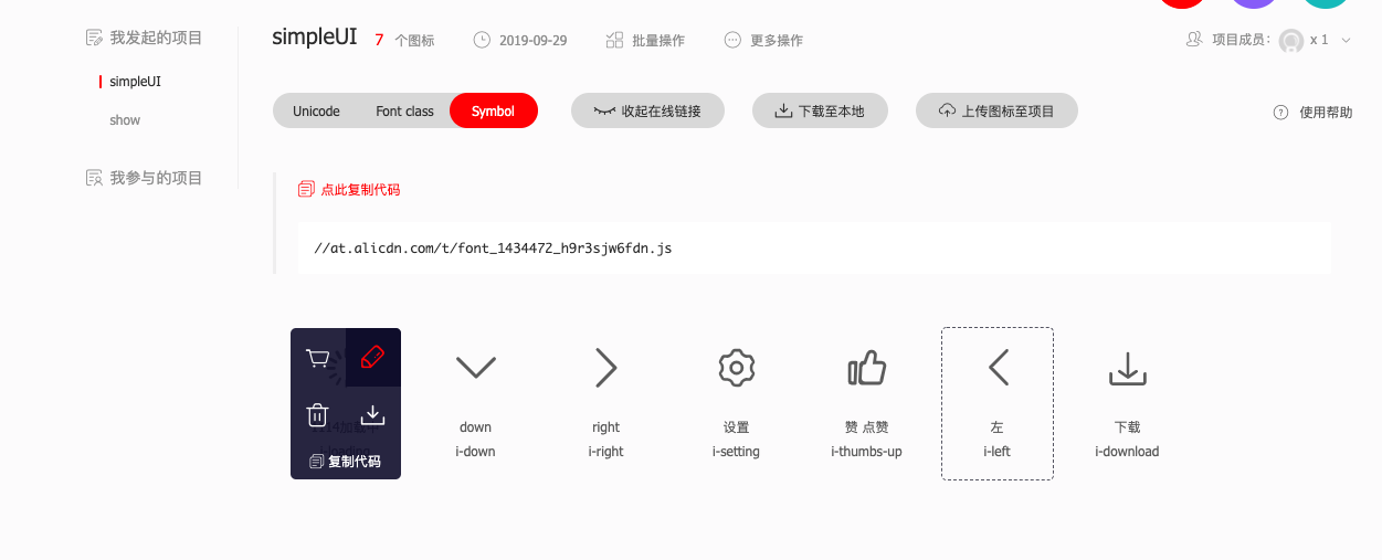
选择symbol
点击icon,你可以对icon进行命名,也可以调整icon的大小
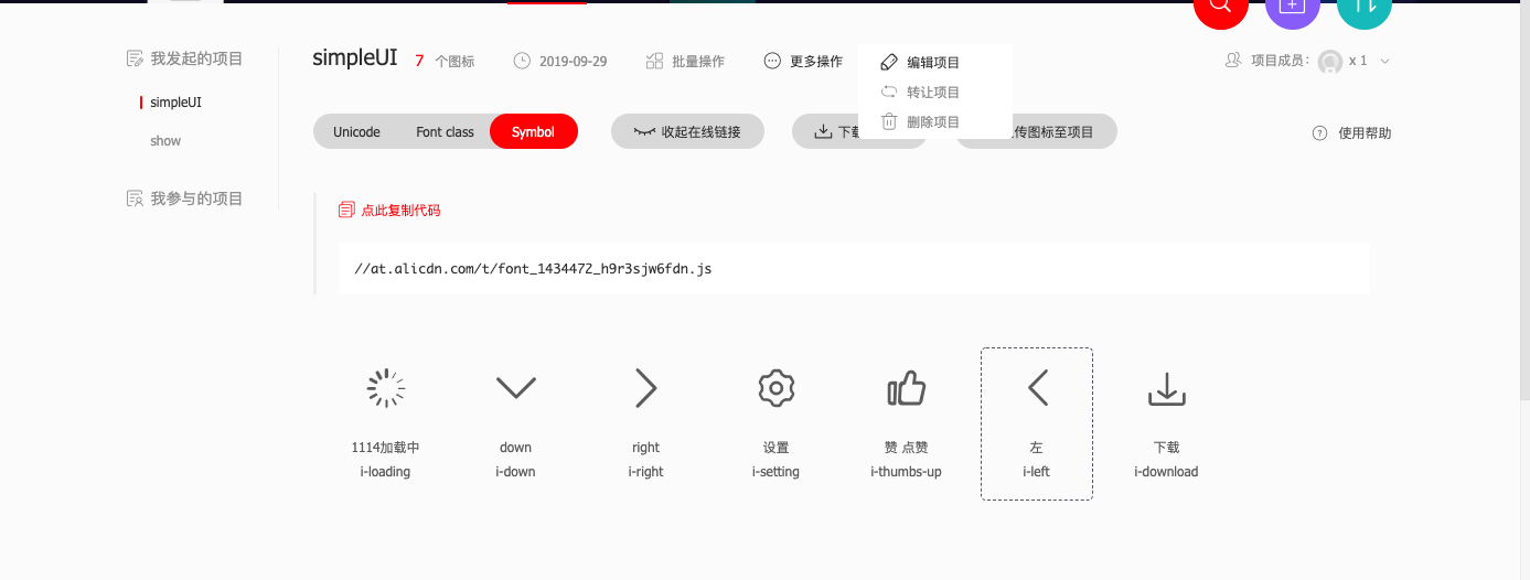
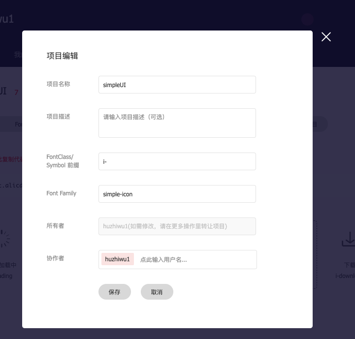
选择编辑项目,可以编写icon名的前缀,和font-family
复制这段代码
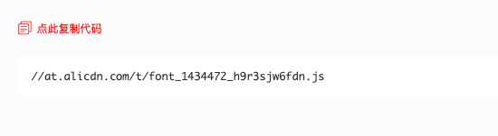
在index.html文件中导入
<script src="//at.alicdn.com/t/font_1434472_h9r3sjw6fdn.js"></script>
关于symbol的怎么使用,请看官方文档
https://www.iconfont.cn/help/detail?spm=a313x.7781069.1998910419.16&helptype=code
创建icon组件
在src文件夹下,新建一个icon.vue 的文件,
<template>
    <svg class="h-icon" aria-hidden="true">
        <use xlink:href="#icon-xxx"></use>
    </svg>
</template>
icon 应该是动态的,使用props来动态改变
<template>
    <svg class="h-icon" aria-hidden="true">
        <use :xlink:href="`#i-${name}`"></use>
    </svg>
</template>
<script>
    export default {
        props:{
            name:{
                type:String,
                default:'',
              //对icon 进行过滤,不在数组里的icon,则会提示错误
                validator(value){
                    return ['loading','right','down','setting','thumbs-up','left','download'].indexOf(value)!=-1
                }
            }
        }
    }
</script>
将icon的大小设置为全局的基本字体大小
.h-icon{
  height:var(--font-size-base);
  width:var(--font-size-base)
}
在app.js中去注册全局的icon组件
import Icon from './icon'
import Vue from 'vue'
Vue.component('h-icon',Icon)
六、icon和button组合
在button中我们可以通过icon这个属性来决定button内部使用什么icon
<template>
    <button>
    	<h-icon class='icon' :name='icon'></h-icon>
    </button>
</template>
<script>
  export default{
    props:{
      icon:{
        type:String
      }
    }
  }
</script>
icon可能在左右两边,我们可以在button组件设置一个iconPosition的prop来决定icon的位置
<template>
    <button :class='["h-button",{[`icon-${iconPosition}`]:true}]'>
      <h-icon class='icon' :name='icon'></h-icon>
      <div class='content'>
        <slot></slot>
      </div>
    </button>
</template>
<script>
 export default{
    props:{
      iconPosition{
      	type:String,
      	default:'left',
      	validator(value){
    			return ['left','right'].indexOf(value)!=-1
  		}
      }
    }
  }
</script>
<style>
  .h-button{
    display:inline-flex;
    &.icon-left{
      .icon{
        order:1;
        margin-right:.2em
      }
      .content{
        order:2
      }
    }
    &.icon-right{
      .icon{
        order:2;
        margin:0;
        margin-left:.2em
      }
      .content{
        order:1;
      }
    }
  }
</style>
七、点击button会出现icon会切换loading
在button组件中添加loading的icon,并且loading和原有的icon是互斥关系
<template>
...
<h-icon name="loading" class="icon" v-if="loading"></h-icon>
<h-icon :name="icon" class="icon" v-if="icon&&!loading"></h-icon>
...
</template>
<script>
...
loading:{
 type:Boolean,
 default:false
}
</script>
如果我们这样添加事件,vue并不会响应
<h-button :loading="loading" icon="down" icon-position="right" @click='loading=!loading'>down</h-button>
因为h-button是一个自定义组件,vue并不知的你点击的是自定组件中个哪个html标签
所以我们要在自定义组件内部自己触发click事件
<template>
	<button @click='$emit('click')'>
  </button>
</template>
结语
作者:胡志武
时间:2019/09/30
如果本文有错漏的地方,请各位看官指正。如果决定本文对你有那么一点点帮助,请点赞哦!
如果要转载请注明出处
