

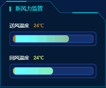
在项目中遇到的需求,纯CSS实现,无切图,代码实现较简单,不过多累赘了,
来源个人博客: [shengchangwei.github.io/hc-wind/]
<div class="out">
  <div class="inner">
    <div class="progress"></div>
  </div>
</div>
.out {
    width: 300px;
    padding: 8px;
    background: rgba(15, 27, 71, 1);
    border: 2px solid rgba(20, 125, 229, 0.42);
    border-radius: 10px;
}
.inner {
    width: 100%;
    height: 27px;
    background: rgba(23, 50, 110, 1);
    border: 2px solid rgba(20, 125, 229, 0.42);
    border-radius: 10px;
}
.progress {
    height: 100%;
    border-radius: 10px;
    width: 70%;
    background: -webkit-linear-gradient(
    left,
    #66ffff 10%,
    #ba6409 100%
    );
    background-size: 200% 100%;
    animation: progressMove 3s linear infinite;
}
@keyframes progressMove {
    0% {
    background-position: 0 0;
    }
    100% {
    background-position: -100% 0;
    }
}
