

盒模型
line-height:1.6em增加文本行高改善可读性,与其他部分形成反差。行间距。
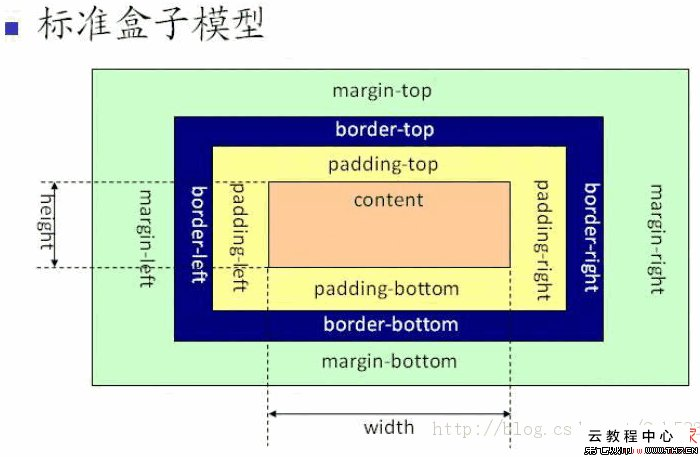
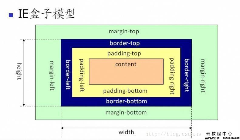
内容区:正好包容所有内容,内容区中,内容与盒子边缘没有空间
内边距:内容区周围,透明的,没有颜色,没有装饰
边框:包围内边距。
外边距:包围着边框,外边距是透明的。
增加一个背景图像
h1 {
background-img: url(images/background.gif);
background-repeat:no-repeat;
background-position:top left;
}
background-position(top,left,right,bottom,center)
background-repeat:repeat(水平,垂直重复),no-repeat,repeat-x,repeat-y,inherit(按父元素的处理)
h1 {
    padding:25px;
    padding-left:80px;
    /*获得更大的左内边距,顺序很重要*/
}
边框概览
border-style:solid实线,dotted虚线, double两条线,dashed破折线,groove槽线,,inset内凹,outset外突,ridge脊线 边框宽度border-width:thin;medium;thick 边框颜色background-color
指定某一边的边框
    border-top-color
    border-bottom-style
    border-left-width
指定某一边的圆角
    border-top-radius:15px;
    border-bottom-radius:3em;
指定媒体类型
    <link href="moblie.css" rel="stylesheet" media="screen and (max-device-width:480px)">
    <link href="print.css" rel="stylesheet" media="print"
还有很多属性min-device-width。还有orientation可以是landscape(横向)或纵向(portrait)
方法二:直接在css中增加媒体查询
@media screen and (max-device-width:480px) {
    ....
}
@media print {
    body {

    }
}
div与span
处理div宽度
    div {
        width:200px;
    }
如果一个元素没有设置宽度,默认值是auto,他会自动占满可用的空间。
用百分比指定宽度,宽度会计算为元素所在容器宽度的一个百分比。容器可以是body,div。
使用块元素的text-align:center史文字居中。会让块元素中所有内联内容居中,包括图片。只能在块元素上设置。会继承。
选择子孙的方法
    #haha h2 {
        color:black;
    }
选择了haha中的所有子孙,孙子,曾孙子。
#haha>h2选择直接孩子
#haha heihei h2 选择haha中的heihei中的h2
修正行高
    #haha {
        line-height:1;
    }
这个属性特殊,设置为1,行高基于各个元素本身的字体大小。
用简写指定属性
    #haha {
        padding: 0px 20px 30px 10px;
        padding: 20px;
        margin: 0px 20px;
        background: white url(cock.gif) repeat-x;
    }
从顶开始,顺时针顺序
    #haha {
        font:font-style font-variant font-weight  font-size/line-height font-family
    }
利用span创建内联字符和元素的逻辑分组
div允许块级内容逻辑划分,span建立内联内容的逻辑分组。
可以设置内联元素的宽度。内联元素四周都增加外边距,只能看到左边和右边增加空间。增加上下内边距,会与其他内联元素重叠。
<a>元素指定样式
    a:link {
        color: green;
    }
    a:visited {
        color: red;
    }
    a:hover {
        color:yellow;
    }
    a:focus {

    }
    a:active {

    }
active是第一次点击的状态,要按照上述顺序写
运用伪类
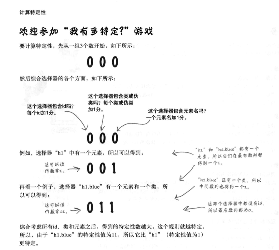
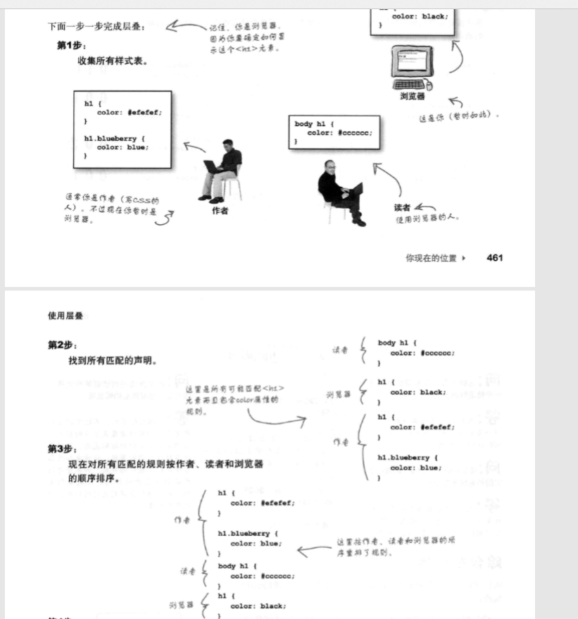
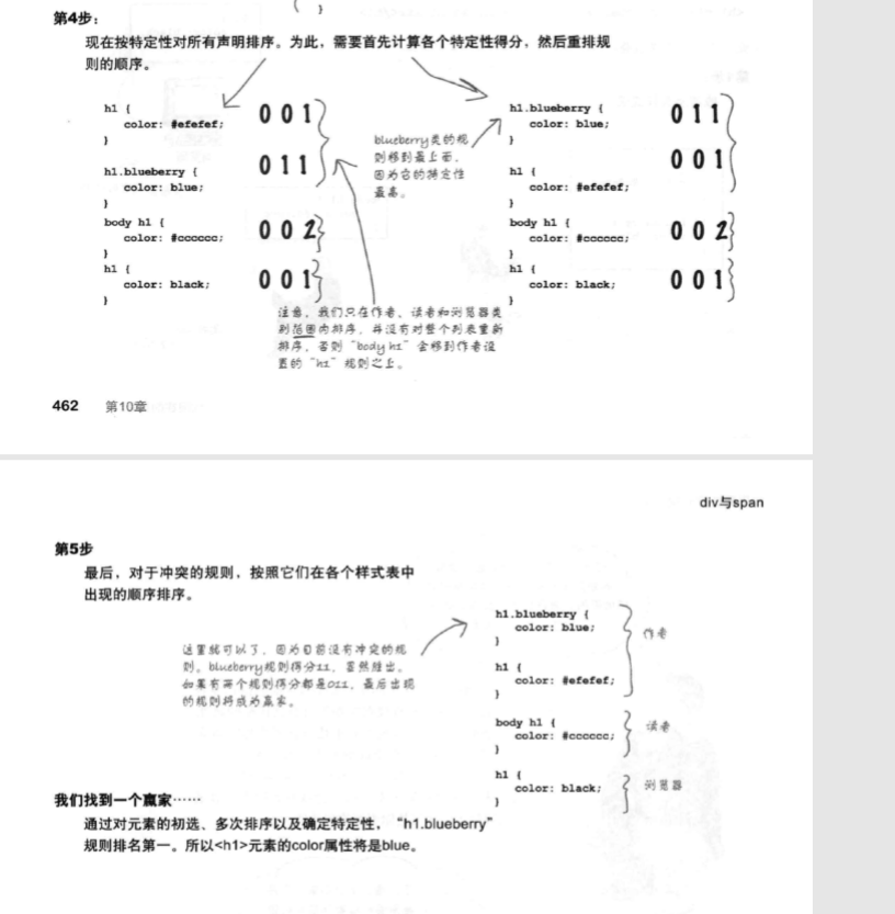
层叠
