

Flex布局笔记
重学一遍做做笔记,避免每次反复查。
部分图用的是参考链接里面的图或者他修改过的。原谅我懒。
1 基本布局
1.1 基本概念
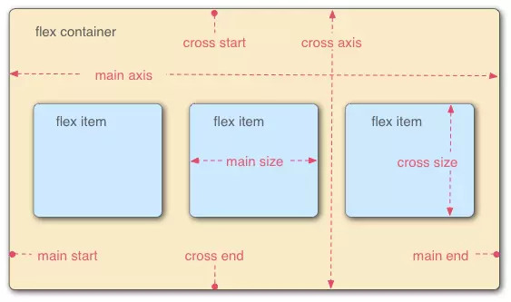
flex布局 外部包裹的就是 flex container MDN称为flex 容器
里面的每一个子元素都是flex item ,MDN称为flex 元素(有的文章写的项目,我反应了半天)
1.2 主轴和交叉轴
如1.1的图flex布局分为主轴和交叉轴,主轴和交叉轴垂直。
注意⚠️:这个主轴的方向是由flex-direction 决定的,如果值是row 或者row-reverse那么横向是主轴,如果值是column或者column-reverse那么竖直情况为主轴。
1.3 flex-start 从左还是右
注意⚠️:下面会有flex-start属性,他从左边开始还是从右边开始是由文字的排列方向决定的也就是direction属性或者是语言本身的属性(例如阿拉伯语)。
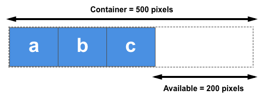
1.4 关于剩余空间概念
flex布局是会牵涉到一个概念关于剩余空间,
我们改变flex的相关属性时,都会直接或者简介的涉及到flex的剩余空间。
举例说明:如果3个100px的元素在一个500px的容器中,那么剩下的200px就是剩余空间。
在设置flex-basis flex-grow flex-shrink 都会用到,这样你会理解他如和去算
2 flex容器属性
2.1 flex-direction
决定了主轴的方向。
flex-direction: row | row-reverse | column | column-reverse;
主轴方向:水平排列(默认) | 水平反向排列 | 垂直排列 | 垂直反向排列
2.1 flex-wrap
决定flex元素是否换行,flex-wrap: nowrap | wrap | wrap-reverse;
换行:不换行(默认) | 换行 | 反向换行(第一行在最后面)
2.2 flex-flow
flex-direction属性和flex-wrap属性的简写形式,默认值为row nowrap
flex-flow: || ;
2.3 justify-content
主轴对齐方式:起点对齐(默认) | 终点对齐 | 居中对齐 | 两端对齐 | 分散对齐
justify-content: flex-start | flex-end | center | space-between | space-around;
2.4 align-items
交叉轴对齐方式:拉伸对齐(默认) | 起点对齐 | 终点对齐 | 居中对齐 | 第一行文字的基线对齐
align-items: stretch | flex-start | flex-end | center | baseline;
2.5 align-content
多根轴线对齐方式:拉伸对齐(默认) | 起点对齐 | 终点对齐 | 居中对齐 | 两端对齐 | 分散对齐
align-content: stretch | flex-start | flex-end | center | space-between | space-around;
3 flex 元素属性
3.1 order
3.2 flex-grow
放大比例:默认为0,如果有剩余空间也不放大,值为1则放大,2是1的双倍大小,以此类推
flex-grow: ;
flex-grow他是根据你的剩余空间在进行分配的。我们来算一遍
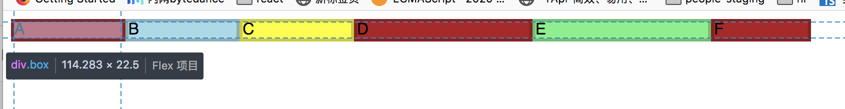
基础HTML
<div id="content">
    <div class="box" style="background-color:red;">A</div>
    <div class="box" style="background-color:lightblue;">B</div>
    <div class="box" style="background-color:yellow;">C</div>
    <div class="box1" style="background-color:brown;">D</div>
    <div class="box1" style="background-color:lightgreen;">E</div>
    <div class="box" style="background-color:brown;">F</div>
</div>
实验1
        <style>
        #content {
            display: flex;
            justify-content: space-around;
            flex-flow: row wrap;
            align-items: stretch;
            width:800px;
            }
            .box {
            flex-grow: 1;
            border: 3px solid rgba(0,0,0,.2);
            box-sizing: border-box;
            width: 50px;
            }
            .box1 {
            flex-grow: 2;
            border: 3px solid rgba(0,0,0,.2);
            box-sizing: border-box;
            width: 50px;
            }

        </style>
总宽度800px 每一个宽度50px 剩余500px 按照flex-grow属性分为八份就是500/8=62.5 那么box 就是 62.5+50
=112.5 box1就是 62.5*2+50=175
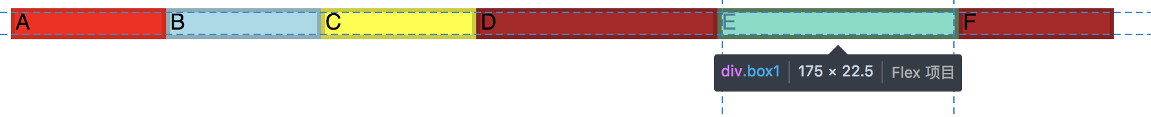
各位可以自己验证一下
⚠️注意:
如果由min-width min-heigth那么情况会有点差别
<html>
<head>
<style>
#content {
display: flex;
justify-content: space-around;
flex-flow: row wrap;
align-items: stretch;
width:800px;
}
.box {
flex-grow: 1;
border: 3px solid rgba(0,0,0,.2);
box-sizing: border-box;
width: 50px;
}
.box1 {
flex-grow: 2;
border: 3px solid rgba(0,0,0,.2);
box-sizing: border-box;
width: 50px;
}
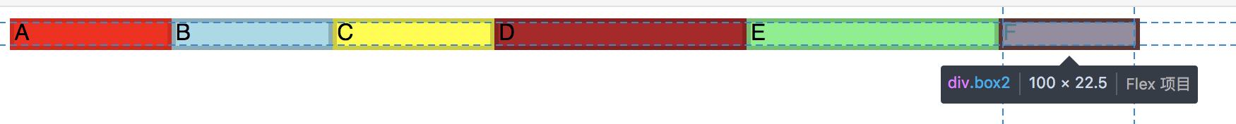
.box2{
flex-grow: 1;
border: 3px solid rgba(0,0,0,.2);
box-sizing: border-box;
min-width: 100px;
}
</style>
</head>
<body>
<div id="content">
<div class="box" style="background-color:red;">A</div>
<div class="box" style="background-color:lightblue;">B</div>
<div class="box" style="background-color:yellow;">C</div>
<div class="box1" style="background-color:brown;">D</div>
<div class="box1" style="background-color:lightgreen;">E</div>
<div class="box2" style="background-color:brown;">F</div>
</div>
</body>
</html>
这里计算的时候 剩余空间就是 800-50*5-100=450 box2 不参与分配 那么每一份就是450/7约等于69.29 大家可以验证一下
3.3 flex-shrink
缩小比例:默认为1,如果空间不足则会缩小,值为0不缩小
flex-shrink: ;
3.4 flex-basis
项目自身大小:默认auto,为原来的大小,可设置固定值 50px/50%
flex-basis: | auto;
3.5 flex
flex-grow, flex-shrink 和 flex-basis的简写,默认值为0 1 auto
两个快捷值:auto (1 1 auto) 和 none (0 0 auto)
flex:none | [ <'flex-grow'> <'flex-shrink'>? || <'flex-basis'> ]
3.6 flex-start
项目自身对齐:继承父元素(默认) | 起点对齐 | 终点对齐 | 居中对齐 | 基线对齐 | 拉伸对齐 align-self: auto | flex-start | flex-end | center | baseline | stretch;
4 参考链接
www.ruanyifeng.com/blog/2015/0…
developer.mozilla.org/en-US/docs/…
developer.mozilla.org/en-US/docs/…
developer.mozilla.org/en-US/docs/…
developer.mozilla.org/en-US/docs/…developer.mozilla.org/en-US/docs/…
