

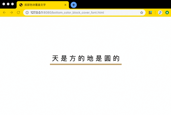
底部色块覆盖文字 在线地址: https://zhaoolee.com/ProgrammingWithChrome/bottom_color_block_cover_font/
源码:
<!DOCTYPE html>
<html lang="en">
<head>
    <meta charset="UTF-8">
    <title>底部色块覆盖文字</title>
</head>
<body>
    <span class="bottom_color_block_cover_font">天 是 方 的 地 是 圆 的</span>

    <style>
        body{
            height: 80vh;
            display: flex;
            justify-content: center;
            align-items: center;

        }
        .bottom_color_block_cover_font{
            display: inline-block;
            padding: 10px;
            position: relative;
            color: #020002;
            z-index: 1;
            font-size: 30px;
        }

        /*鼠标浮动到文字上方变成小手*/
        .bottom_color_block_cover_font:hover{
            cursor: pointer;
        }


        .bottom_color_block_cover_font::after{
            content: "";
            position: absolute;
            left: 0;
            right: 0;
            bottom: 0;
            z-index: -1;
            height: 6px;
            background-color: #BE9F6A;
            transform-origin: bottom;
            transition: all 0.2s ease-in-out;
        }


        .bottom_color_block_cover_font:hover::after{
            z-index: -1;
            height: 100%;
            background-color: #BE9F6A;
        }


    </style>


</body>
</html>
上图中文字的底部色块就是用伪元素添加的
关于伪元素
- 伪元素就像某宝/某多多商品大促销免费赠送的DOM元素。它可以被添加与DOM元素相关的属性, 但不会在HTML中展示出来
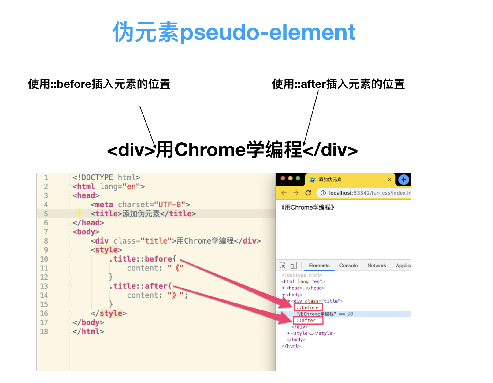
由于伪元素不在正式的文档流当中,所以上图网页中的
《和》无法被鼠标拖拽选中
<!DOCTYPE html>
<html lang="en">
<head>
    <meta charset="UTF-8">
    <title>添加伪元素</title>
</head>
<body>
    <div class="title">用Chrome学编程</div>
    <style>
        .title::before{
            content: "《"
        }
        .title::after{
            content: "》";
        }
    </style>
</body>
</html>
- 善用before 、after两个伪元素。一个标签可以当3个标签来使用, 配合css, 让单标签动画成为了可能~
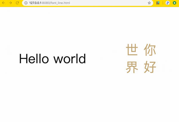
为字体添加划线 在线查看地址: https://zhaoolee.com/ProgrammingWithChrome/font_line/
- 源码
<!DOCTYPE html>
<html lang="en">
<head>
    <meta charset="UTF-8">
    <title>为字体添加划线</title>
</head>
<body>

        <div class="atom">
            <span class="font_line_en">Hello world</span>
        </div>
        <div class="atom">
            <span class="font_line_cn">你 好<br/>世 界</span>
        </div>

    <style>
        body{
            height: 80vh;
            display: flex;
            justify-content: center;
            align-items: center;
        }
        .atom{
            flex: 1 1 auto;
            display: flex;
            justify-content: center;
            align-items: center;
        }
        .atom span{
        }

        .font_line_cn{
            writing-mode: vertical-rl;
            font-size: 60px;
            color: #BE9F6A;
            position: relative;
        }

        /*浮动上方需要显示小手*/
        .font_line_cn:hover{
            cursor: pointer;
        }

        /*为文字内容前后 添加伪元素*/
        .font_line_cn::before,
        .font_line_cn::after{
            content: "";
            /*通过absolute定位, left:0 right:0 让元素宽度与文章内容宽度相同*/
            position: absolute;
            top: 0;
            bottom: 0;
            /*设置元素高度为2px*/
            width: 4px;
            /*设置元素背景色为#111111*/
            background-color: #BE9F6A;
            /*transform属性允许你旋转,缩放,倾斜或平移给定元素 这里通过设置scaleX(0) 把横线隐藏*/
            transform: scaleY(0);
            /* 过渡属性的名称  持续时间  缓动函数 */
            transition: transform 0.2s ease-in-out;
        }
        /*添加到文字元素 前面的伪元素 top为0  转换原点在右侧(如下图)
          */
        .font_line_cn::before{
            left: 0;
            transform-origin: top left;
        }

        .font_line_cn::after{
            right: 0;
            transform-origin:  bottom right;
        }

        .font_line_cn:hover::before{
            transform-origin: top right;
            transform: scaleY(1);
        }

        .font_line_cn:hover::after{
            transform-origin: bottom left;
            transform: scaleY(1);
        }

        /* 英文*/

        .font_line_en{
            font-size: 60px;
            color: #111111;
            position: relative;
        }

        /*浮动上方需要显示小手*/
        .font_line_en:hover{
            cursor: pointer;
        }

        /*为文字内容前后 添加伪元素*/
        .font_line_en::before,
        .font_line_en::after{
            content: "";
            /*通过absolute定位, left:0 right:0 让元素宽度与文章内容宽度相同*/
            position: absolute;
            left: 0;
            right: 0;
            /*设置元素高度为2px*/
            height: 4px;
            /*设置元素背景色为#111111*/
            background-color: #111111;
            /*transform属性允许你旋转,缩放,倾斜或平移给定元素 这里通过设置scaleX(0) 把横线隐藏*/
            transform: scaleX(0);
            /* 过渡属性的名称  持续时间  缓动函数 */
            transition: transform 0.2s ease-in-out;
        }
        /*添加到文字元素 前面的伪元素 top为0  转换原点在右侧(如下图)
          */
        .font_line_en::before{
            top: 0;
            transform-origin: left top;
        }

        .font_line_en::after{
            bottom: 0;
            transform-origin: right bottom ;
        }

        .font_line_en:hover::before{
            transform-origin: right bottom;
            transform: scaleX(1);
        }

        .font_line_en:hover::after{
            transform-origin: left bottom;
            transform: scaleX(1);
        }

    </style>
</body>
</html>
- 完整程序已经上传到github, 下载地址如下:
编程小知识
- 伪元素虽然非常有用,但有一些特定的标签是不支持伪元素 before 和 after 的, 比如常见的
<img>、<input>、<iframe>都不支持伪元素; 为啥不支持? 标签要想支持伪元素,就需要这个标签必须允许插入其它元素, 但<img>、<input>、<iframe>这三位大佬都不允许插入其它元素(比如<img><span>欧拉欧拉</span></img>的写法是不符合语法的), 所以 不允许插入其它元素的DOM元素,都不支持伪元素; MDN的专业解释链接
项目推广:
本文属于《用Chrome学编程》的一部分, 《用Chrome学编程》用Gif图展示Chrome的骚操作, 充分挖掘Chrome的编程潜力!开源地址: github.com/zhaoolee/Pr… 如果你喜欢这个项目, 欢迎为项目加一颗🌟星 ~
