

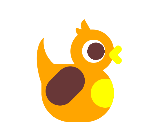
看到可爱的卡通形象就很想用CSS实现一波,找点乐子~
codepen链接:codepen.io/woshilyy/pe…
HTML代码如下:
<div class="wrap">
            <div class='head'>
                <div class='eye'></div>
                <div class='mounth'></div>
             </div>
                <div class='body'></div>
                <div class='tail'></div>
             <div class='hand'></div>
</div>
头部与头上两撮毛毛代码如下:
.head {
  position: relative;
  display: flex;
  align-items: center;
  width: 150px;
  height: 150px;
  background:orange;
  border-radius: 50%;
  z-index: 111;
}

.head::before,
.head::after {
  content: "";
  position: absolute;
  width: 50px;
  height: 25px;
  background: orange;
  border-radius: 0 0 0 25px;
}

.head::before {
  transform: rotate(60deg);
  top: -20px;
  left: 25px;
}

.head::after {
  transform: rotate(15deg);
  top: 0;
  left: 15px;
}
眼睛代码如下:
.eye {
  position: absolute;
  width: 80px;
  height: 80px;
  background: radial-gradient(circle at 60% 50%, #fff 1px, transparent 1px), radial-gradient(circle at 60% 50%, rgb(104, 55, 55) 30px, transparent 30px), radial-gradient(circle at 50% 55%, #FFF 35px, transparent 35px), #fff;
  ;
  border-radius: 50%;
  right: 30px;
  animation: eyes 3s infinite;
}
@keyframes eyes {
    0%,
    6% {
        transform: scaleX(1) scaleY(1)
    }
    3% {
        transform: scaleX(1) scaleY(.1);
    }
}
眼睛内部背景颜色变化使用的是径向渐变
鸡嘴代码如下:
.mounth::before,
.mounth::after {
  content: '';
  position: absolute;
  right: -35px;
  width: 50px;
  height: 25px;
  background: yellow;
  border-radius: 25px;
  transform: rotate(calc(45deg * var(--n)));
  transform-origin: 20% center;
  animation: mounth 2s infinite ;
}
@keyframes mounth {
    3%,12%{
        transform: rotate(calc(45deg * var(--n)));
    }
    6%{
        transform: rotate(calc(0deg * var(--n)));
    }
}
.mounth::before {
  --n: -1
}

.mounth::after {
  --n: 1
}
嘴巴由两个圆角矩形组成,旋转角度刚好相反,所以使用了变量控制角度的不同
身体代码如下:
.body {
    display: flex;
    align-items: center;
  position: relative;
  background:orange;
  width: 250px;
  height: 200px;
  border-radius:0 200px 200px 200px;
  margin-top: -30px;
  margin-left: -100px;
  z-index: 111;
  overflow: hidden;

}
.body::before{
    content:"";
    position: absolute;
    right:-20px;
    width: 100px;
    height: 100px;
    border-radius: 100px;
    background: yellow;
}
尾巴代码如下:
.tail {
  position: relative;
  background:orange;
  z-index: 1;
  width: 150px;
  height:300px;
  border-radius: 100% 0 0 100%;
  margin-top: -308px;
  margin-left: -209px;
  transform: rotate(-20deg);
}
.tail::before{
    content:"";
    position: absolute;
    width: 200px;
    height: 200px;
    background: #fff;
    border-radius: 50%;
    left: 50px;
    top: -50px;
}
尾巴使用了大圆遮小圆进行实现,应该有更好的方法的,但暂时没想到就用了比较笨的方法替代(有更好实现方法的请提出好嘛蟹蟹~)
手部代码:
.hand{
    position: relative;
    height: 150px;
    width: 100px;
    margin-top: -170px;
    background: rgb(104, 55, 55);
    border-radius: 50px;
    transform: rotate(45deg);
    transform-origin: top;
    z-index: 111;
    margin-left: -80px;
}
手部是一个简单的圆角矩形,但其实看起来怪怪的,应该是一个精致的翅膀才对
整个小鸡做得很粗糙,阴影都没有加,动画也比较呆板,但做小卡通就是很开心鸭hhhhh
