

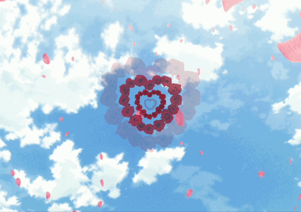
成品:


<body>
	<div>
		<img src="images/hua2.png" alt="">
		<img src="images/hua2.png" alt="">
		<img src="images/hua2.png" alt="">
		<img src="images/hua2.png" alt="">
	</div>
</body>
首先给窗口加上背景图
        *{margin: 0;padding:0;}
	html,body{
		height: 100%;
		width: 100%;
		background: url('images/timg.gif') no-repeat;
		background-size: 100% 100%;
	}
接着固定一下 图片位置,使其居中
div{
		position: fixed;
		width: 300px;
		height: 300px;
		top: 0;
		bottom: 0;
		left: 0;
		right: 0;
		margin: auto;
	}
然后利用animation属性给图片加上动画
img{
		position: absolute;
		width: 100%;
		animation: hua 8s infinite linear both;
		opacity: 0;
	}
	@keyframes hua{
		0%{
			transform: scale(0, 0);
			opacity: 0;
		}
		25%{
			transform: scale(0.5, 0.5);
			opacity: 0.3;
		}
		50%{
			transform: scale(1, 1);
			opacity: 1;
		}
		75%{
			transform: scale(2, 2);
			opacity: 0.5;
		}
		100%{
			transform: scale(3, 3);
			opacity: 0;
		}
	}
最后将每张图片的动画时间错开,就达到我们想要的效果了
img:nth-child(2){
		animation-delay: 2s;
	}
	img:nth-child(3){
		animation-delay: 4s;
	}
	img:nth-child(4){
		animation-delay: 6s;
	}
	img:nth-child(5){
		animation-delay: 8s;
	}
