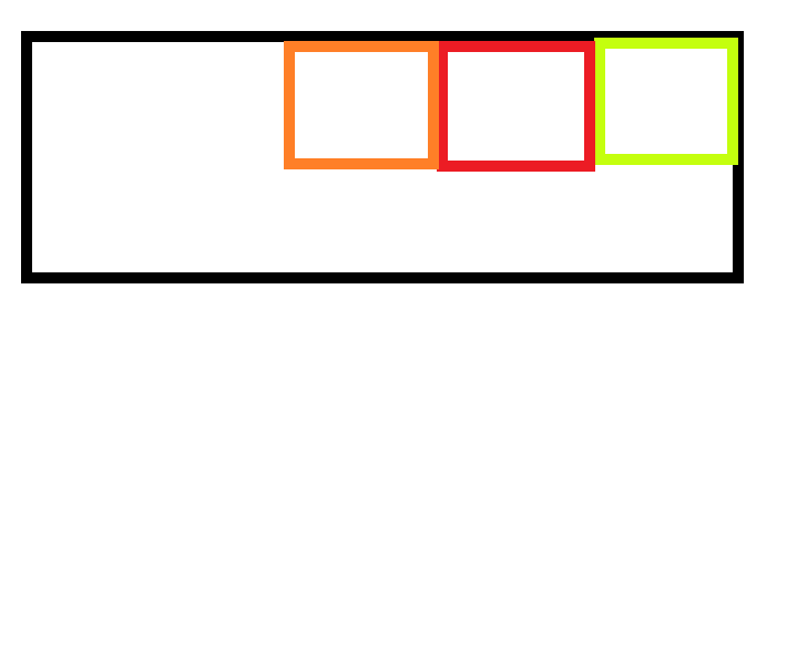
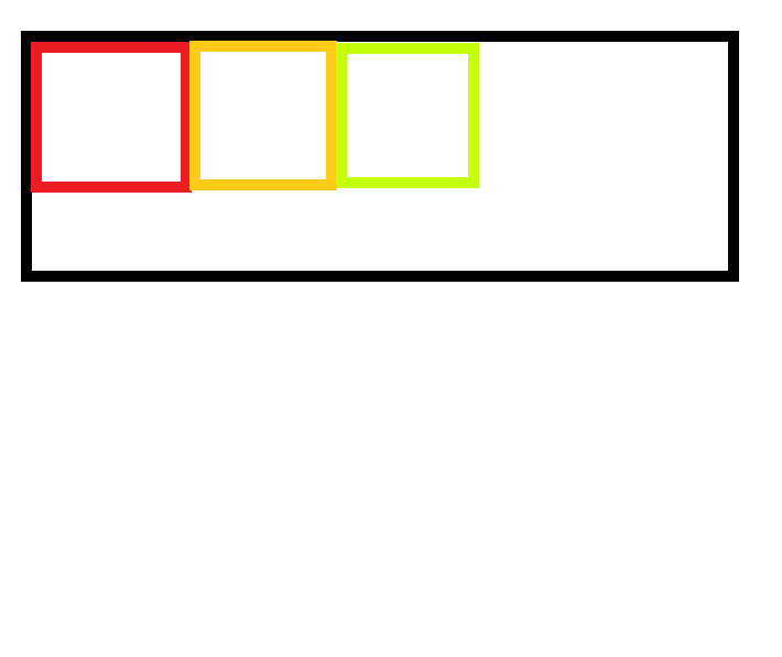
在父元素上加 display:flex 子元素加flex-grow:(想要占父元素剩下大小几份的具体值)
    .contain{
        width:600px;
        height: 200px;
        display: flex;
        border: 2px solid;
    }
    .squa1{
        height: 200px;
        flex-grow: 2;
        background: red;
    }
    .squa2{
        width: 100px;
        height: 200px;
        background: blue;
    }
    .squa3{
        height: 200px;
        flex-grow: 2;
        background: pink;
    }
上面的例子 父容器宽为600px,squa2宽设置为100px,而squa1,squa2没有设置宽度,它们瓜分600-100=500px宽度,flex-glow:2,所以宽度都是250px.
若反向排序,则需要在父元素加上flex-direction:reverse;
若垂直反向排序,则需要在父元素上加 flex-direction:column-reverse;
justify-content
flex-start:从起始位置对齐。
flex-end:从结束位置对齐。