

一、 什么是SVG
SVG,即可缩放的矢量图(Scalable Vector Graphics),是一种XML应用。什么是矢量图?在计算机的图形系统中有两大系统,分别是栅格图形(位图)和矢量图形。矢量图可以描述为一组绘图指令,而位图则是在特定的位置填充颜色的点。位图用来表示照片,矢量图形可以用来设计动画等。
二、需要知道的基础知识
- SVG中有个比较重要的属性分支,名为
stroke, 中文软件中称之为“描边”。参考文档
stroke表示描边颜色stroke-width表示描边的粗细stroke-linecap表示描边的表现形式,可用值有:butt,round,square,inherit. 表现如下图: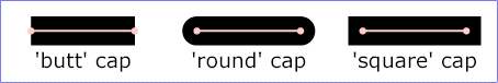
stroke-linejoin表示描边转角的表现方式。可用值有:miter,round,bevel,inherit. 表现如下图:
stroke-dasharray表示虚线描边。可选值为:none,<dasharray>,inherit. 其中,none表示不是虚线;<dasharray>为一个逗号或空格分隔的数值列表。表示各个虚线端的长度。可以是固定的长度值,也可以是百分比值;inherit表继承。stroke-dashoffset表示虚线的起始偏移。可选值为:<percentage>,<length>,inherit. 百分比值,长度值,继承。两个值时,第一个是虚线的宽度,第二个是虚线之间的间距。stroke-opacity表示描边透明度。默认是1
而与我们这次相关的动画效果只有
stroke-dasharray和stroke-dashoffset
-
SVG形状
名称 描述 属性 <rect>矩形 x,y:左侧顶点坐标rx,ry:设置圆角width:矩形宽height:矩形高<circle>圆形 cx,cy:圆心坐标r:半径<ellipse>椭圆 cx,cy:圆心坐标rx:在x轴的椭圆半径ry:在y轴的椭圆半径<line>直线 x1,y1:起点坐标x2,y2:终点坐标<polyline>折线 points:点的集合<polyline fill="none" stroke="black" points="20,100 40,60 70,80 100,20"/><polygon>多边形 points:点的集合(与polyline的用法一样)path路径 d:路径pathlength:指定路径长度fillOpacity:填充透明度
❤ path属性d (参考文档)
| 名称 | 描述 | 参数 |
|---|---|---|
| M = moveto | 点之间的移动 | <path d="M50,100..." /> |
| L = lineto | 直线,从当前点到终点 V:垂直直线 H:水平直线 |
<path d="M50,100 L100,100" /><path d="M50,100 V200"><path d="M50,100 H100"> |
| Q = quadratic Belzier curve | 二次贝塞尔曲线 | cpx1 cpy1:控制点x y:终点坐标 |
| T = smooth quadratic Belzier curve | 平滑二次贝塞尔曲线 | |
| C = curveto | 三次贝塞尔曲线 | cpx1 cpy1:控制点1cpx2 cpy2:控制点2x y:终点坐标 |
| S = smooth curveto | 平滑的三次贝塞尔曲线 | cpx cpy:控制点x y:终点坐标 |
| A = arcto | 圆弧 | rx,ry:圆弧的x和y轴半径xAxisRotate:x轴的旋转角度LargeArcFlag:圆弧的角度小于180度,为0;大于或等于180度,则为1SweepFlag:以负角度绘制为0,否则为1x,y:终点的x,y坐标 |
| Z = closepath | 关闭路径 |
注释:以上所有命令均允许小写字母。大写表示绝对定位,小写表示相对定位。
三、栗子
1、基础动画效果
<!DOCTYPE html>
<html lang="zh-CN">
	<head>
		<meta charset="utf-8">
		<title>demo02-stroke</title>
		<style>
			.svgForStroke{
			  stroke-dasharray: 1000;
			  stroke-dashoffset: 1000;
			  animation: dash 5s linear infinite;
			}

			@keyframes dash {
			  to {
			    stroke-dashoffset: 0;
			  }
			}
		</style>
	</head>
	<body>
		<!-- 最简单的描边 -->
		<svg class="svgForStroke" xml="http://www.w3.org/2000/svg">
			<g>
				<line fill="null" stroke="#000" stroke-width="5" stroke-linecap="round" x1="0" y1="90" x2="300" y2="90">
			</g>
		</svg>
		<svg width="100%" height="300" style="padding: 15px;">
			<line stroke-dasharray="5, 5" x1="10" y1="10" x2="190" y2="10" stroke="#000" stroke-width="2"/>
			<text x="200" y="10" font-family="Verdana">stroke-dasharray="5, 5"</text>

		    <line stroke-dasharray="5, 10" x1="10" y1="30" x2="190" y2="30" stroke="#000" stroke-width="2"/>
		    <text x="200" y="30" font-family="Verdana">stroke-dasharray="5, 10"</text>

		    <line stroke-dasharray="10, 5"             x1="10" y1="50" x2="190" y2="50" stroke="#000" stroke-width="2"/>
		    <text x="200" y="50" font-family="Verdana">stroke-dasharray="10, 5"</text>

		    <line stroke-dasharray="5, 1"              x1="10" y1="70" x2="190" y2="70" stroke="#000" stroke-width="2"/>
		    <text x="200" y="70" font-family="Verdana">stroke-dasharray="5, 1"</text>

		    <line stroke-dasharray="1, 5"              x1="10" y1="90" x2="190" y2="90" stroke="#000" stroke-width="2"/>
		    <text x="200" y="90" font-family="Verdana">stroke-dasharray="1, 5"</text>

		    <line stroke-dasharray="0.9"               x1="10" y1="110" x2="190" y2="110" stroke="#000" stroke-width="2"/>
		    <text x="200" y="110" font-family="Verdana">stroke-dasharray="0.9"</text>

		    <line stroke-dasharray="15, 10, 5"         x1="10" y1="130" x2="190" y2="130" stroke="#000" stroke-width="2"/>
		    <text x="200" y="130" font-family="Verdana">stroke-dasharray="15, 10, 5"</text>

		    <line stroke-dasharray="15, 10, 5, 10"     x1="10" y1="150" x2="190" y2="150" stroke="#000" stroke-width="2"/>
		    <text x="200" y="150" font-family="Verdana">stroke-dasharray="15, 10, 5, 10"</text>

		    <line stroke-dasharray="15, 10, 5, 10, 15" x1="10" y1="170" x2="190" y2="170" stroke="#000" stroke-width="2"/>
		    <text x="200" y="170" font-family="Verdana">stroke-dasharray="15, 10, 5, 10, 15"</text>

		    <line stroke-dasharray="5, 5, 1, 5"        x1="10" y1="190" x2="190" y2="190" stroke="#000" stroke-width="2"/>
		    <text x="200" y="190" font-family="Verdana">stroke-dasharray="5, 5, 1, 5"</text>
		</svg>
	</body>
</html>
<!DOCTYPE html>
<html lang="zh-CN">
	<head>
		<meta charset="UTF-8">
		<title>SVG-demo1</title>
		<style>
			body{
			    font-size:10px;
			}

			.container{
			    width: 100%;
			}
			.line-wrap{
			    width:300px;
			    margin:0 auto;
			}
			.circle-load-rect-svg{
			    margin: 10px;
			}

			.g-rect-path{
			    fill: none;
			    stroke-width:10;
			    stroke: #d3dce6;
			    stroke-linejoin: round;
			    stroke-linecap: round;
			}

			.g-rect-fill{
			    fill: none;
			    stroke-width: 10;
			    stroke: #ff7700;
			    stroke-linejoin: round;
			    stroke-linecap: round;
			    stroke-dasharray: 0, 1370;
			    stroke-dashoffset: 0;
			    animation: lineMove 2s ease-out infinite;
			}

			@keyframes lineMove {
			    0%{
			        stroke-dasharray: 0, 1350;
			    }
			    100%{
			        stroke-dasharray: 1350, 1350;
			    }
			}
		</style>
	</head>
	<body>
		<div class="contrainer">
			<div class="line-wrap">
				<svg version="1.1"
				xml:space="preserve"
				class="circle-load-rect-svg"
				width="300"
				height="200"
				viewbox="0 0 600 400">
					<polyline points="5 5, 575 5, 575 200, 5 200" fill="none" class="g-rect-path"/>
            		<polyline points="5 5, 575 5, 575 200, 5 200" fill="none" class="g-rect-fill"/>
				</svg>
			</div>
		</div>
	</body>
</html>
2、场景一:饼图
想使用饼图,但是第三方图标库太大且不易修改
<!DOCTYPE html>
<html lang="zh-CN">
	<head>
		<meta charset="utf-8">
		<title>demo03-饼图</title>
		<style>
			.circle{
				stroke-dasharray: 0 628;
				animation: circleDash 1.5s ease-out forwards;
			}
			@keyframes circleDash {
				to {
					stroke-dasharray: 502 124;
				}
			}
			span{
				position: absolute;
			    top: 205px;
			    left: 200px;
			    font-size: 32px;
			}
		</style>
	</head>
	<body>
		<svg width="440" height="440">
		    <circle cx="220" cy="220" r="100" stroke-width="30" stroke="#D1D3D7" fill="none"></circle>
		    <circle class="circle" cx="220" cy="220" r="100" stroke-width="30" stroke="#00A5E0" fill="none" transform="matrix(0,-1,1,0,0,440)"></circle>
		</svg>
		<span>80%</span>
	</body>
</html>
| 函数 | 值的说明 |
|---|---|
| matrix(a,b,c,d,e,f) | 数值a:水平方向上的尺寸缩放 数值b:垂直方向上的倾斜率(sin(x)) 数值c:水平方向上的倾斜率(-sin(x)) 数值d:垂直方向上的尺寸缩放 数值e:水平方向上的移动距离 数值f:垂直方向上的移动距离 |
3、场景二:自定义的loading动画效果
<!DOCTYPE html>
<html lang="zh-CN">
	<head>
		<meta charset="utf-8">
		<title>自定义loading动画</title>
		<style>
			.mouth{
				fill: none;
				stroke: #fff;
				stroke-width: 5px;
				stroke-linecap: round;
				stroke-dashoffset: -23;
				stroke-dasharray: 42,95;
				transform: rotate(280deg);
				transform-origin: 50% 70%;
				animation: mouth .8s linear infinite;
			}
			@keyframes mouth {
				0% {
					transform: rotate(-80deg);
					stroke-dasharray: 60, 95;
					stroke-dashoffset: 0;
				}
				40% {
					transform: rotate(280deg);
					stroke-dasharray: 60, 95;
					stroke-dashoffset: 0;
				}
				70%, 100% {
					transform: rotate(280deg);
					stroke-dashoffset: -23;
					stroke-dasharray: 42, 95;
				}
			}
		</style>
	</head>
	<body>
		<svg width="100" height="100">
			<!-- 绘制购物袋 -->
			<path d="M 20 40 L 80 40 L 80 90 A 10 10 90 0 1 70 100 L 30 100 A 10 10 90 0 1 20 90" style="fill: #e9e8ee;" />
			<path d="M 35 40 A 15 15 180 1 1 65 40" style="fill: none; stroke: #e9e8ee; stroke-width: 5;" />
			<!-- 眼睛运动轨迹 -->
			<path id="eyeleft"  d="M 40 60 A 15 15 180 0 1 60 60" style="fill: none; stroke-width: 0;" />
			<path id="eyeright"  d="M 35 70 A 15 15 30 0 1 40 60" style="fill: none; stroke-width: 0;" />
			<!-- 眼睛 -->
			<circle cx="" cy="" r="2.5" style="fill: #fff;">
				<animateMotion
				    dur="0.8s"
				    repeatCount="indefinite"
				    keyPoints="0;0;1;1"
				    keyTimes="0;0.3;0.9;1"
				    calcMode="linear">
				    <mpath xlink:href="#eyeleft"/>
			 	</animateMotion>
			</circle>
			<circle cx="" cy="" r="2.5" style="fill: #fff;">
				<animateMotion
				    dur="0.8s"
				    repeatCount="indefinite"
				    keyPoints="0;0;1;1"
				    keyTimes="0;0.3;0.9;1"
				    calcMode="linear">
				    <mpath xlink:href="#eyeright"/>
			 	</animateMotion>
			</circle>
			<!-- 嘴巴 -->
			<circle cx="50" cy="70" r="15" class="mouth"/>
		</svg>
	</body>
</html>
animateMotion来设置动画,可以引用一个事先定义好的动画路径,让图像元素按路径定义的方式运动:
dur:动画的时间repeatCount:重复次数keyPoints:运动路径的关键点timePoints:时间的关键点calcMode:控制动画的运动速率的变化,discrete | linear | paced | spline四个属性可选mpath:指定一个外部定义的路径
4、场景三:倒计时⏳
<!DOCTYPE html>
<html lang="zh-CN">
	<head>
		<meta charset="utf-8">
		<title>demo05-倒计时</title>
		<style>
			html{
				background: #000;
			}
			svg{
				position: absolute;
				height: 200px;
				width: 200px;
				text-align: center;
				padding: 20px;
				top: 50%;
				left: 50%;
				transform: translateY(-50%);
			}
			#path {
        		animation: animation 15s infinite cubic-bezier(.34,1.61,.7,1);
     		}
     		@keyframes animation {
		        0%,
		        7% {
		          d: path('M0,100 L50,100 L50,50 L50,0 L0,0 L0,50 L50,50')
		        }
		        11%,
		        17% {
		          d: path('M0,0 L50,0 L50,100 L0,100 L0,0 L0,50 L50,50')
		        }
		        21%,
		        27% {
		          d: path('M0,0 L50,0 L50,20 L50,40 L50,60 L50,80 L50,100')
		        }
		        31%,
		        37% {
		          d: path('M50,0 L0,0 L0,50 L0,100 L50,100, L50,50 L0,50')
		        }
		        41%,
		        47% {
		          d: path('M50,0 L0,0 L0,50 L25,50 L50,50 L50,100 L0,100')
		        }
		        51%,
		        57% {
		          d: path('M0,0 L0,50 L50,50 L50,0 L50,35 L50,70 L50,100')
		        }
		        61%,
		        67% {
		          d: path('M0,0 L50,0 L50,100 L0,100 L50,100 L50,50 L0,50')
		        }
		        71%,
		        77% {
		          d: path('M0,0 L50,0 L50,50 L25,50 L0,50 L0,100 L50,100')
		        }
		        81%,
		        87% {
		          d: path('M50,0 L50,15 L50,30 L50,45 L50,60 L50,75 L50,100')
		        }
		        91%,
		        96% {
		          d: path('M0,0 L50,0 L50,50 L50,100 L0,100 L0,25 L0,0')
		        }
		     }
		</style>
	</head>
	<body>
		<div>
			<svg>
				<path id="path" fill="none" stroke="#1B8798" stroke-width="2px" d="M0,0 L50,0 L50,50 L50,100 L0,100 L0,25 L0,0"></path>
			</svg>
		</div>
	</body>
</html>
5、快速制作动画
<!DOCTYPE html>
<html lang="zh-CN">
<head>
    <meta charset="utf-8">
    <title>SVG</title>
    <style>
        .text {
          font-size: 200px;
          font-family: cursive;
        }
        svg {
          position: absolute;
          width: 100%;
          height: 100%;
          background-color: #000;
        }
        .use-text {
          fill: none;
          stroke: white;
          stroke-dashoffset: 0;
          stroke-dasharray: 0 100%;
          stroke-width: 2px;
        }
        .use-text:nth-child(1) {
          stroke: #360745;
          animation: animation1 8s infinite ease-in-out forwards;

        }
        .use-text:nth-child(2) {
          stroke: #D61C59;
          animation: animation2 8s infinite ease-in-out forwards;

        }
        .use-text:nth-child(3) {
          stroke: #E7D84B;
          animation: animation3 8s infinite ease-in-out forwards;

        }
        .use-text:nth-child(4) {
          stroke: #EFEAC5;
          animation: animation4 8s infinite ease-in-out forwards;

        }
        .use-text:nth-child(5) {
          stroke: #1B8798;
          animation: animation5 8s infinite ease-in-out forwards;

        }

        @keyframes animation1 {
          50%, 70%{
            stroke-dasharray: 7% 28%;
            stroke-dashoffset: 7%;
          }
        }
        @keyframes animation2 {
          50%, 70%{
            stroke-dasharray: 7% 28%;
            stroke-dashoffset: 14%;
          }
        }
        @keyframes animation3 {
          50%, 70%{
            stroke-dasharray: 7% 28%;
            stroke-dashoffset: 21%;
          }
        }
        @keyframes animation4 {
          50%, 70%{
            stroke-dasharray: 7% 28%;
            stroke-dashoffset: 28%;
          }
        }
        @keyframes animation5 {
          50%, 70%{
            stroke-dasharray: 7% 28%;
            stroke-dashoffset: 35%;
          }
        }

    </style>
</head>
<body>
    <svg viewBox="0 0 800 600">
      <symbol id="text">
        <text x="30%" y="35%" class="text">Web</text>
        <text x="25%" y="70%" class="text">Love</text>
      </symbol>
      <g>
        <use xlink:href="#text" class="use-text"></use>
        <use xlink:href="#text" class="use-text"></use>
        <use xlink:href="#text" class="use-text"></use>
        <use xlink:href="#text" class="use-text"></use>
        <use xlink:href="#text" class="use-text"></use>
      </g>
    </svg>
</body>
</html>
