

实现底部导航栏并点击切换页面可简述为有三种方式
- TabBar + TabBarView
- BottomNavigationBar + BottomNavigationBarItem
- 自定义 BottomAppBar
- 自定义绘制布局
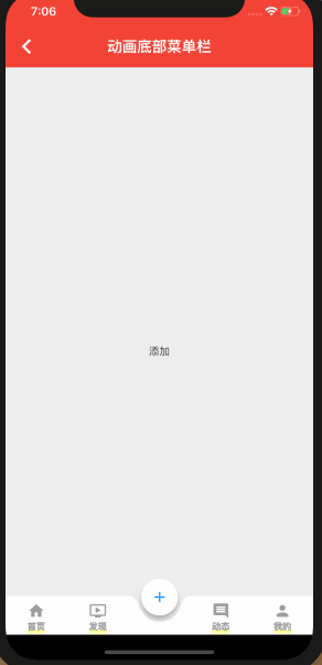
这里实现的是自定义绘制布局
class MoveBottomMenu extends StatefulWidget {
  @override
  _MoveBottomMenuState createState() => _MoveBottomMenuState();
}

class _MoveBottomMenuState extends State<MoveBottomMenu>
    with SingleTickerProviderStateMixin {
  //当前选中的页面
  int _activeIndex = 0;

  //导航栏高度
  double _height = 52.0;

  //悬浮图标半径
  double _floatRadius;

  //移动补间
  double _moveTween = 0.0;

  //浮动图标与圆弧之间的间隙
  double _padding = 10.0;

  //动画控制器
  AnimationController _animationController;

  //移动动画
  Animation<double> _moveAnimation;

  //导航栏使用到的图标
  List _icons = [
    Icons.home,
    Icons.ondemand_video,
    Icons.add,
    Icons.insert_comment,
    Icons.person
  ];

  //点击导航项是要显示的页面
  final _pages = [
    ChildItemView("首页"),
    ChildItemView("发现"),
    ChildItemView("添加"),
    ChildItemView("动态"),
    ChildItemView("我的")
  ];

  //导航栏使用到的标题
  final _titls = ["首页", "发现", "添加", "动态", "我的"];

  @override
  void initState() {
    _floatRadius = _height * 2 / 3;
    _animationController =
        AnimationController(vsync: this, duration: Duration(milliseconds: 400));
    super.initState();
  }

  @override
  Widget build(BuildContext context) {
    final double bottomPadding = MediaQuery.of(context).padding.bottom;
    double width = MediaQuery.of(context).size.width;
    double singleWidth = width / _icons.length;
    double posTop = _animationController.value <= 0.5
        ? (_animationController.value * _height * _padding / 2) -
            _floatRadius / 3 * 2
        : (1 - _animationController.value) * _height * _padding / 2 -
            _floatRadius / 3 * 2;
    print("posTop " + posTop.toString());
    if (posTop > 0) {
      posTop = 0;
    }
    print("posTop--- " + posTop.toString());
    print("bottomPadding "+bottomPadding.toString());
    return Container(
      padding: EdgeInsets.only(bottom: bottomPadding),
      child: Stack(children: [
        Scaffold(
          //对应的页面
          body: _pages[_activeIndex],
          appBar: AppBar(
            backgroundColor: Colors.red,
            elevation: 0.5,
            title: Text('动画底部菜单栏'),
            centerTitle: true,
          ),
          backgroundColor: Color(0xFFEEEEEE),
        ),
        Positioned(
          bottom: 0.0,
          child: Container(
            width: width,
            child: Stack(
              overflow: Overflow.visible,
              children: <Widget>[
                //浮动图标
                Positioned(
                  top: posTop,
                  left: _moveTween * singleWidth +
                      (singleWidth - _floatRadius) / 2 -
                      _padding / 2 -
                      2,
                  child: DecoratedBox(
                    decoration:
                    ShapeDecoration(shape: CircleBorder(), shadows: [
                      BoxShadow(
                          blurRadius: _padding / 2,
                          offset: Offset(0, _padding / 2),
                          spreadRadius: 0,
                          color: Colors.black26),
                    ]),
                    child: CircleAvatar(
                        radius: _floatRadius - _padding,
                        //浮动图标和圆弧之间设置10pixel间隙
                        backgroundColor: Colors.white,
                        child: Icon(_icons[_activeIndex], color: Colors.blue)),
                  ),
                ),
                //所有图标
                CustomPaint(
                  child: SizedBox(
                    height: _height,
                    child: Row(
                      mainAxisAlignment: MainAxisAlignment.spaceAround,
                      crossAxisAlignment: CrossAxisAlignment.center,
                      children: _icons
                          .asMap()
                          .map((i, v) => MapEntry(
                          i,
                          GestureDetector(
                            child: buildBotomItem(
                                _activeIndex, i, v, _titls[i]),
                            onTap: () {
                              _switchNav(i);
                            },
                          )))
                          .values
                          .toList(),
                    ),
                  ),
                  painter: ArcPainter(
                      navCount: _icons.length,
                      moveTween: _moveTween,
                      padding: _padding),
                )
              ],
            ),
          ),
        )
      ]),
    );
  }

  //切换导航
  _switchNav(int newIndex) {
    print("switch " + newIndex.toString());
    double oldPosition = _activeIndex.toDouble();
    double newPosition = newIndex.toDouble();
    if (oldPosition != newPosition &&
        _animationController.status != AnimationStatus.forward) {
      _animationController.reset();
      _moveAnimation = Tween(begin: oldPosition, end: newPosition).animate(
          CurvedAnimation(
              parent: _animationController, curve: Curves.easeInCubic))
        ..addListener(() {
          setState(() {
            _moveTween = _moveAnimation.value;
          });
        })
        ..addStatusListener((AnimationStatus status) {
          if (status == AnimationStatus.completed) {
            setState(() {
              _activeIndex = newIndex;
            });
          }
        });
      _animationController.forward();
    }
  }

  @override
  void dispose() {
    _animationController.dispose();
    super.dispose();
  }

  buildBotomItem(int selectIndex, int index, IconData iconData, String title) {
    //未选中状态的样式
    TextStyle textStyle = TextStyle(fontSize: 12.0, color: Colors.grey);
    Color iconColor = Colors.grey;
    Color bgColor = Colors.white;
    EdgeInsetsGeometry padding = EdgeInsets.only(top: 8.0);

    if (selectIndex == index) {
      //选中状态的文字样式
      textStyle = TextStyle(fontSize: 0.0, color: Colors.transparent);
      //选中状态的按钮样式
      iconColor = Colors.transparent;
      bgColor = Colors.transparent;
      padding = EdgeInsets.only(top: 0.0);
    }
    Widget padItem = SizedBox();
    if (iconData != null) {
      padItem = Padding(
        padding: padding,
        child: Container(
          color: bgColor,
          child: Center(
            child: Column(
              children: <Widget>[
                Icon(
                  iconData,
                  color: iconColor,
                ),
                Text(
                  title,
                  style: textStyle,
                )
              ],
            ),
          ),
        ),
      );
    }
    return SizedBox(
      height: 52,
      child: padItem,
    );
  }
}

//绘制圆弧背景
class ArcPainter extends CustomPainter {
  final int navCount; //导航总数
  final double moveTween; //移动补间
  final double padding; //间隙
  ArcPainter({this.navCount, this.moveTween, this.padding});

  @override
  void paint(Canvas canvas, Size size) {
    Paint paint = Paint()
      ..color = (Colors.white)
      ..style = PaintingStyle.stroke; //画笔
    double width = size.width; //导航栏总宽度,即canvas宽度
    double singleWidth = width / navCount; //单个导航项宽度
    double height = size.height; //导航栏高度,即canvas高度
    double arcRadius = height * 2 / 3; //圆弧半径
    double restSpace = (singleWidth - arcRadius * 2) / 2; //单个导航项减去圆弧直径后单边剩余宽度

    Path path = Path() //路径
      ..relativeLineTo(moveTween * singleWidth, 0)
      ..relativeCubicTo(restSpace + padding, 0, restSpace + padding / 2,
          arcRadius, singleWidth / 2, arcRadius) //圆弧左半边
      ..relativeCubicTo(arcRadius, 0, arcRadius - padding, -arcRadius,
          restSpace + arcRadius, -arcRadius) //圆弧右半边
      ..relativeLineTo(width - (moveTween + 1) * singleWidth, 0)
      ..relativeLineTo(0, height)
      ..relativeLineTo(-width, 0)
      ..relativeLineTo(0, -height)
      ..close();
    paint.style = PaintingStyle.fill;
    canvas.drawPath(path, paint);
  }

  @override
  bool shouldRepaint(CustomPainter oldDelegate) {
    return true;
  }
}
子页面widget
class ChildItemView extends StatefulWidget {
  String _title;

  ChildItemView(this._title);

  @override
  _ChildItemViewState createState() => _ChildItemViewState();
}

class _ChildItemViewState extends State<ChildItemView> {
  @override
  Widget build(BuildContext context) {
    return Container(
      child: Center(child: Text(widget._title)),
    );
  }
}
