Button 按钮
自定义一个圆角Button
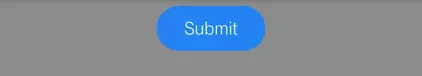
  Widget buildCustomButton(){
    return FlatButton(
      //按钮文字颜色
      textColor: Colors.white,
      //按钮禁用时的背景颜色
      disabledColor:Colors.grey,
      //按钮禁用时的文字颜色
      disabledTextColor: Colors.grey,
      //正常状态下的背景颜色
      color: Colors.blue,
      //按钮按下时的背景颜色
      highlightColor: Colors.blue[700],
      //按钮主题,默认是浅色主题
      colorBrightness: Brightness.dark,
      //外形
      splashColor: Colors.grey,
      // button 显示的文字
      child: Text("Submit"),
      //圆角边框
      shape:RoundedRectangleBorder(borderRadius: BorderRadius.circular(20.0)),
      //按钮点击回调
      onPressed: () => {},
    );
  }
Flutter 提供的Button比较多
  Widget buildRaisedButton(){
    //它默认带有阴影和灰色背景。按下后,阴影会变大
    return RaisedButton(
      child: Text("RaisedButto"),
      onPressed: () => {},
    );
  }
  //
  Widget buildFlatButton(){
    //FlatButton即扁平按钮,默认背景透明并不带阴影。按下后,会有背景色:
    return FlatButton(
      child: Text("登录"),
      onPressed: () => {},
    );
  }
  Widget buildOutlineButton(){
    //OutlineButton默认有一个边框,不带阴影且背景透明。按下后,边框颜色会变亮、同时出现背景和阴影(较弱):
    return OutlineButton(
      child: Text("登录"),
      onPressed: () => {},
    );
  }

  Widget buildIconButton(){
    return IconButton(
      icon: Icon(Icons.thumb_up),
      onPressed: () => {},
    );
  }


