

Flutter Scaffold
1 作用
Scaffold 实现了基本的 Material Design 布局结构.
我们可以将 Scaffold 理解为一个布局的容器。可以在这个容器中绘制我们的用户界面。
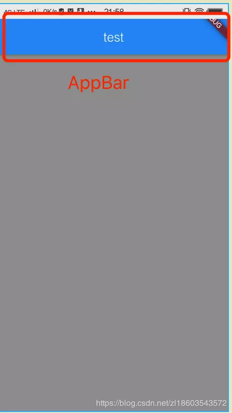
2 案例一 只有一个标题和一个空页面
import 'package:flutter/material.dart';

//Flutter程序入口
void main() => runApp(getApp());

Widget getApp() {
  return new MaterialApp(
    //应用默认所显示的界面 页面
    home: getDefaultScaffold(),
  );
}

Widget getDefaultScaffold() {
  return new Scaffold(
    //显示在界面顶部的一个 AppBar
    appBar: buildDefaultBar("test"),
    //body:当前界面所显示的主要内容
    body: new Container(color: Colors.grey),
  );
}
走到这里 我们可以理解为MaterialApp 用来规范应用的主题一类,一个应用中只有一个 MaterialApp, Scaffold 用来布局一个页面。
3 属性说明
| 属性 | 备注说明 |
|---|---|
| appBar | 显示在界面顶部的一个 AppBar。 |
| body | 当前界面所显示的主要内容 Widget。 |
| floatingActionButton | Material 设计中所定义的 FAB,界面的主要功能按钮。 |
| persistentFooterButtons | 固定在下方显示的按钮,比如对话框下方的确定、取消按钮。 |
| drawer | 抽屉菜单控件。 |
| backgroundColor | 内容的背景颜色,默认使用的是 ThemeData.scaffoldBackgroundColor 的值。 |
| bottomNavigationBar | 显示在页面底部的导航栏。 |
| resizeToAvoidBottomPadding | 类似于 Android 中的 android:windowSoftInputMode=‘adjustResize’,控制界面内容 body 是否重新布局来避免底部被覆盖了,比如当键盘显示的时候,重新布局避免被键盘盖住内容。默认值为 true。 |
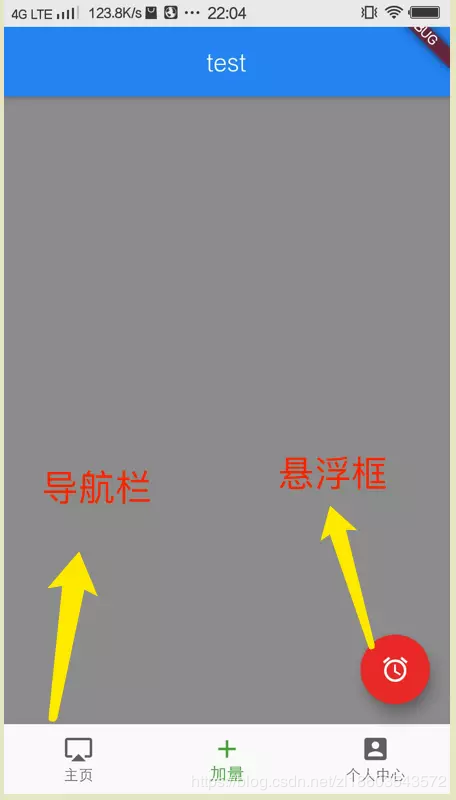
4 有一个AppBar 一个空页面 一个悬浮框 一个底部导航栏
import 'package:flutter/material.dart';

//Flutter程序入口
void main() => runApp(getApp());

Widget getApp() {
  return new MaterialApp(
    //应用默认所显示的界面 页面
    home: getAllScaffold(),
  );
}

/**
 * 所有的属性设置
 */
Widget getAllScaffold() {
  return new Scaffold(
    //显示在界面顶部的一个 AppBar
    appBar: buildDefaultBar("test"),
    //body:当前界面所显示的主要内容
    body: new Container(color: Colors.grey),
    //显示在页面底部的导航栏
    bottomNavigationBar: buildBottomBar(),
    //固定在下方显示的按钮,比如对话框下方的确定、取消按钮。
    //一般不使用
//    persistentFooterButtons: <Widget>[
//      new Icon(Icons.share),
//      new Icon(Icons.shop),
//    ],
    //侧边栏 左滑可以拉出来
    drawer: new Drawer(
      child: new Container(
        color: Colors.green,
      ),
    ),
    //悬浮按钮
    floatingActionButton: buildFloatingAction(),
  );
}
4.1 构造一个悬浮按钮
Widget buildFloatingAction() {
  return new Builder(builder: (BuildContext context) {
    return new FloatingActionButton(
        tooltip: '这里是长按提示的文字',
        backgroundColor: Colors.red,
        //设置悬浮按钮的背景颜色
//             heroTag: ,//页面切换动画的tag
        elevation: 10.0,
        //阴影大小
//             highlightElevation: 20.0,//设置高亮的阴影
        mini: false,
        //设置是否为小图标
        child: new Icon(Icons.access_alarm),
        onPressed: () {});
  });
}
4.2 构造一个底部导航栏
//底部导航栏
Widget buildBottomBar() {
  return new BottomNavigationBar(
    //底部导航栏
    currentIndex: 1, //默认选中的位置
    fixedColor: Colors.green, //选中的颜色
    items: <BottomNavigationBarItem>[
      new BottomNavigationBarItem(
        icon: new Icon(
          Icons.airplay,
        ),
        title: new Text(
          '主页',
        ),
      ),
      new BottomNavigationBarItem(
        icon: new Icon(
          Icons.add,
        ),
        title: new Text(
          '加量',
        ),
      ),
      new BottomNavigationBarItem(
        icon: new Icon(
          Icons.account_box,
        ),
        title: new Text(
          '个人中心',
        ),
      ),
    ],
  );
}
4.3 构造 AppBar
//构造 AppBar
Widget buildDefaultBar(String title) {
  return AppBar(
    //标题居中显示
    centerTitle: true,
    //返回按钮占位
    leading: Container(),
    //标题显示
    title: Text(title),
  );
}
