

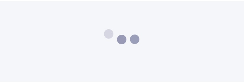
# html:

<div class="bouncing-loader">
  <div></div>
  <div></div>
  <div></div>
</div>
# css:

@keyframes bouncing-loader {
  from {
    opacity: 1;
    transform: translateY(0);
  }
  to {
    opacity: 0.1;
    transform: translateY(-1rem);
  }
}
.bouncing-loader {
  display: flex;
  justify-content: center;
}
.bouncing-loader > div {
  width: 1rem;
  height: 1rem;
  margin: 3rem 0.2rem;
  background: #8385aa;
  border-radius: 50%;
  animation: bouncing-loader 0.6s infinite alternate;
}
.bouncing-loader > div:nth-child(2) {
  animation-delay: 0.2s;
}
.bouncing-loader > div:nth-child(3) {
  animation-delay: 0.4s;
}
说明
注:1rem 通常是16px 。
@keyframes定义了一个具有两种状态的动画,其中元素更改opacity并使用transform: translateY()在2D平面上进行transform: translateY() 。
.bouncing-loader是弹跳圆圈的父容器,使用display: flex和justify-content: center将它们放置在中心位置。
.bouncing-loader > div ,将父级的三个子div作为样式。 div的宽度和高度为1rem ,使用border-radius: 50%将它们从正方形变成圆形。
margin: 3rem 0.2rem 指定每个圆的上边距/下边距为3rem 和左/右边距0.2rem 以便它们不直接接触对方,给它们一些呼吸空间。
animation是各种动画属性的缩写属性:使用animation-name , animation-duration , animation-iteration-count , animation-direction 。
nth-child(n)目标是其父元素的第n个子元素。
animation-delay分别用于第二个和第三个div ,以便每个元素不会同时启动动画。
