

前言
🔥这个我会持续更新,自己用到的一些包括看到的一些 如果你有一些用法也可以分享分享
一些html和css的小细节,让你少写不必要的JS,代码更优雅
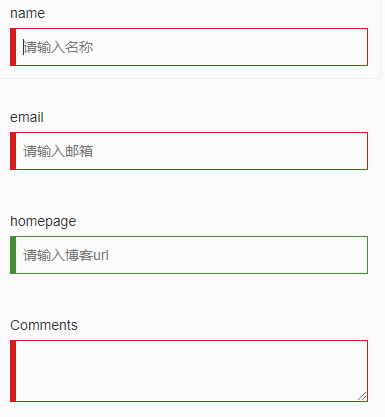
1.利用 :valid 和 :invalid 来做表单即时校验
需求
让表单检验变得简单优雅,不需要写冗长的 JS 代码来校验设置样式
html5 丰富了表单元素,提供了类似 required,email,tel 等表单元素属性。同样的,我们可以利用 :valid 和 :invalid 来做针对html5表单属性的校验。
:required伪类指定具有required 属性的表单元素:valid伪类指定一个通过匹配正确的所要求的表单元素:invalid伪类指定一个不匹配指定要求的表单元素
代码
<div class="container">
    <div class="row" style="margin-top: 2rem;">
      <form>
        <div class="form-group">
          <label>name</label>
          <input type="text" required placeholder="请输入名称">
        </div>
        <div class="form-group">
          <label>email</label>
          <input type="email" required placeholder="请输入邮箱">
        </div>
        <div class="form-group">
          <label>homepage</label>
          <input type="url" placeholder="请输入博客url">
        </div>
        <div class="form-group">
          <label>Comments</label>
          <textarea required></textarea>
        </div>
      </form>
    </div>
  </div>
.valid {
  border-color: #429032;
  box-shadow: inset 5px 0 0 #429032;
}

.invalid {
  border-color: #D61D1D;
  box-shadow: inset 5px 0 0 #D61D1D;
}

.form-group {
  width: 32rem;
  padding: 1rem;
  border: 1px solid transparent;
  &:hover {
    border-color: #eee;
    transition: border .2s;
  }
  label {
    display: block;
    font-weight: normal;
  }
  input,
  textarea {
    display: block;
    width: 100%;
    line-height: 2rem;
    padding: .5rem .5rem .5rem 1rem;
    border: 1px solid #ccc;
    outline: none;
    &:valid {
      @extend .valid;
    }
    &:invalid {
      @extend .invalid;
    }
  }
}
最终效果
2、利用 nth-of-type 选择某范围内的子元素
需求
table表格红绿相间,显示的更加直观
代码
<table>
  <tbody>
    <tr>
      <td>1</td>
    </tr>
    <tr>
      <td>2</td>
    </tr>
    <tr>
      <td>3</td>
    </tr>
    <tr>
      <td>4</td>
    </tr>
    <tr>
      <td>5</td>
    </tr>
    <tr>
      <td>6</td>
    </tr>
  </tbody>
</table>
tbody tr:nth-of-type(2n){
background-color: red;
}

tbody tr:nth-of-type(2n+1){
background-color: green;
}
最终效果
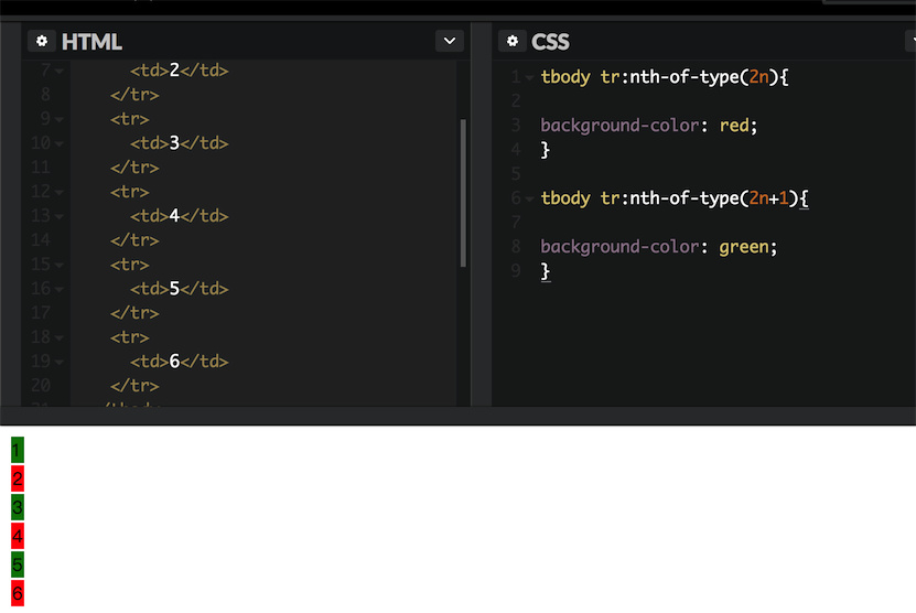
table tr:nth-child(n+5):nth-child(-n+10) {
    background-color: red;
}
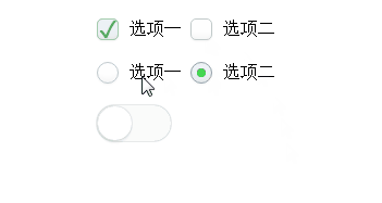
3.美化浏览器自带的 radio ,checkbox 属性
需求
设计师:你那个单选框按钮好丑啊,跟我的设计稿差好远。程序员:我有什么办法,浏览器就是这样的。。。
记得刚开始写页面时候,被浏览器各种默认的 UI 样式恶心到了,当初确实也没啥办法,反正也不影响功能,就那样吧。
先讲一下原理:checkbox hack技术
我们使用
CSS一些特殊的选择器,然后配合单选框以及复选框自带的一些特性,可以实现元素的显示隐藏效果。然后通过一些简单的扩展,我们可以不使用任何JavaScript代码实现类似:自定义的单复选框,“更多”展开与收起效果,选项卡切换效果,或是多级下拉列表效果等等。
相信很多前端开发人员都会遇到
boss让修改checkbox和radio样式,毕竟自带的样式太丑了。后来我们发现修改自带样式并不是那么容易,最后直接使出杀手锏——点击之后替换图片。
今天教大家一种方法,不用替换图片,随意修改样式。
先讲一下原理:两个关键东东,一是伪类选择器
:checked,表示对应控件元素(单选框或是复选框)选中时的样式;二就是加号 + 相邻兄弟选择器,这个符号表示选择后面的兄弟节点。于是,两者配合,就可以轻松自如控制后面元素的显示或者隐藏,或是其他样式了。
而如何让单复选框选中和不选中了,那就是
label标签了哈,for属性锚定对应的单选框或是复选框,然后点击这里的label标签元素的时候,对应的单复选框就会选中或是取消选中。然后,就有上面的效果啦!
代码
这里只给一个 radio 单选框的代码,仅供参考:
<div class="radio-beauty-container">
    <label>
        <span class="radio-name">前端工程师</span>
        <input type="radio" name="radioName" id="radioName1" hidden/>
        <label for="radioName1" class="radio-beauty"></label>
    </label>
    <label>
        <span class="radio-name">后端工程师</span>
        <input type="radio" name="radioName" id="radioName2" hidden/>
        <label for="radioName2" class="radio-beauty"></label>
    </label>
    <label>
        <span class="radio-name">全栈工程师</span>
        <input type="radio" name="radioName" id="radioName3" hidden/>
        <label for="radioName3" class="radio-beauty"></label>
    </label>
</div>
.radio-beauty-container {
    font-size: 0;
    $bgc: green;
    %common {
        padding: 2px;
        background-color: $bgc;
        background-clip: content-box;
    }
    .radio-name {
        vertical-align: middle;
        font-size: 16px;
    }
    .radio-beauty {
        width: 18px;
        height: 18px;
        box-sizing: border-box;
        display: inline-block;
        border: 1px solid $bgc;
        vertical-align: middle;
        margin: 0 15px 0 3px;
        border-radius: 50%;
        &:hover {
            box-shadow: 0 0 7px $bgc;
            @extend %common;
        }
    }
    input[type="radio"]:checked+.radio-beauty {
        @extend %common;
    }
}
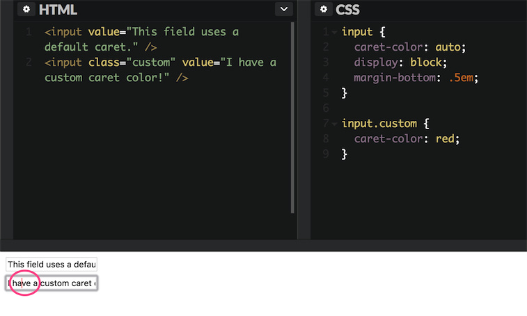
4.改变 input 焦点光标的颜色
需求
设计师觉得默认的光标颜色有点与整体设计风格不符合,有点突兀,想换成红色的
代码
<input value="This field uses a default caret." />
<input class="custom" value="I have a custom caret color!" />
input {
  caret-color: auto;
  display: block;
  margin-bottom: .5em;
}

input.custom {
  caret-color: red;
}
最终效果
5.移动web页面支持弹性滚动
需求
在IOS机型中,非body元素的滚动条会非常不流畅,又不想用JS模拟滚动条。
传统 pc 端中,子容器高度超出父容器高度,通常使用 overflow:auto 可出现滚动条拖动显示溢出的内容,而移动web开发中,由于浏览器厂商的系统不同、版本不同,导致有部分机型尤其是 IOS 机型不支持弹性滚动,从而在开发中制造了所谓的 BUG。
代码
body{
-webkit-overflow-scrolling: touch; /* ios5+ */
}
ele{
overflow:auto;
}
6.用Font-Size:0来清除间距
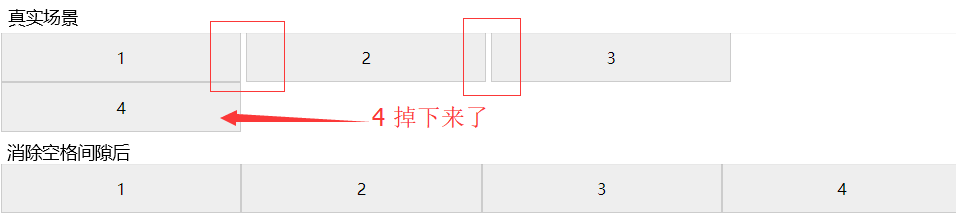
inline-block的元素之间会受空白区域的影响,也就是元素之间差不多会有一个字符的间隙。如果在同一行内有4个25%相同宽度的元素,会导致最后一个元素掉下来(如图)。你可以利用元素浮动float,或者压缩html,清除元素间的空格来解决。但最简单有效的方法还是设置父元素的font-size属性为0。
*{
  box-sizing: border-box;
}
.items {
  font-size: 0;
  > .item {
    display: inline-block;
    width: 25%;
    height: 50px;
    border: 1px solid #ccc;
    text-align: center;
    line-height: 50px;
    background-color: #eee;
    font-size: 16px; //不要忘了给子元素设置字号
  }
}
<div class="items">
  <div class="item">1</div>
  <div class="item">2</div>
  <div class="item">3</div>
  <div class="item">4</div>
</div>
最后
希望大家能分享更多的小技巧
