

面试提问:
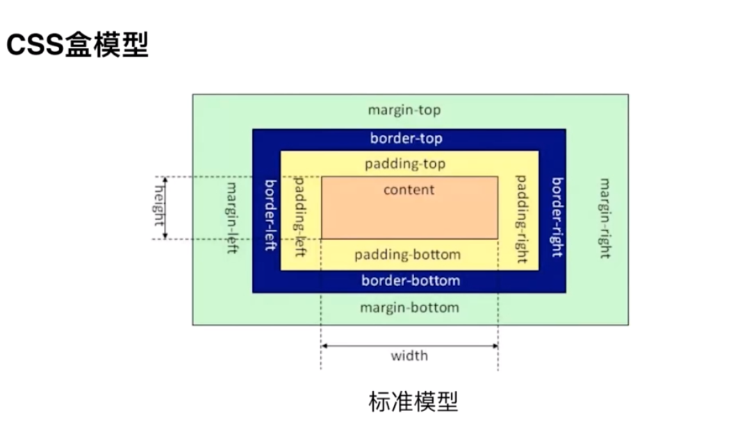
1 、基本概念:标准模型和IE模型;
2 、二者区别?
3 、CSS如何设置者两种模型?
4 、JS如何设置与获取对应的高和宽?
5 、实例题:根据盒模型解释边距重叠?
6 、BFC ( 边距解决方案 ) / IFC
解答:
1、基本概念:标准模型和IE模型;
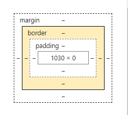
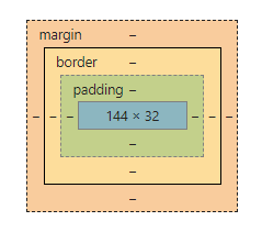
二者都是content,padding,border,margin
2 、二者区别?
标准模型的content的宽和高不包括padding和border。
IE模型content的宽和高包含border和padding的。
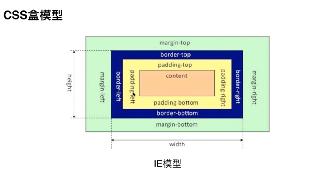
3 、CSS如何设置者两种模型?
标准模型
box-sizing:content-box;IE模型
box-sizing:border-box;浏览器默认是标准模型。
4 、JS如何设置与获取对应的高和宽?
html
<div class="content" style="width: 250px;height:100px;" > dom获取盒模型的宽和高 </div>第一种 dom.style.width / height
let content = document.getElementsByClassName('content')[0]let content_wid = content.style.width;let content_hei = content.style.height;console.log('宽为:',content_wid,"*******",'高为',content_hei)只能获取行内css设置的宽和高,并不准确。
第二种 window.getComputedStyle(con).width
console.log(window.getComputedStyle(con).width, window.getComputedStyle(con).height)当页面运行结束之后也,获取的时候dom的真实宽和高。
第三种 con.getBoundingClientRect().width
console.log(con.getBoundingClientRect().width, con.getBoundingClientRect().height)当页面运行结束之后也,获取的时候dom的真实宽和高。
适用于计算元素的绝对位置,根据视框(viewport)的左上角的绝对位置,所以一共可以拿到4个值,left , top , width , height 。
5 、实例题:根据盒模型解释边距重叠?
边距重叠分为兄弟边距重叠,和父子元素边距重叠。
在兄弟边距中,会选择二者之间最大的为作为二者之间的距离,如果其中一个为空元素,但是空元素设置了上下边距,那么会选择最大的最为边距。
题目:子元素高度为100px,上边距为10px ,那么父级元素为多高。
<div class="parent"> <div class="child"></div> </div>.parent { background-color: skyblue; } .child { height: 100px; margin-top: 10px; background-color: pink; }当父级元素不是 BFC 的时候为 100px
当父级元素为 BFC 块级元素的时候为 110px
此时父级的css
.parent { background-color: skyblue; overflow: hidden; }6 、BFC ( 边距解决方案 ) / IFC
BFC 基本概念:块级格式化上下文。
IFC 基本概念:内联元素的格式化上下文。
BFC 基本原理 即为 BFC 的渲染规则
1 、在BFC这个元素的垂直方向的边距会发生重叠。
2 、 BFC的元素不会与浮动的区域重叠,即用来清除浮动。
3 、 BFC 在页面是一个独立的,外面的元素不会影响里面的元素,相反也是一样,各自独立。
4 、 计算BFC 元素高度的时候,浮动元素也会参与计算,
如何创建一个BFC
1 、只要元素设置了float ,那么该元素就是BFC,也就是说只要不是 float:none 就为BFC
2 、 只要元素的position的值不是static / relative 就是一个BFC
3 、 当display 属性为table 相关的时候就创建一个BFC
4 、 overflow 为auto / hidden 可以创建一个 BFC
示例
垂直方向的边距重叠
<h3>垂直方向的边距重叠</h3> <section class="bfc"> <p>1</p> <p>2</p> <p>3</p> </section> h3 { width: 100%; height: 50px; background-color: #b6a5a5; line-height: 50px; text-align: center; }.bfc { background-color: pink; overflow: hidden; } .bfc p { margin: 5px auto 25px; background-color: skyblue; }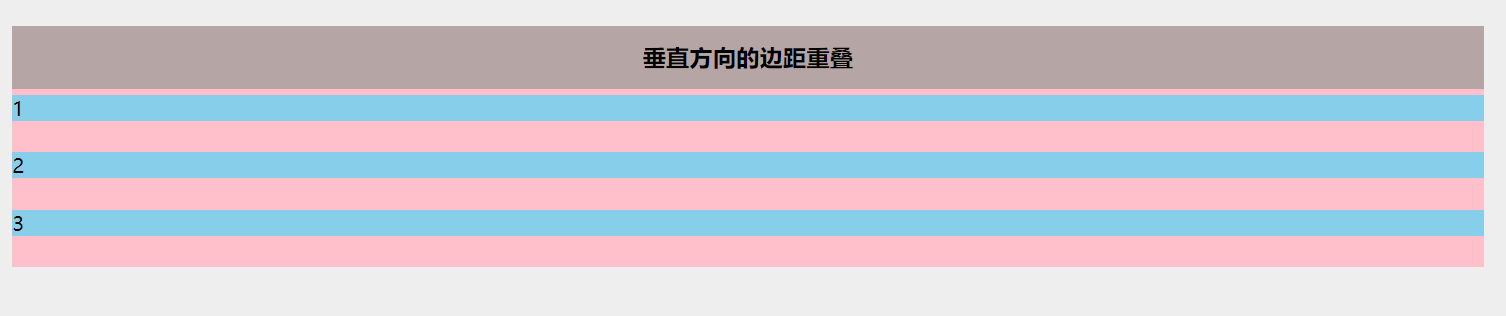
1与2,2与3之间的边距是25,取二者之间的最大值。
解决
将p标签使用块级元素包,并添加 overflow: hidden; 或者其他BFC属性也可以。
<h3>垂直方向的边距重叠</h3> <section class="bfc"> <p>1</p> <div class="inner_bfc" > <p>2</p> </div> <p>3</p> </section> .inner_bfc{ position: absolute }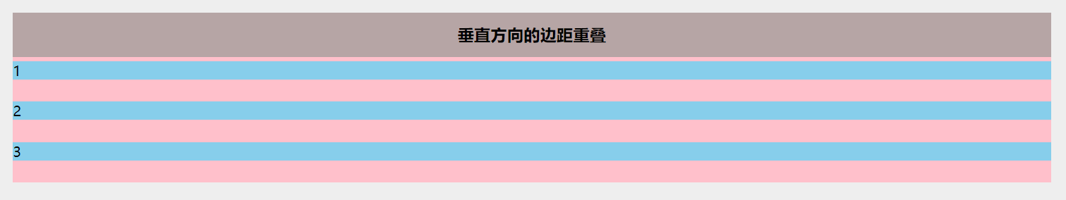
此时2已经是上下的边距都会生效。
浮动侵占
<h3>浮动侵占</h3> <section class="bfc" > <div class="left"></div> <div class="right"></div> </section>.bfc{ background-color: aliceblue; }.left{ float: left; width: 100px; height: 100px; background-color: pink; } .right{ height: 110px; background-color: skyblue }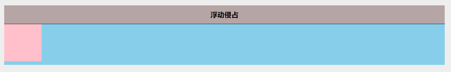
解决
.right{ height: 110px; background-color: skyblue; overflow: auto; }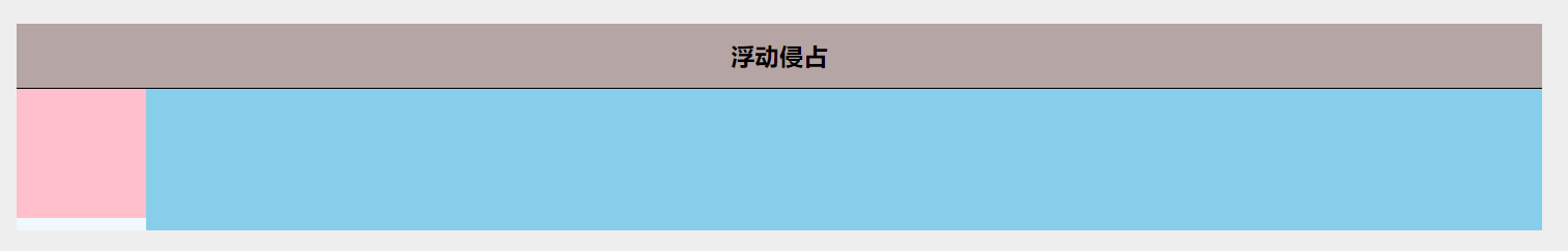
BFC 的清除浮动
<h3>BFC清除浮动</h3> <section class="bfc" > <div class="left">我是浮动元素</div> </section> .bfc{ background-color: aliceblue; }此时的section的高度为0
解决 :将section 变为 BFC
1 、section 添加 overflow: hidden
.bfc{ background-color: aliceblue; overflow: hidden; }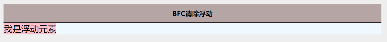
2 、section 添加 float: left;
.bfc{ background-color: aliceblue; float: left; }此时的 section 高度为32
3 、section 添加 position: absolute;
.bfc{ background-color: aliceblue; position: absolute; }

注意 如果添加 position:relative 高度仍为0,因为section并没有成为BFC。

css 盒模型大概有这么多吧。
