

1、假设高度已知,请写出三栏布局,其中左栏、右栏宽度各为300px,中间自适应。
基础问题
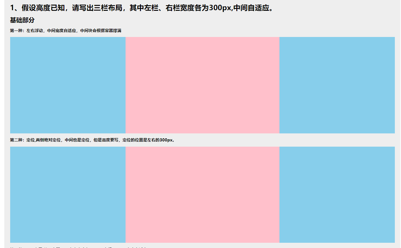
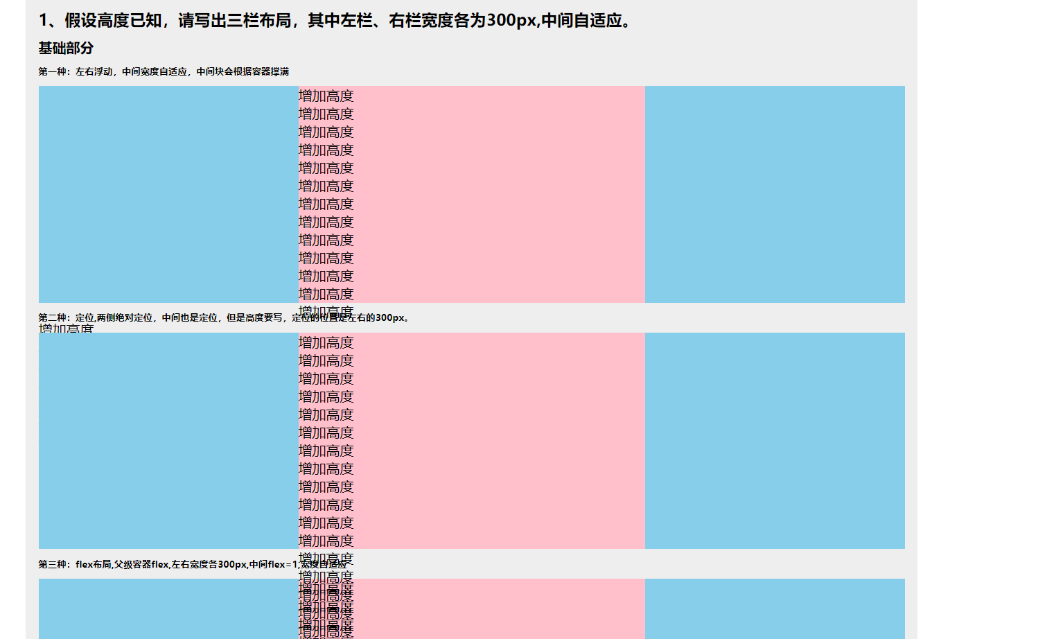
第一种:左右浮动,中间宽度自适应,中间块会根据容器撑满
html
<section class="contain mar_b10"> <h6 class="mar_b10"> 第一种:左右浮动,中间宽度自适应,中间块会根据容器撑满 </h6> <article class="one_height"> <div class="one_left"></div> <div class="one_right"></div> <div class="one_mid"></div> </article> </section>css
.one_height { height: 250px; } .one_left { width: 300px; float: left; height: 250px; background-color: skyblue } .one_right { width: 300px; float: right; height: 250px; background-color: skyblue } .one_mid { height: 100%; background-color: pink; }第二种:定位,两侧绝对定位,中间也是定位,但是高度要写,定位的位置是左右的300px。
html
<section class="contain mar_b10"> <h6 class="mar_b10 "> 第二种:定位,两侧绝对定位,中间也是定位,但是高度要写,定位的位置是左右的300px。 </h6> <article class="two_height"> <div class="two_left"></div> <div class="two_mid"></div> <div class="two_right"></div> </article> </section>css
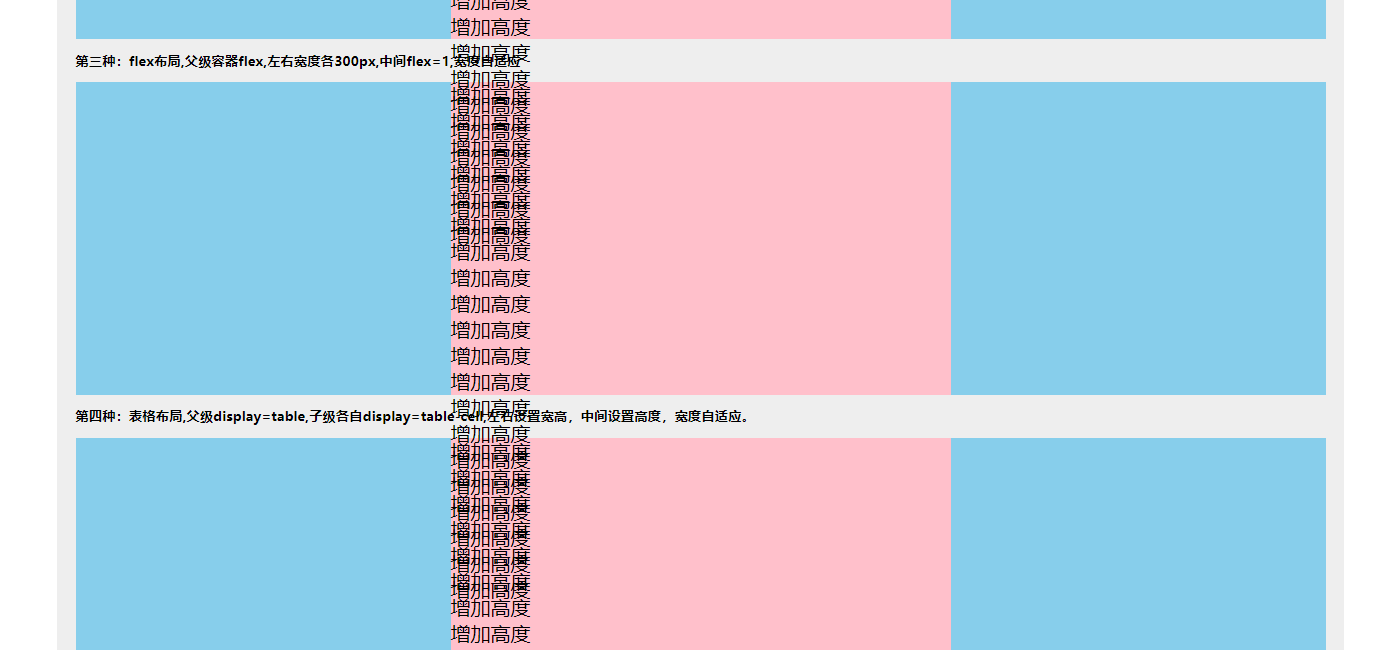
.two_height { height: 250px; width: 100%; position: relative; } .two_left { width: 300px; height: 250px; position: absolute; left: 0; background-color: skyblue; } .two_mid { position: absolute; height: 250px; left: 300px; right: 300px; background-color: pink; } .two_right { position: absolute; right: 0; width: 300px; height: 250px; background-color: skyblue; }第三种:flex布局,父级容器flex,左右宽度各300px,中间flex=1,宽度自适应。
html
<section class="contain mar_b10"> <h6 class="mar_b10 "> 第三种:flex布局,父级容器flex,左右宽度各300px,中间flex=1,宽度自适应 </h6> <article class="three_height"> <div class="three_left"></div> <div class="three_mid"></div> <div class="three_right"></div> </article> </section>css
.three_height { width: 100%; height: 250px; display: flex;}.three_left,.three_right { width: 300px; height: 250px; background-color: skyblue;}.three_mid { flex: 1; background-color: pink}第四种:表格布局,父级display=table,子级各自display=table-cell,左右设置宽高,中间设置高度,宽度自适应。
html
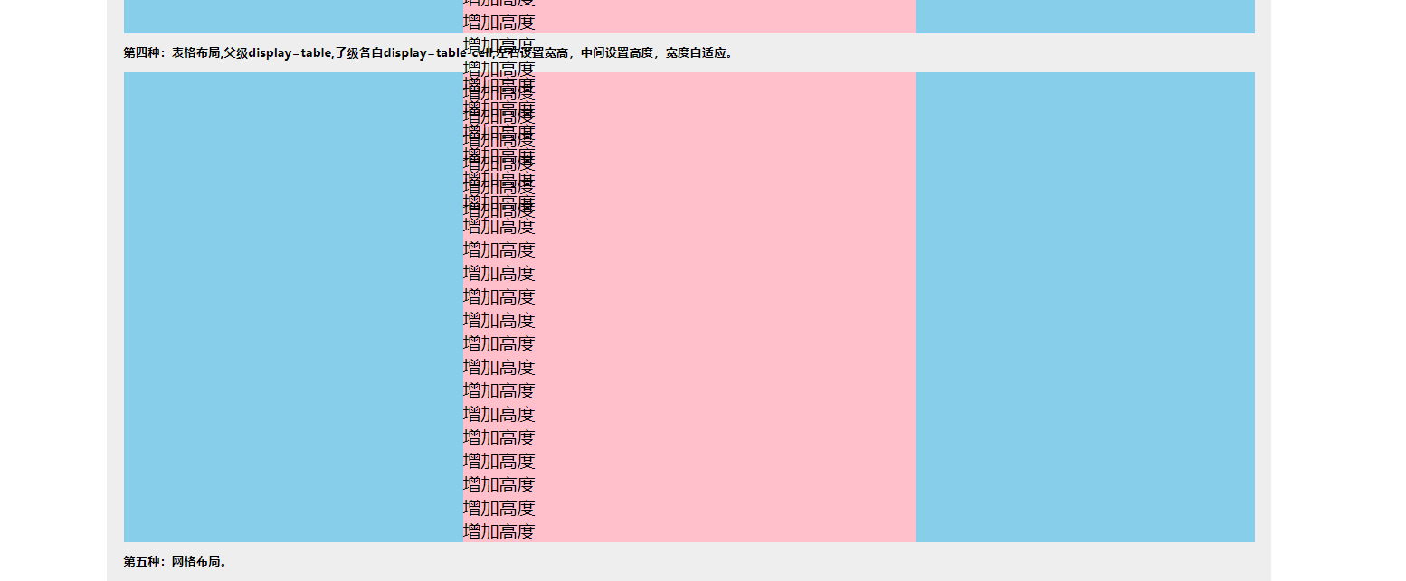
      <section class="contain mar_b10">        <h6 class="mar_b10 ">          第四种:表格布局,父级display=table,子级各自display=table-cell,左右设置宽高,
                 中间设置高度,宽度自适应。        </h6>        <article class="four_height">          <div class="four_left"></div>          <div class="four_mid"></div>          <div class="four_right"></div>        </article>      </section>
css
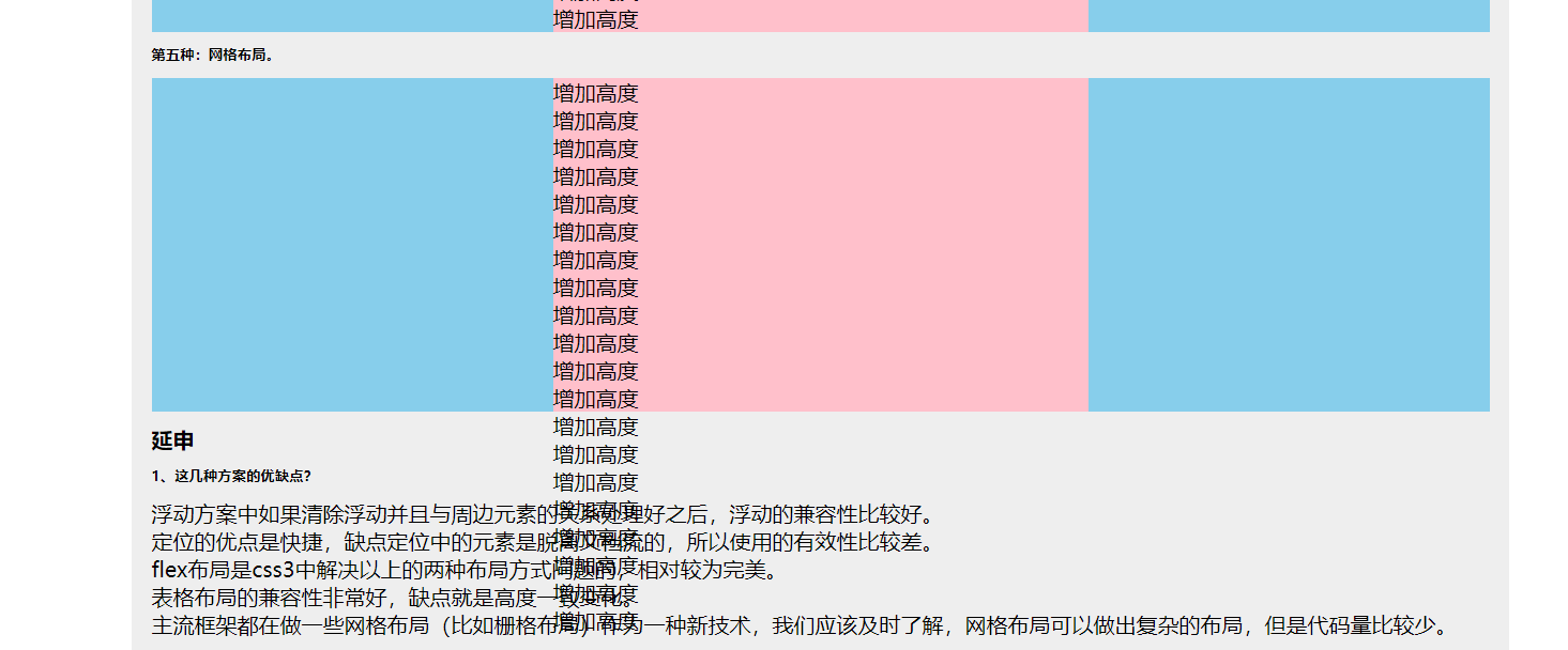
.four_height { width: 100%; height: 250px; display: table;}.four_left, .four_right{ display: table-cell; width: 300px; height: 250px; background-color: skyblue;}.four_mid{ display: table-cell; height: 250px; background-color: pink;}第五种:网格布局。
html
<section class="contain mar_b10"> <h6 class="mar_b10 "> 第五种:网格布局。 </h6> <article class="five_height"> <div class="five_left"></div> <div class="five_mid"></div> <div class="five_right"></div> </article> </section>css
.five_height { display: grid; width: 100%; grid-template-rows: 250px; grid-template-columns: 300px auto 300px;}.five_left,.five_right { background-color: skyblue;}.five_mid { background-color: pink}flex布局与grid布局
Flex 布局是轴线布局,只能指定"项目"针对轴线的位置,可以看作是一维布局。Grid 布局则是将容器划分成"行"和"列",产生单元格,然后指定"项目所在"的单元格,可以看作是二维布局。Grid 布局远比 Flex 布局强大。
父级
.container {
  display: grid;
  grid-template-columns: 100px 100px 100px;
  grid-template-rows: 100px 100px 100px;
}grid-template-columns属性定义每一列的列宽
grid-template-rows属性定义每一行的行高。
上面代码指定了一个三行三列的网格,列宽和行高都是100px。
效果图
延伸问题
1、这几种方案的优缺点?
浮动方案中如果清除浮动并且与周边元素的关系处理好之后,浮动的兼容性比较好。<br>
定位的优点是快捷,缺点定位中的元素是脱离文档流的,所以使用的有效性比较差。<br>
flex布局是css3中解决以上的两种布局方式问题的,相对较为完美。<br>
表格布局的兼容性非常好,缺点就是高度一致变化。<br>
主流框架都在做一些网格布局(比如栅格布局)作为一种新技术,我们应该及时了解,网格布局可以做出复杂的布局,但是代码量比较少。
2、将高度去掉之后,还有哪些方案可以适用?
只有flex布局和table布局可以正常
