

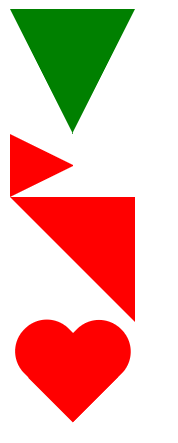
<!DOCTYPE html>
<html>
<head>
	<meta charset="utf-8">
	<title></title>
	<style type="text/css">
		#triangle-down {
			height: 0;
			width: 0;
			border-top: 100px solid green;
			border-right: 50px solid transparent;
			border-left: 50px solid transparent;
		}
		#triangle-right {
			height: 0;
			width: 0;
			border-left: 50px solid red;
			border-top: 25px solid transparent;
			border-bottom: 25px solid transparent;
		}
		#triangle-top-right {
			height: 0;
			width: 0;
			border-top: 100px solid red;
			border-left: 100px solid transparent;
		}
	   #heart {
	      position: relative;
	      width: 100px;
	      height: 90px;
	    }
	    #heart:before,
	    #heart:after {
	      position: absolute;
	      content: "";
	      left: 50px;
	      top: 0;
	      width: 50px;
	      height: 80px;
	      background: red;
	      border-radius: 50px 50px 0 0;
	      transform: rotate(-45deg);
	      transform-origin: 0 100%;
	    }
	    #heart:after {
	      left: 0;
	      transform: rotate(45deg);
	      transform-origin: 100% 100%;
	    }
	</style>
</head>
<body>
	<div id="triangle-down"></div>
	<div id="triangle-right"></div>
	<div id="triangle-top-right"></div>
	<div id="heart"></div>
</body>
</html>
效果图:
字体抗锯齿:
-webkit-font-smoothing: antialiased; /*chrome、safari*/

-moz-osx-font-smoothing: grayscale;/*firefox*/
opacity
p {
  background: #fff;
  opacity: .5;
}
字体和背景都半透明
rgba()
p {
  background: rgba(255, 255, 255, .5);
}
只有背景半透明
height: 100%
父容器有具体的高度值,则当前元素高度值为父容器的100%
外边距塌陷
相邻块元素垂直外边距合并(外边距塌陷):上下两个块元素有margin-bottom和margin-top时,之间的垂直距离是二者较大的那个边距值,避免就好
响应式菜单
<!DOCTYPE html><html lang="en"><head>  <meta charset="UTF-8">
 <meta name="viewport" content="width=device-width, initial-scale=1.0">
 <meta http-equiv="X-UA-Compatible" content="ie=edge">
 <title>Document</title>  <style type="text/css">
 body {      margin: 0;    }
.container {      width: 80%;      height: 500px;      margin: 0 auto;      background-color: red;    }
  .header {      display: flex;      justify-content: space-between;      line-height: 70px;      position: relative;    }
  .tab-bar {      display: flex;    }    .tab {      width: 120px;      text-align: center;    }
  .tab-bar-vertical {      display: none;      position: absolute;      top: 70px;      left: 0;      background-color: #fff;    }    .tab-vertical {      line-height: 70px;      width: 120px;    }    .toggle-menu {      display: none;    }    @media screen and (max-width: 500px) {      .container {        width: 95%;      }      .tab-bar {        display: none;      }      .tab-bar-vertical {        display: block;      }      .toggle-menu {        display: block;      }    }  </style></head><body>  <div class="header">    <div class="logo">xiaobao</div>    <div class="tab-bar">      <div class="tab">首页</div>      <div class="tab">客户</div>      <div class="tab">关于我们</div>      <div class="tab">登录</div>    </div>    <div class="toggle-menu">三</div>    <div class="tab-bar-vertical">      <div class="tab-vertical">首页</div>      <div class="tab-vertical">客户</div>      <div class="tab-vertical">关于我们</div>      <div class="tab-vertical">登录</div>    </div>  </div>  <div class="container">  </div></body></html>
动态样式
可以先将样式写在不同的选择器下,通过更换选择器来实现样式变更
