需求
- 适用场景-条件搜索
- 选择的"所有"的选项,其他子选项取消选择
- 选择了子选项,"所有"选项取消选择
- 默认选择所有,跟后台协商好了选择所有传null,可以根据自己的情况修改
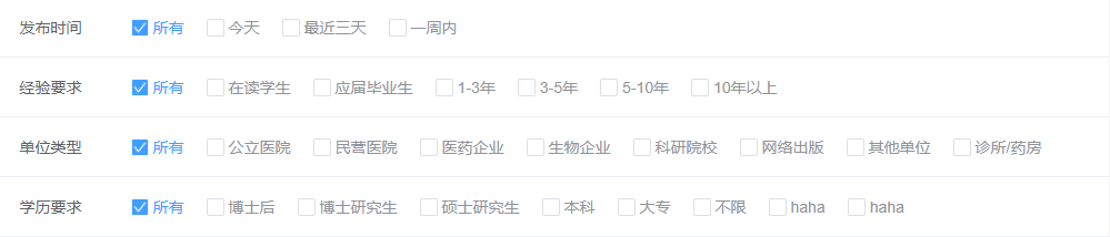
效果图
代码
<template>
<div>
<label class="label">
<input
v-model="arr"
type="checkbox"
class="label-checkbox"
:value="null"
@click="selectAll"
/>
<span class="label-triangle"></span>
<span class="label-text">所有</span>
</label>
<label class="label" v-for="item of options" :key="item.key">
<input
v-model="arr"
type="checkbox"
class="label-checkbox"
:value="item.key"
@click="spliceAll"
/>
<span class="label-triangle"></span>
<span class="label-text">{{ item.label }}</span>
</label>
</div>
</template>
<script>
export default {
props: {
options: Array
},
data() {
return {
arr: [null],
checked: false
};
},
methods: {
selectAll() {
const index = this.arr.indexOf(null);
if (index == -1) {
this.arr = [null];
}
},
spliceAll() {
const index = this.arr.indexOf(null);
if (index > -1) {
this.arr.splice(index, 1);
}
},
getArr() {
this.$emit("getArr", this.arr);
console.log(this.arr);
}
}
};
</script>
<style scoped lang="scss">
//多选框的样式
.label {
float: left;
display: flex;
height: 30px;
line-height: 30px;
align-items: center;
justify-content: center;
margin-right: 20px;
cursor: pointer;
.label-checkbox {
width: 0;
height: 0;
opacity: 0;
}
.label-triangle {
display: inline-block;
height: 16px;
width: 16px;
border: 1px solid $border1;
border-radius: 2px;
margin-right: 4px;
position: relative;
&:after {
content: "";
background-image: url("../../../../img/check.png");
background-size: 100%;
display: block;
color:
position: absolute;
top: 0;
bottom: 0;
right: 0;
left: 0;
}
}
.label-text {
font-weight: normal;
color: $text3;
&:hover {
color: $mtc;
}
}
.label-checkbox {
&:checked {
+ .label-triangle {
border-color: $mtc-hover;
background: $mtc;
+ .label-text {
color: $mtc;
}
}
}
}
}
</style>


