

flutter控件练习demo地址:github
一 Row 和 Column
1. 简介
因为 Row 和 Column 都是继承于 Flex,所以他们两个的属性也都是 Flex 的属性
- Row 是 Flutter 中常用的控件。一个让 children 在水平方向依次排列 。如果 Row 空间 不足的话。 自身不带滚动的。
- Column 也是 Flutter 中常用的控件。 一个 children 在垂直方向依次排列 。如果 Column 空间 不足的话。 自身不带滚动的。
2. 属性
2.1 mainAxisAlignment (主轴对准方式)
对于 Row 来说 , 水平是主轴。垂直是 交叉轴。 对于 Column 来说, 垂直是主轴。水平是 交叉轴 把 children 放到 主轴 的哪个位置 。 如果要验证这个属性,记住把 mainAxisSize 设置成 MainAxisSize.max ,
| 取值 | 说明 | 样式图片(Rowd 的demo) |
|---|---|---|
| MainAxisAlignment.start(默认值) | 把 children 放到主轴的头部 | 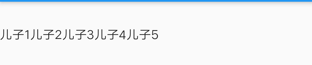 |
| MainAxisAlignment.center | 把 children 放到主轴的中间 | 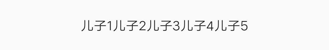 |
| MainAxisAlignment.end | 把 children 放到主轴的尾部 | 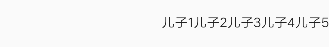 |
| MainAxisAlignment.spaceAround | 将主轴方向空白区域均分,使得children之间空间相等,但是首尾 childre 的空白部分为一半 |  |
| MainAxisAlignment.spaceBetween | 将主轴方向空白区域均分,使得children之间空间相等,但是首尾childre靠近收尾,没有空细逢 | 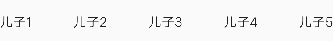 |
| MainAxisAlignment.spaceEvenly | 将主轴方向空白区域均分,使得children之间空间相等,包括首尾childre | 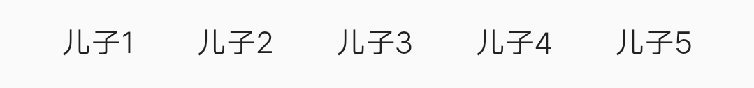 |
2.2 mainAxisSize
也就是来规定自己( Row 或者 Column )的大小。
- MainAxisSize.min : 主轴方向,包裹住 childre 即可。相当于 android 中的 wrap_content
- MainAxisSize.max(默认值) : 主轴方向,铺满 ( Row 或者 Column )的父 Widget 的大小。 相当于 android 中的 match_parent
2.3 crossAxisAlignment (交叉轴)跟主轴垂直的一个轴
交叉轴 顾名思义: 就是 跟 主轴 垂直的 一个轴 对于 Row 。交叉轴 是 在垂直。对于 Column,交叉轴 是水平 。下面还是 以 Row 举个例子
| 取值 | 说明 | 图片demo(Row) |
|---|---|---|
| CrossAxisAlignment.start | 把 children 放到交叉轴的头部 |  |
| CrossAxisAlignment.end | 把 children 放到交叉轴的尾部 | 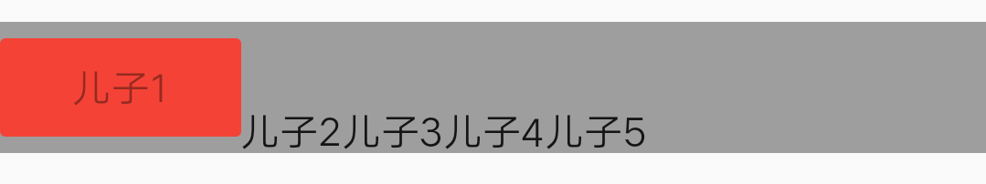 |
| CrossAxisAlignment.center | 把 children 放到交叉轴的中间 | 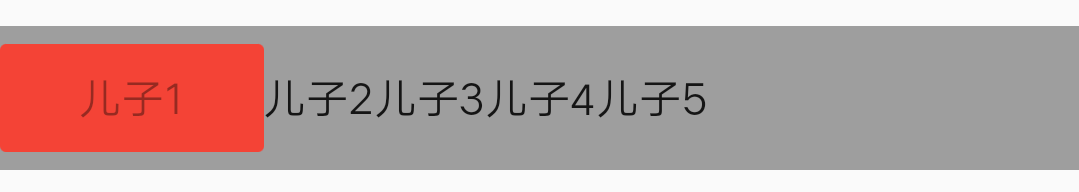 |
| CrossAxisAlignment.stretch | 让children填满交叉轴方向 | 无(没有测试出来,控件 找不到了) |
| CrossAxisAlignment.baseline | 让children 于 baseline 对齐,如果主轴是垂直的,那么这个值是当作开始 ,设置了此 属性 textBaseline 不能为 null | |
2.4 textDirection
children 在 主轴 怎样排列。 正方向排列还是反方向排列
Row
- TextDirection.ltr : 表示在水平方向(主轴)。由左到右 , 左为头 , 右为尾
- TextDirection.rtl :表示在水平方向(主轴)。由右到左 , 右为头 , 左为尾
Column
- TextDirection.ltr : 表示在垂直方向(主轴)。由上到下 , 上为头 , 下为尾
- TextDirection.rtl :表示在垂直方向(主轴)。由下到上 , 下为头 ,上为尾
2.5 verticalDirection
children 在 交叉轴 怎样排列。 正方向排列还是反方向排列
Row
- VerticalDirection.down : 表示在垂直方向(交叉轴)。由上到下 , 上为头 , 下为尾
- VerticalDirection.up :表示在垂直方向(交叉轴)。由下到上 , 下为头 , 上为尾
Column
- VerticalDirection.down : 表示在水平方向(交叉轴)。由左到右 , 左为头 , 右为尾
- TextDirection.rtl :表示在水平方向(交叉轴)。由右到左 , 右为头 , 左为尾
二 Stack
取代线性布局 (和Android中的LinearLayout相似,但是我感觉怎么这么像 FrameLayout 呢?),Stack允许子 widget 堆叠, 你可以使用 Positioned 来定位他们相对于Stack的上下左右四条边的位置。Stacks是基于Web开发中的绝度定位(absolute positioning )布局模型设计的。用于将多个childs相对于其框的边缘定位,多用于以简单方式重叠children
2.1 属性
- alignment: 默认值。AlignmentDirectional.topStart ( AlignmentDirectional(-1.0, -1.0) )。 表示从左上角开始排 children
- textDirection: 文本方向 , children 的流动方向
- overflow: 表示 超过的部分是否裁剪掉 Overflow.visible 不剪掉。 Overflow.clip 减掉
- fit: 让 children 怎样填充 Stack 。
- StackFit.passthrough 不改变子节点约束 也就是说 children 是多大就是多大
- StackFit.expand 子节点最大可能的占用空间 ,让 children 的大小 扩大到 Stack 的大小
- StackFit.loose:放开了子节点宽高的约束,可以让子节点从0到最大尺寸
三 demo图片
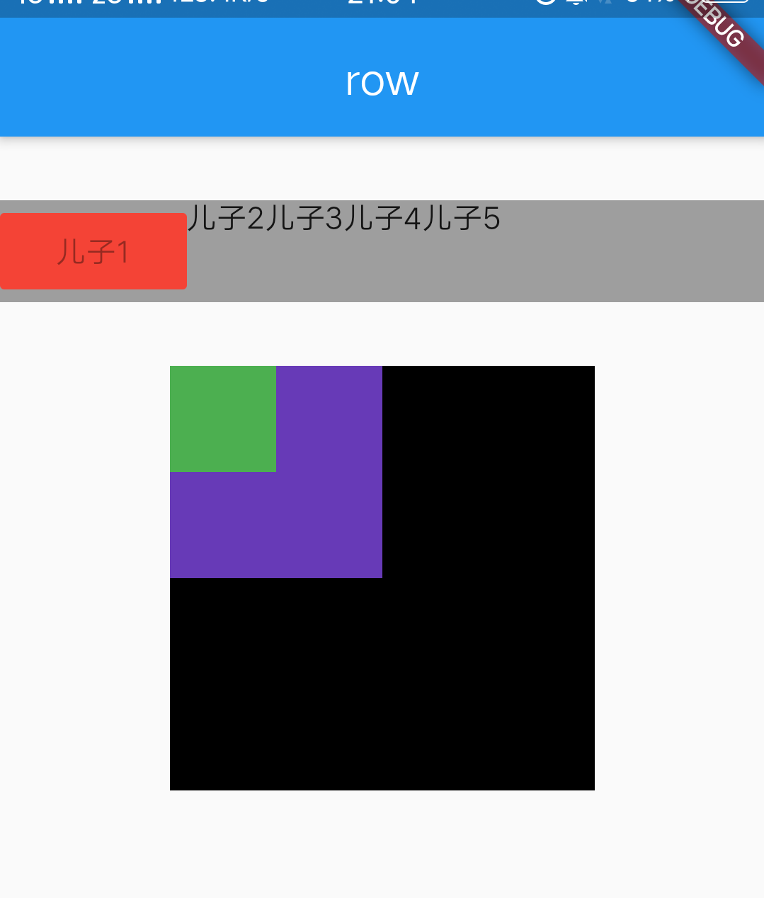
demo 代码
import 'package:flutter/material.dart';

class LayoutDemo extends StatelessWidget {
  @override
  Widget build(BuildContext context) {
    // TODO: implement build
    return Scaffold(
      appBar: AppBar(
        title: Text("row"),
        centerTitle: true,
      ),
      body: RowDemo(),
    );
  }
}

class RowDemo extends StatelessWidget {
  @override
  Widget build(BuildContext context) {
    // TODO: implement build
    final _list = <Widget>[
      RaisedButton(
        disabledColor: Colors.red,
        child: Text("儿子1"),
      ),
      Text("儿子2"),
      Text("儿子3"),
      Text("儿子4"),
      Text("儿子5"),
    ];
    return Column(
      children: <Widget>[
        SizedBox(
          height: 30,
        ),
        Container(
          color: Colors.grey,
          child: Row(
            // 主轴(main axis)
            // 把 children 放到 Column 主轴 的哪个位置
            //  end : 尾部, start :头部, center : 中间 ,spaceBetween:在 children 之间均匀地放置 空间 ,spaceAround : 每个 children
            mainAxisAlignment: MainAxisAlignment.start,

            // 此 Row 的宽度。默认是 MainAxisSize.max
            //          MainAxisSize.min 是 包裹 children 的高度 即可  。android 中 相当于 wrap_content
            //          MainAxisSize.max 是 铺满 Row 的父 Widget 的宽度  。android 中 相当于 match_parent
            //  如果设置成 MainAxisSize.min 。 那么 mainAxisAlignment 属性相当于无效。 因为是包裹 children
            mainAxisSize: MainAxisSize.max,
            // 交叉轴(cross axis)
            // 把 children 放到 Column 主轴 的哪个位置
            // end : 尾部, start :头部, center : 中间 ,
            crossAxisAlignment: CrossAxisAlignment.start,
            // children 在主轴 的排列顺序
            textDirection: TextDirection.ltr,
            // children 在 交叉轴 的排列顺序
            verticalDirection: VerticalDirection.down,
            children: _list,
          ),
        ),
        SizedBox(
          height: 30,
        ),
        SizedBox(
            width: 200,
            height: 200,
            child: Stack(
              alignment: AlignmentDirectional.topStart,
//            alignment:   AlignmentDirectional(-1.0, -1.0),
              fit: StackFit.loose,
              overflow: Overflow.visible,
              children: <Widget>[
                Container(
                  color: Colors.black,
                  height: 200,
                  width: 200,
                ),
                Container(
                  color: Colors.deepPurple,
                  height: 100,
                  width: 100,
                ),
                Container(
                  color: Colors.green,
                  height: 50,
                  width: 50,
                ),
              ],
            )),
      ],
    );
  }
}
