

介绍
ConstraintLayout 在 2016 年 Google IO 中面世,它的出现是为了解决开发中过于复杂的页面层级嵌套过多的问题——层级过深会增加绘制界面需要的时间,影响用户体验。
在使用过程中,ConstraintLayout 可以看做是一个更强大的 RelativeLayout,它提供了更多的 API 来约束控件的相对关系,更容易满足复杂的页面布局。
布局属性
约束布局拥有更强大的约束能力,其拥有的布局属性数量也非常多,笔者在这里进行分类讲解。
相对定位属性
相对定位是约束布局中创建布局的基本属性之一。这些属性和 RelativeLayout 布局属性是类似的,用来控制控件相对于另外一个控件或者父容器的位置。
分别可以在水平轴和垂直轴上约束控件:
- Horizontal: left, right, start, end
- Vertical: top, bottom, text baseline
简单来说就是将给定一侧需要约束的控件约束到另一个控件的另一侧。 举个例子,把按钮 B 放到按钮 A 的右边:
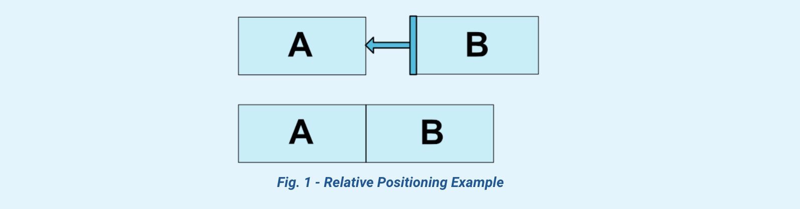
我们可以这样写:
<Button android:id="@+id/buttonA" ... />
<Button android:id="@+id/buttonB" ...
app:layout_constraintLeft_toRightOf="@+id/buttonA" />
除了指定另外一个控件 id 进行约束,我们还可以与父布局进行约束:
<Button android:id="@+id/buttonB" ...
app:layout_constraintLeft_toLeftOf="parent" />
Margins
设置控件的间距属性与其他布局相同,但约束布局中对应间距值生效需要有对应的约束条件,比如需要给控件设置左间距,那该控件它的 constraint<Left/Start>_toXXXOf 一定需要,否则间距无法生效。
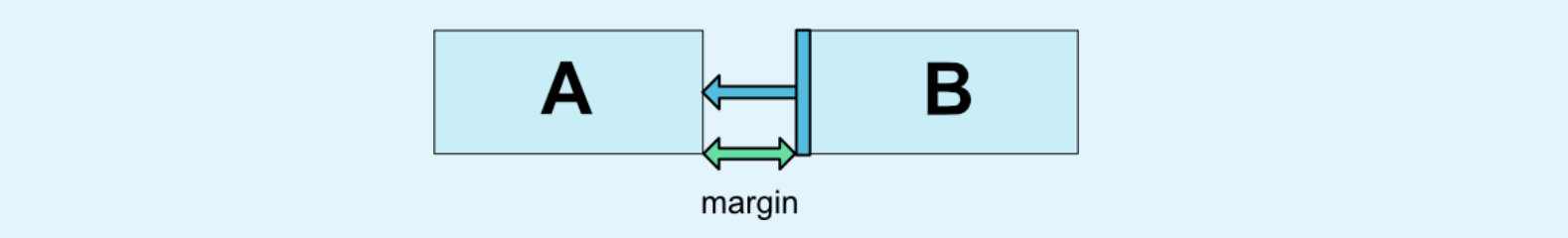
与其他控件不同的是新增了一系列 goneMargin 属性,用来控制当约束目标可见性为 GONE 的时候,设置不同的间距值。
实践过程中笔者能够想到的一个场景需求是:
在动画中,A 不可见的时候,需要保证 B 的布局位置不变,这个时候设置 goneMarginStart 的值为 A 的宽度加上 B 的 marginStart ,就可以满足该需求。
居中和 Bias
居中
跟其他布局一样,约束布局同样拥有子控件居中的能力,居中定位是以横向/竖向两端同时约束来定位布局位置。比如让 A 在父容器中左右居中:
<android.support.constraint.ConstraintLayout ...>
  <Button android:id="@+id/button" ...
          app:layout_constraintLeft_toLeftOf="parent"
          app:layout_constraintRight_toRightOf="parent/>
</>
竖直居中同理。
Bias
上述布局约束会把控件居中对齐,使用 bias 可以进行偏移。
- layout_constraintHorizontal_bias
- layout_constraintVertical_bias
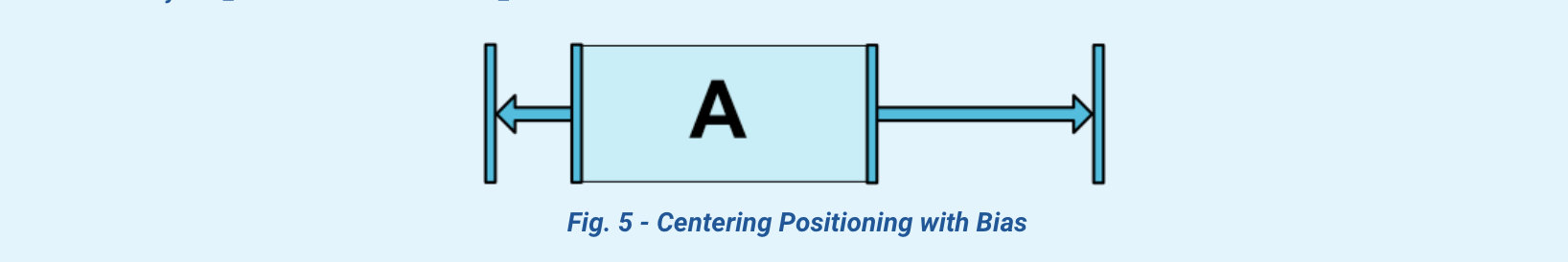
如果没有设置 bias 值,则左右两边取值各占有 50% 也就是居中的效果,如果把 bias 修改为 0.3 (30%),则左边空白的边距会减少,右边会相应增多。
给上述代码增加一行 app:layout_constraintHorizontal_bias="0.3" ,就可以得到图片的效果。
<android.support.constraint.ConstraintLayout ...>
  <Button android:id="@+id/button" ...
          app:layout_constraintHorizontal_bias="0.3"
          app:layout_constraintLeft_toLeftOf="parent"
          app:layout_constraintRight_toRightOf="parent/>
</>
相对圆周定位 (ver 1.1)
constraintCircle 属性在 1.1 版本中添加,提供开发者相对控件的中心一个角度和距离上约束另外一个控件的能力。
- layout_constraintCircle
- layout_constraintCircleRadius
- layout_constraintCircleAngle
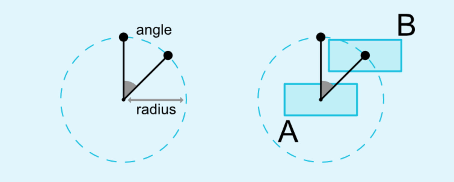
<Button android:id="@+id/buttonA" ... />
<Button android:id="@+id/buttonB" ...
        app:layout_constraintCircle="@+id/buttonA"
        app:layout_constraintCircleRadius="100dp"
        app:layout_constraintCircleAngle="45" />
控件的尺寸约束
在 ConstraintLayout 中设置控件的高度和宽度是通过 android:layout_width 和 android:layout_height 来指定,但有三种不同类型:
- 使用确定的尺寸,给定数值,比如
36dp - 使用
WRAP_CONTENT该效果与其他控件相同 - 使用
0dp来表示MATCH_CONSTRAINT, 意思是根据约束规则指定高宽
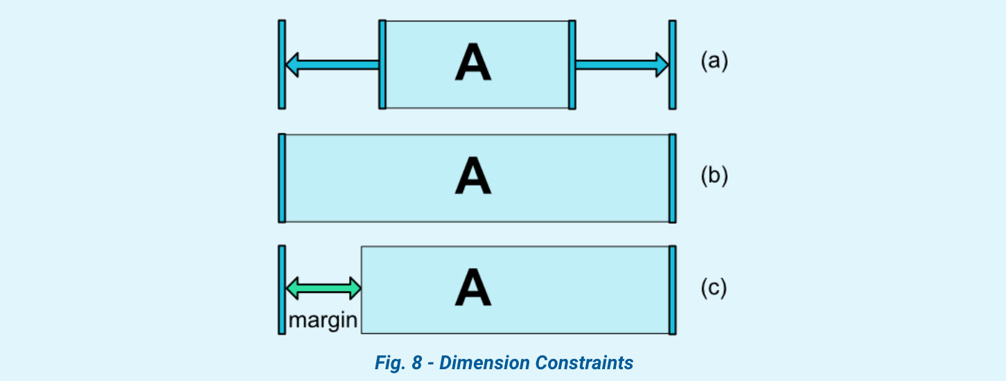
(a) 设置为 WRAP_CONTENT;(b) 设置为 0dp;(c) 是设置了 margin 情况下的 (b)
WRAP_CONTENT 下的强制约束 (ver 1.1)
在 1.1 版本之前,约束布局对于控件的 WRAP_CONTENT 是不会限制它的结果大小。所以这在你希望使用 WRAP_CONTENT 但仍然需要强制约束条件来限制它的结果,就可能需要添加以下属性:
- app:layout_constrainedWidth="true|false"
- app:layout_constrainedHeight="true|false"
在最后业务实战的第一个例子中会具体说明该属性的使用场景
宽高比例
layout_constraintDimensionRatio 限制控件的宽高比,如果要使用宽高比来约束尺寸,则至少要设置宽高其中一个尺寸为0dp,然后再设置上 layout_constraintDimentionRatio 属性。
<Button android:layout_width="wrap_content"
        android:layout_height="0dp"
        app:layout_constraintDimensionRatio="1:1" />
上述代码会得到一个高度跟宽度相同的 Button。
关于比例的取值有两种方式:
- float 值,代表宽度/高度的比率
- 宽度:高度这种比率值,比如 9:16
如果宽高都是 MATCH_CONSTRAINT (0dp) 也可以是用宽高比,这种情况系统会使用满足所有约束条件和宽高比率的最大尺寸。如果要根据其中一个尺寸来约束另外一个尺寸,可以在比率数值前添加 "W/H" 来分别约束宽度或者高度。
举例:app:layout_constraintDimensionRatio="H,16:9"
这行代码表示约束该 View 的高度,其数值需要符合 16:9 的比率。
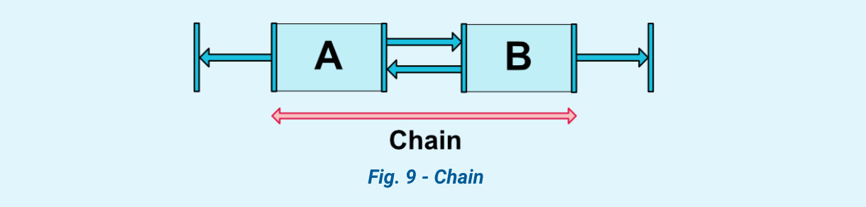
链条
Chains 为同一个方向(水平或者垂直)上的多个控件提供一个类似群组的概念。其他的方向则可以单独控制。
创建链条
多个控件相互在同一个方向上双向引用就可以创建一个 Chain.
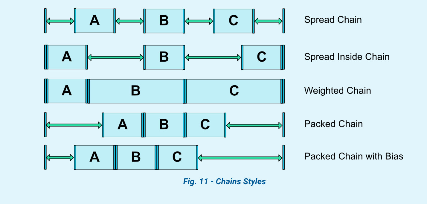
Chain Style
以下属性是用来控制 Chain Style 的:
– layout_constraintHorizontal_chainStyle – layout_constraintHorizontal_weight – layout_constraintVertical_chainStyle – layout_constraintVertical_weight
其中 Style 有 4 种:
CHAIN_SPREAD这个是默认的 Style, 里面的所有控件会分散开布局- Weighted chain,在
CHAIN_SPREAD模式下,如果有些控件的尺寸设置为MATCH_CONSTRAINT(0dp),则这些控件尺寸会占据所有剩余可用的空间,和 LinearLayout weight 类似。 CHAIN_SPREAD_INSIDE和CHAIN_SPREAD类似,只不过两端的两个控件和父容器直接不占用多余空间,多余空间在控件之间分散CHAIN_PACKED这种模式下,所有的控件都居中聚集在一起,但是可以设置 bias 属性来控制聚集的位置。
辅助布局
Guideline
Guideline 是约束布局中一个特殊的辅助布局类,可以创建水平或者垂直的参考线,其他的控件可以根据这个参考线来进行布局,它本质是不可见的控件。
参考线的位置属性:
- orientation:vertical/horizontal
- layout_constraintGuide_begin 指定距离左/上边开始的固定位置
- layout_constraintGuide_end 指定距离右/下边开始的固定位置
- layout_constraintGuide_percent 指定位于布局中所在的百分比
Barrier
Barrier 在约束布局中通过 constraint_referenced_ids 引用多个控件,看作一个整体来添加一个与另外一个控件限制最大宽/高的约束。
通过 app:barrierDirection 属性来决定 Barrier 的方向。
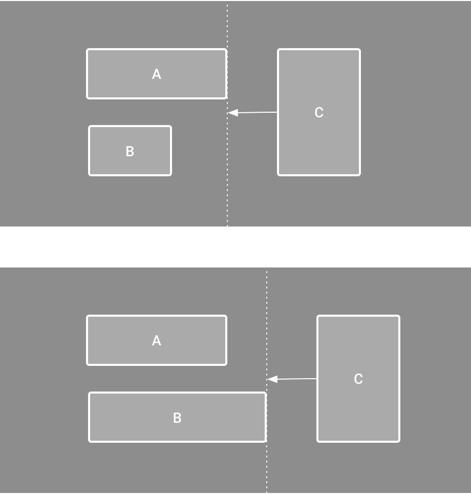
 <android.support.constraint.Barrier
          android:id="@+id/barrier"
          android:layout_width="wrap_content"
          android:layout_height="wrap_content"
          app:barrierDirection="start"
          app:constraint_referenced_ids="button1,button2" />
Group
Group 是约束布局用来控制一组控件的可见性。
<android.support.constraint.Group
    android:id="@+id/group"
    android:layout_width="wrap_content"
    android:layout_height="wrap_content"
    android:visibility="visible"
    app:constraint_referenced_ids="button4,button9" />
被引用 id 的控件的可见性(visibility)和深度(elevation)属性与 Group 相同。
换句话说:被 Group 引用的控件会导致它们的自身的可见性和深度失效。
业务经典场景
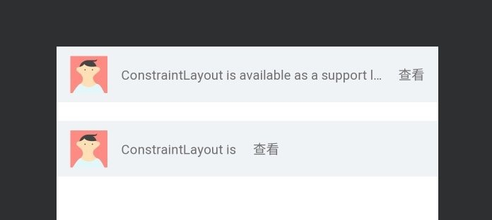
1. 固定一边,中间宽度可变,另一边跟随中间尾部
设计需求:头像位置固定,中间文字长度可变,最右侧按钮跟在文字右侧,但不能超出屏幕。
<androidx.constraintlayout.widget.ConstraintLayout xmlns:android="http://schemas.android.com/apk/res/android"
      xmlns:app="http://schemas.android.com/apk/res-auto"
      xmlns:tools="http://schemas.android.com/tools"
      android:layout_width="match_parent"
      android:layout_height="60dp"
      tools:background="@color/background_gray">

      <ImageView
          android:id="@+id/iv_avatar"
          android:layout_width="40dp"
          android:layout_height="40dp"
          android:layout_marginStart="15dp"
          app:layout_constraintBottom_toBottomOf="parent"
          app:layout_constraintEnd_toEndOf="parent"
          app:layout_constraintHorizontal_bias="0"
          app:layout_constraintStart_toStartOf="parent"
          app:layout_constraintTop_toTopOf="parent"
          tools:srcCompat="@tools:sample/avatars[2]" />

      <TextView
          android:id="@+id/tv_text"
          android:layout_width="wrap_content"
          android:layout_height="wrap_content"
          android:layout_marginStart="15dp"
          android:layout_marginEnd="15dp"
          android:singleLine="true"
          app:layout_constrainedWidth="true"
          app:layout_constraintBottom_toBottomOf="@+id/iv_avatar"
          app:layout_constraintEnd_toStartOf="@id/tv_action"
          app:layout_constraintHorizontal_bias="0"
          app:layout_constraintHorizontal_chainStyle="packed"
          app:layout_constraintStart_toEndOf="@id/iv_avatar"
          app:layout_constraintTop_toTopOf="@+id/iv_avatar"
          tools:text="ConstraintLayout is available as a support library" />

      <TextView
          android:id="@+id/tv_action"
          android:layout_width="wrap_content"
          android:layout_height="wrap_content"
          android:layout_marginEnd="15dp"
          app:layout_constraintBottom_toBottomOf="@+id/iv_avatar"
          app:layout_constraintEnd_toEndOf="parent"
          app:layout_constraintStart_toEndOf="@id/tv_text"
          app:layout_constraintTop_toTopOf="@+id/iv_avatar"
          tools:text="查看" />


</androidx.constraintlayout.widget.ConstraintLayout>
该场景重点需要熟悉属性:layout_constrainedWidth/Height 应用。
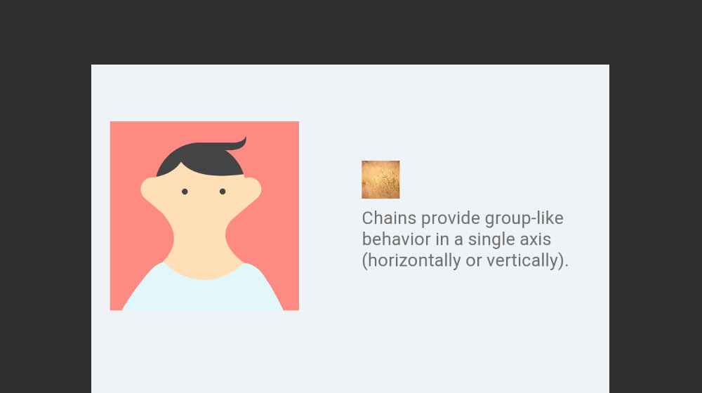
2. 根据某个 View 的高度/宽度,来居中一组 View
设计需求:右侧图片和文字,需要整体跟左边头像居中。
<androidx.constraintlayout.widget.ConstraintLayout xmlns:android="http://schemas.android.com/apk/res/android"
    xmlns:app="http://schemas.android.com/apk/res-auto"
    xmlns:tools="http://schemas.android.com/tools"
    android:layout_width="match_parent"
    android:layout_height="300dp"
    tools:background="@color/background_gray">

    <ImageView
        android:id="@+id/iv_avatar"
        android:layout_width="150dp"
        android:layout_height="150dp"
        android:layout_marginStart="15dp"
        app:layout_constraintBottom_toBottomOf="parent"
        app:layout_constraintEnd_toEndOf="parent"
        app:layout_constraintHorizontal_bias="0"
        app:layout_constraintStart_toStartOf="parent"
        app:layout_constraintTop_toTopOf="parent"
        app:layout_constraintVertical_bias="0.3"
        tools:srcCompat="@tools:sample/avatars[2]" />

    <ImageView
        android:id="@+id/iv_pic"
        android:layout_width="30dp"
        android:layout_height="30dp"
        android:layout_marginStart="50dp"
        android:scaleType="centerCrop"
        app:layout_constraintBottom_toTopOf="@+id/tv_content"
        app:layout_constraintStart_toEndOf="@id/iv_avatar"
        app:layout_constraintTop_toTopOf="@id/iv_avatar"
        app:layout_constraintVertical_chainStyle="packed"
        tools:srcCompat="@tools:sample/backgrounds/scenic[6]" />

    <TextView
        android:id="@+id/tv_content"
        android:layout_width="0dp"
        android:layout_height="wrap_content"
        android:layout_marginTop="5dp"
        app:layout_constraintBottom_toBottomOf="@id/iv_avatar"
        app:layout_constraintEnd_toEndOf="parent"
        app:layout_constraintStart_toStartOf="@id/iv_pic"
        app:layout_constraintTop_toBottomOf="@+id/iv_pic"
        tools:text="Chains provide group-like behavior in a single axis (horizontally or vertically). " />
</androidx.constraintlayout.widget.ConstraintLayout>
该场景重点需要熟悉约束布局:Chain 的应用。
iv_pic 与 tv_content 双向依赖,使用 packed Style 让它们紧靠一起,同时,iv_pic 头部与 iv_avatar 的头部对齐, tv_content 的底部与 iv_avatar 的底部对齐,达到它们居中显示的效果。
