

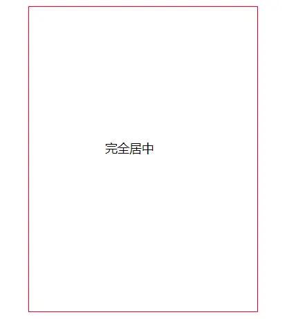
  <div class="parent">
    <p class="children">完全居中</p>
</div>- 知道宽高
(1)绝对定位
.parent {
    width: 300px;
    height: 400px;
    margin: 0 auto;
    border: 1px solid red;
    position: relative;
  }
  .children {
    position: absolute;
    top: 0;
    left: 0;
    right: 0;
    bottom: 0;
    margin: auto;
    width: 100px;
    height: 50px;
  }
<div class="parent">
<p class="children">完全居中</p>
</div>- 知道宽高
(1)绝对定位
.parent {
width: 300px;
height: 400px;
margin: 0 auto;
border: 1px solid red;
position: relative;
}
.children {
position: absolute;
top: 0;
left: 0;
right: 0;
bottom: 0;
margin: auto;
width: 100px;
height: 50px;
}(2)负margin
  .parent {
    width: 300px;
    height: 400px;
    margin: 0 auto;
    border: 1px solid red;
    position: relative;
  }
  .children {
    position: absolute;
    top: 50%;
    left: 50%;
    margin: -50px 0 0 -25px;
    width: 100px;
    height: 50px;
}- 不知道宽高
(1)transform
  .parent {
    width: 300px;
    height: 400px;
    margin: 0 auto;
    border: 1px solid red;
    position: relative;
  }
  .children {
    position: absolute;
    top: 50%;
    left: 50%;
    margin: auto;
    transform: translate(-50%, -50%);
  }
(2)table-cell + vertical-align: center
.parent { width: 100px; margin: 0 auto; border: 1px solid red; display: table-cell; vertical-align: center; text-align: center; } .children { margin: 0 auto; }(3)弹性布局 flex
.parent { display: flex; align-items: center; justify-content: center; }(4)display:inline-block
.parent { width: 300px; height: 500px; border: 1px solid red; text-align: center; overflow: auto;}.parent:after, .children { display: inline-block; vertical-align: middle;}.parent:after { content: ''; height: 100%;}
