

使div水平垂直居中
1. flex 布局实现 (元素已知宽度)
效果图:
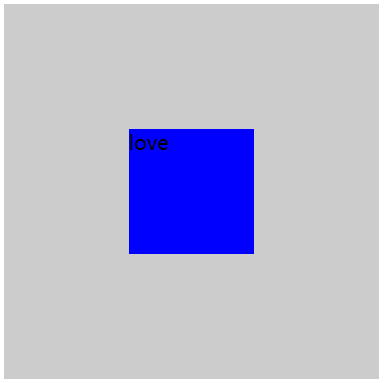
内部 div 要有宽度
CSS 代码:
<style>
.box{
width: 300px;
height: 300px;
background-color: #ccc;
display: flex;
display: -webkit-flex;
justify-content: center;
align-items: center;
}
.box .a{
width: 100px;
height: 100px;
background-color: blue;
}
</style>
HTML 代码:
<div class="box">
<div class="a"></div>
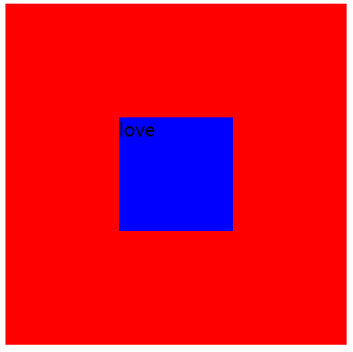
</div>2. position (元素已知宽度)
父元素设置为:position: relative;
子元素设置为:position: absolute;
距上50%,据左50%,然后减去元素自身宽度的一半距离就可以实现
效果图:
CSS代码:
<style>
    .box{
        width: 300px;
        height: 300px;
        background-color: red;
        position: relative;
    }
    .box .a{
        width: 100px;
        height: 100px;
        background-color: blue;
        position: absolute;
        left: 50%;
        top: 50%;
        margin: -50px 0 0 -50px;
    }
    </style>

HTML 代码:
<div class="box">
    <div class="a">love</div>
</div>
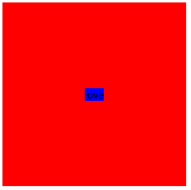
3. position transform (元素未知宽度)
如果元素未知宽度,只需将上面例子中的
margin: -50px 0 0 -50px;替换为:transform: translate(-50%,-50%);效果图:
CSS 代码:
<style>
    .box{
        width: 300px;
        height: 300px;
        background-color: red;
        position: relative;
    }
    .box .a{
        background-color: blue;
        position: absolute;
        top: 50%;
        left: 50%;
        transform: translate(-50%, -50%);
    }
</style>
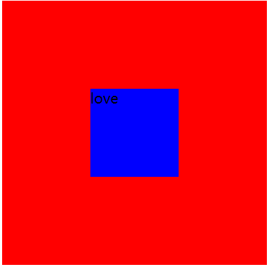
4. position(元素已知宽度)(left,right,top,bottom为0,maigin:auto )
效果图:
CSS 代码:
<style>
    .box{
        width: 300px;
        height: 300px;
        background-color: red;
        position: relative;
    }
    .box .a{
        width: 100px;
        height: 100px;
        background-color: blue;
        position: absolute;
        top: 0;
        bottom: 0;
        left: 0;
        right: 0;
        margin: auto;
    }
</style>
HTML 代码:
 <div class="box">
    <div class="a">love</div>
</div>
★第四种情况方案中,如果子元素不设置宽度和高度,将会铺满整个父级(应用:模态框)
效果图:
CSS 代码:
<style>
    .box{
        width: 300px;
        height: 300px;
        background-color: red;
        position: relative;
    }
    .box .a{
        /* 如果不设置宽高,将铺满整个父级*/
        background-color: pink;
        position: absolute;
        left: 0;
        right: 0;
        top: 0;
        bottom: 0;
        margin: auto;
        text-align: center;
    }
</style>
HTML:
<div class="box">
    <div class="a">love</div>
</div>
5. table-cell 布局实现
table 实现垂直居中,子集元素可以是块元素,也可以不是块元素
CSS:
<style>
    .box{
        width: 300px;
        height: 300px;
        background-color: red;
        display: table-cell;
        vertical-align: middle;
    }
    .box .a{
        margin-left: 100px;
        width: 100px;
        height: 100px;
        background-color: blue;
    }
</style>

<div class="box">
    <div class="a">love</div>
</div>
使内容(文字,图片)水平垂直居中(table-cell 布局)
行元素 text-align :center;
块元素 :margin :0 auto;
text-align : center  给元素的父级加,可以使文本或者行级元素(例如:图片)水平居中
line-height : 值为元素的高度,可以使元素的文本内容垂直居中
margin: 0 auto 使用条件:父级元素宽度可有可无,子级元素必须使块元素,而且要有宽度(否则继承父级)
display:table-cell 会使元素表现的类似一个表格中的单元格td,利用这个特性可以实现文字的垂直居中效果。同时它也会破坏一些 CSS 属性,使用 table-cell 时最好不要与 float 以及 position: absolute 一起使用,设置了 table-cell 的元素对高度和宽度高度敏感,对margin值无反应,可以响 padding 的设置,表现几乎类似一个 td 元素。
小结:
1. 不要与 float:left, position : absolute, 一起使用
2. 可以实现大小不固定元素的垂直居中
3. margin 设置无效,响应 padding 设置
4. 对高度和宽度高度敏感
5. 不要对 display:table-cell 使用百分比设置宽度和高度
应用:
1. 使文字水平垂直居中
效果图:
CSS 代码:
<style>
    .box{
        width: 300px;
        height: 300px;
        background-color: red;
        display: table-cell;
        text-align: center;/*使元素水平居中 */
        vertical-align: middle;/*使元素垂直居中 */
    }
</style>

HTML 代码:
<div class="box">love</div>
给父级设置 display : table,子集设置 display:tablecell ,子集会充满全屏
CSS 代码:
<style>
    .box{
        width: 300px;
        height: 300px;
        background-color: red;
        display: table;
    }
    .box .a{
        display: table-cell;
        vertical-align: middle;
        text-align: center;
        background-color: blue;
    }
</style>

HTML :
<div class="box">
    <div class="a">love</div>
</div>
2. 图片水平垂直居中
效果图:
<style>
    .box{
        width: 300px;
        height: 300px;
        background-color: skyblue;
        display: table-cell;
        text-align: center;
        vertical-align: middle;
    }
    img{
        /* 设置成块元素后,text-align:center 就会失效 */
        width: 100px;
        height: 100px;
    }
</style>

HTML:
<div class="box">
    <img src="1.jpg" alt="">
</div>
中间的图片会随着外层容器的大小而自动水平垂直居中,其实原理和文字水平垂直居中一模一样
3. 元素两端垂直对齐
CSS 代码:
<style>
    *{
        padding: 0;
        margin: 0;
    }
    .box{
        display: table;
        width: 90%;
        margin: 10px  auto;
        padding: 10px;
        border: 1px solid green;
        height: 100px;
    }
    .left,.right{
        display: table-cell;
        width: 20%;
        border: 1px solid red;
    }
    .center{
        /* padding-top: 10px; */
        height: 100px;
        background-color: green;
    }
</style>

HTML:
<div class="box">
    <div class="left">
        <p>我是左边</p>
    </div>
    <div class="center">
        <p>我是中间</p>
    </div>
    <div class="right">
        <p>我是右边</p>
    </div>
</div>
效果: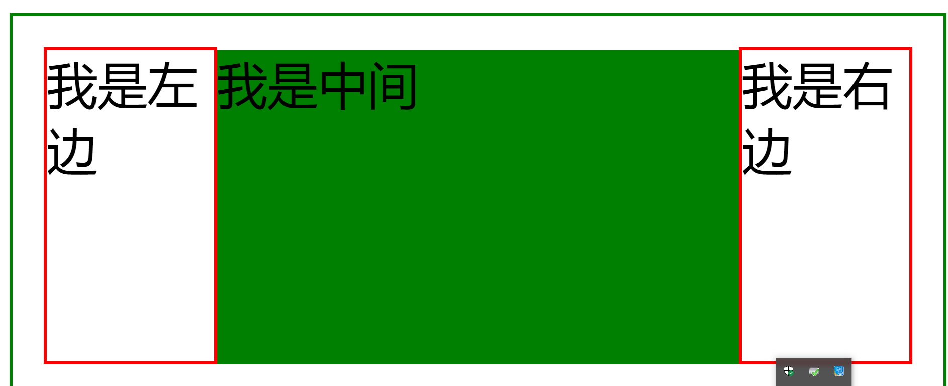
其中 center 的顶部没有与左右两侧对齐,原因是 left 中的 <p> 有一个 margin-top , 而表格布局中默认是文字顶部对齐的,所以 center 会向下移动到首行文字基线对齐,解决办法是为 center 添加与左右两侧中 margin-top 较大者等值的 padding-top 即可。
