介绍
- 简单来说就是页面分为左中右3个部分,其中左右两侧固定宽度,而中间部分自适应。
实现
- 假设每列的高度为150px,左列宽度为200px,右列宽度为150px,中间部分自适应。
方式一:左右浮动+中间100%宽度
HTML结构
- 需要一个父元素来包裹3列,这里为container
<style type="text/css">
.container {
padding-left: 200px;
padding-right: 150px;
}
</style>
<div class="container"></div>

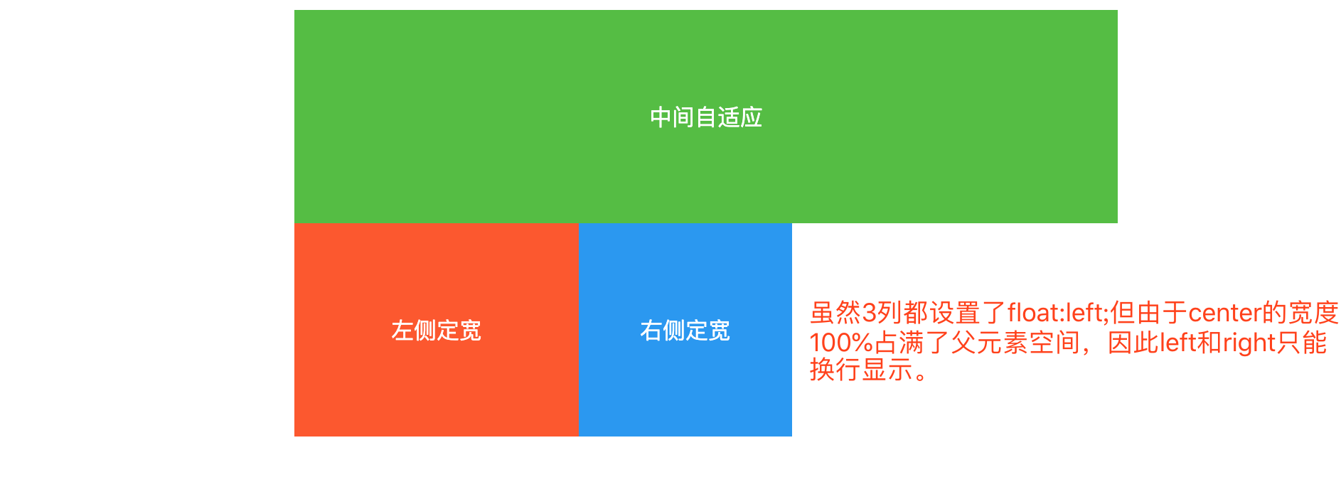
在container中添加三列
- 将三列都设置float:left;使其在同一排显示
- 由于center宽度为100%将父元素占满了,因此left和right只能换行显示
<style type="text/css">
  .container div {
     height: 150px;
     color: white;
     line-height: 150px;
     float: left;
  }
  .center {
     width: 100%;
     background-color: #50bf3c;
  }
  .left {
     width: 200px;
     background-color: #ff5722;
  }
  .right {
     width: 150px;
     background-color: #2196f3;
  }
</style>
<div class="container">
    <div class="center">中间自定义</div>
    <div class="left">左侧定宽</div>
    <div class="right">右侧定宽</div>
</div>
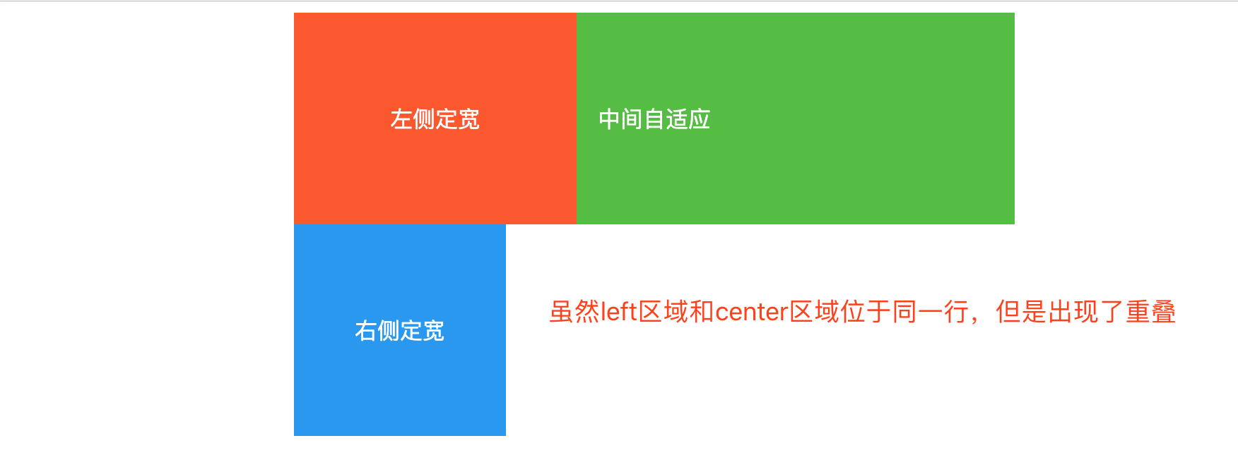
将left上移至center同行显示
- 设置margin-left:-100%;left上移到center一行,并且与center重叠
.left {
   margin-left: -100%;
}
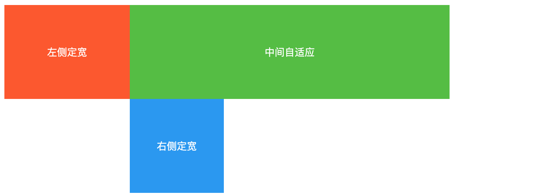
.left {
position: relative;
right: 200px;
}
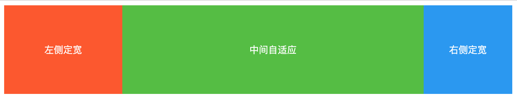
将right上移至center同行显示
- 设置margin-right:-150px;right上移到center一行,完成圣杯布局。此时改变窗口大小,中间区域会自适应变化。
.right {
   margin-right: -150px;
}
关键点
- center放在文档流前面以便于优先渲染
- 使用负外边距
- left使用相对定位
方法二:绝对定位+中间不给宽度
完整代码
<style type="text/css">
   .container {
      position: relative;
      text-align: center;
   }
   .container div {
      height: 150px;
      color: white;
      line-height: 150px;
   }
   .center {
      background-color: #50bf3c;
      margin-left: 200px;
      margin-right: 150px;
   }
   .left {
      width: 200px;
      background-color: #ff5722;
      position: absolute;
      top: 0px;
      left: 0px;
   }
   .right {
      width: 150px;
      background-color: #2196f3;
      position: absolute;
      top: 0px;
      right: 0px;
   }
</style>
<div class="container">
    <div class="center">中间自适应</div>
    <div class="left">左侧定宽</div>
    <div class="right">右侧定宽</div>
</div>
关键点
方法三:flex
HTML结构
<div class="container">
    <div class="center">中间自适应</div>
    <div class="left">左侧定宽</div>
    <div class="right">右侧定宽</div>
</div>
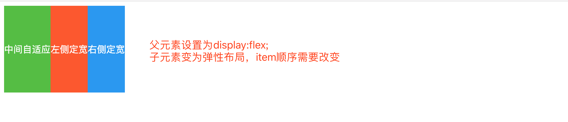
将container设置为弹性布局,display:flex;
- container变为了flex容器,子元素center、left、right自动变为了flex item
.container {
  display:flex;
}
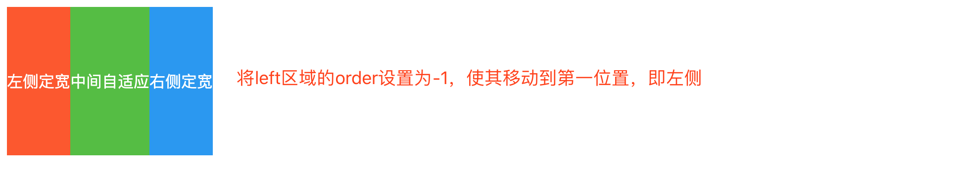
调整item的位置
- 通过设置item的order属性来调整位置
- order默认值为0,值越小item越靠前
.left {
  order: -1;
}
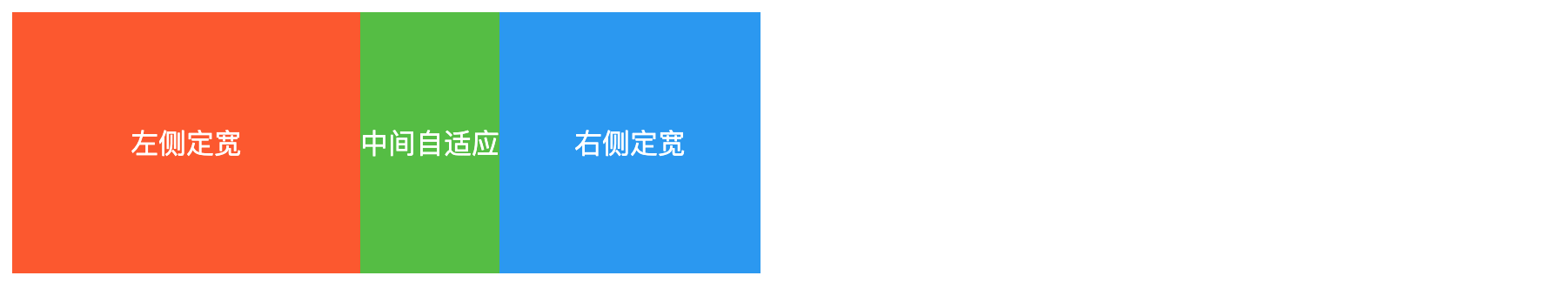
左右两侧定宽
.left {
  flex-basis: 200px;
}
.right {
  flex-basis: 150px;
}
center自动填充剩余空间
- 设置item的flex-grow属性为1,默认为0
.center {
  flex-grow:1;
}
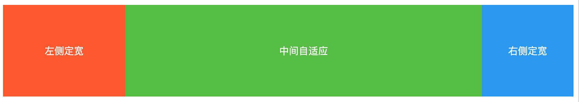
关键点
- 父元素设置为弹性盒子
- 左右两侧使用flex-basis设置元素本身大小
- 中间使用flex-grow设置占满剩余空间


