css画三角形
第一种
border:50px solid transparent;
width:0px;
border-left-color:red;
border-top-width:0px;
- 无用边框为透明
- 内部为0
- 有用边框为有色
- 顶部边框为0将两侧拉伸
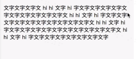
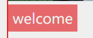
小代码块的实现方式
效果图:
 display: inline-block;
 padding:5px 5px;
 line-height:22px;
因为内联元素不能设置高度,所以先用 display: inline-block;将其变为块级元素,然后再用padding将宽高撑出来,满足宽高并且达到居中效果。
错误解法:
width:70px;
height:30px;
line-height:30px;
text-algin:center;
这样子写死高度会导致不能加字,很容易出bug。
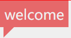
三角形与其他结合
效果图:
.userCard .welcome{
    background:#e6686a;
    color: #EFEFEF;
    display: inline-block;
    padding:5px 5px;
    position:relative;
}
.userCard .welcome .triangle{
    display: block;
    border:12px solid transparent;
    width:0px;
    border-left-color:#E6686A;
    border-top-width:0px;
    top:100%;
    left:4px;
    position:absolute;
}
- 依附元素absolute;被依附元素relative;
- 依附元素top:100%;
- 两者变为块级元素
大框小框div
如果大框中设置了max-width,那么就不要再加padding了,会撑宽。
解决方法:
在div中套div,小框div加padding
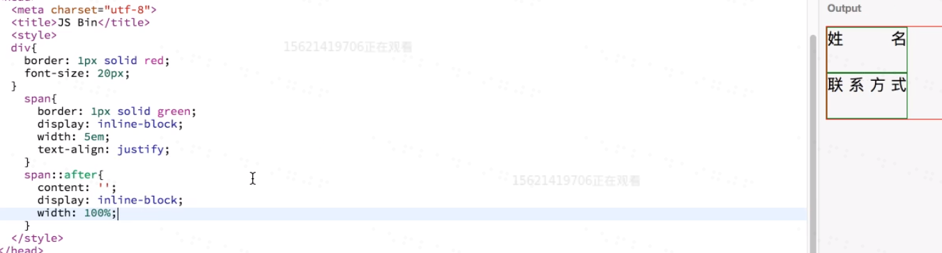
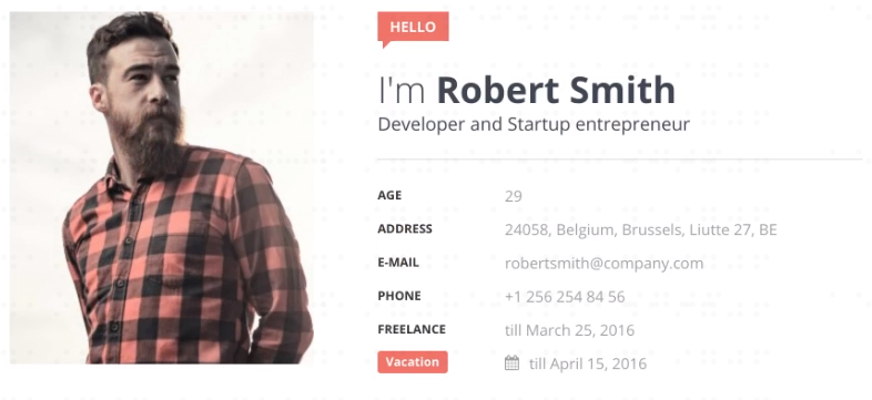
表格类问题
效果图:
.userCard .text>dl>dd{
    float:left;
    width:30%;
}
.userCard .text>dl>dt{
    float:left;
    width:70%;
}
解决思路:
由于dd,dt对导致在同一行,所以设定宽度百分比之和为100霸占一行。
字体样式 行间距问题
*{
    padding: 0px;
    margin:0px;
}
先消除html自带样式,然后用css的padding margin把他撑起来!
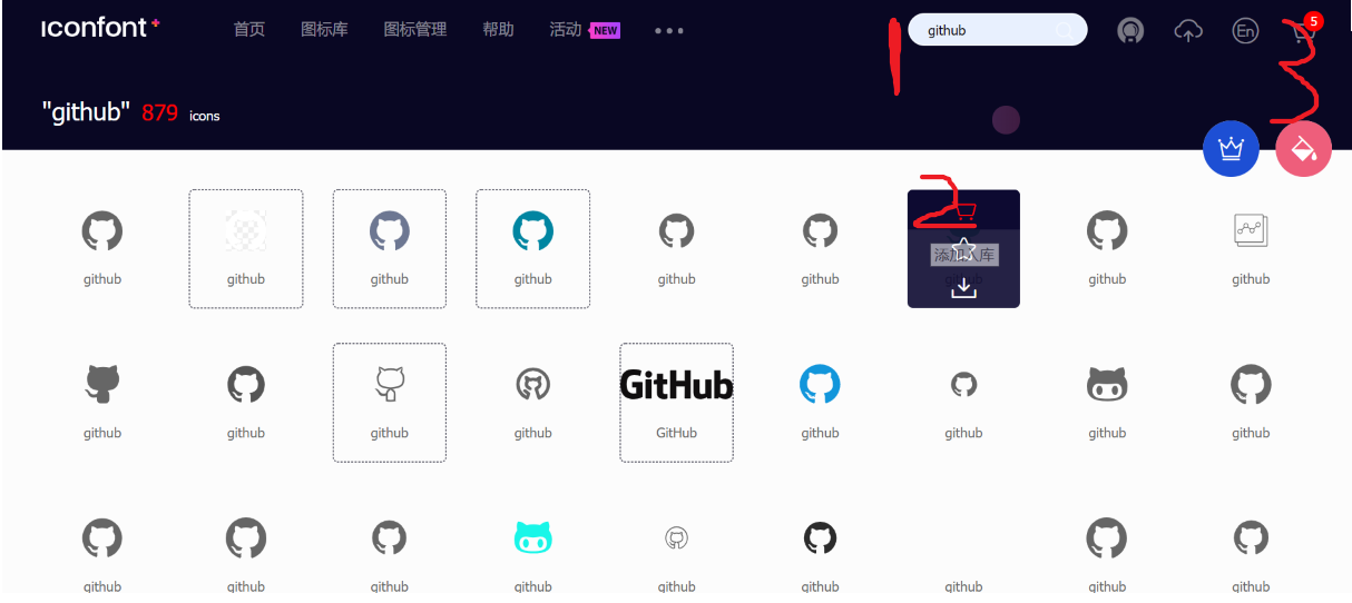
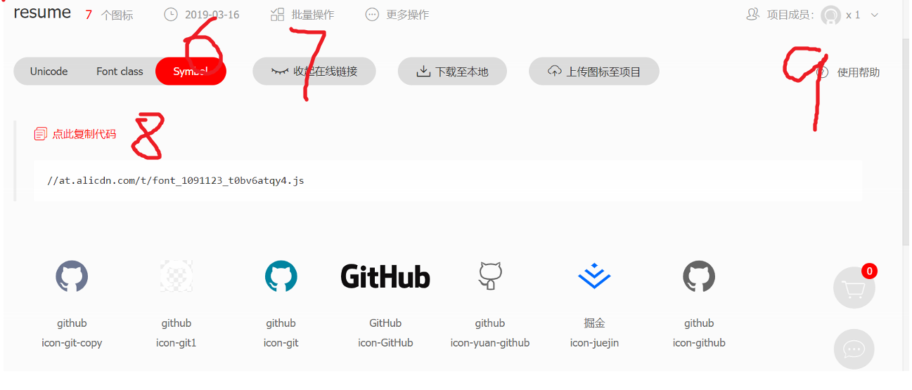
icon-font.cn的使用
- 搜索想要的图标并添加购物车(多加几个)
<script src="//at.alicdn.com/t/font_1091123_sfjj972p7qf.js">
</script>
- 加入通用css代码(引入一次就行)
<style type="text/css">
    .icon {
       width: 1em; height: 1em;
       vertical-align: -0.15em;
       fill: currentColor;
       overflow: hidden;
    }
</style>
- 挑选相应图标并获取类名,应用于页面
<svg class="icon" aria-hidden="true">
    <use xlink:href="#icon-xxx"></use>
</svg>
css画阴阳太极图
div{
  background: linear-gradient(rgba(255,255,255,1) 0%, rgba(255,255,255,1) 51%, rgba(255,255,255,1) 51%, rgba(0,0,0,1) 51%, rgba(0,0,0,1) 100%);
  width:200px;
  height:200px;
  border-radius:50%;
  position:relative;
  border:0.1px solid black;
}
div::before{
  content:"";
  display:block;
  width:20px;
  height:20px;
  background:white;
  position:absolute;
  border-radius:50%;
  top:50px;
  left:0px;
  border:40px solid black;
}
div::after{
  content:"";
  display:block;
  width:20px;
  height:20px;
  background:black;
  position:absolute;
  border-radius:50%;
  top:50px;
  right:0px;
  border:40px solid white;
}
效果图:
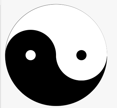
要点: 0. 使用::before ::after伪类省去div
- 伪类中使用content:"";让伪类显示出来
- 伪类自动变成block元素
居中方式
有宽度
使用margin-left:auto;margin-right:auto;
没宽度
谁变成了inline-block,就在谁的父元素上使用text-align:center居中。
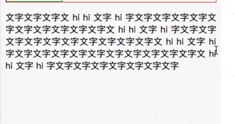
怎么对齐文字:姓名 联系方式
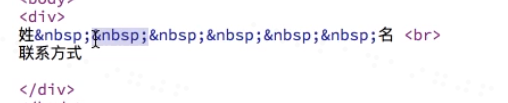
一般使用行内多行对齐属性:text-align:justify,效果图: