

flex布局:
flex布局中,一些属性定义会失效,如float、clear等
关于flex布局的属性:
主轴和交叉轴
在flex布局中,可以想象为在二维坐标系中,主轴为x轴,交叉轴为y轴,并且交叉轴和主轴呈90度,flex-direction可以设置主轴的方向
容器和项目:
在flex布局中有两种角色,容器可以理解为父元素,项目可以理解为子元素
容器:六个属性
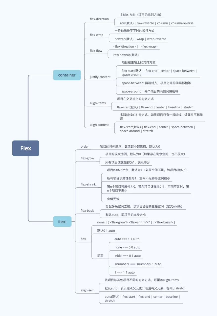
- flex-direction:决定主轴的方向
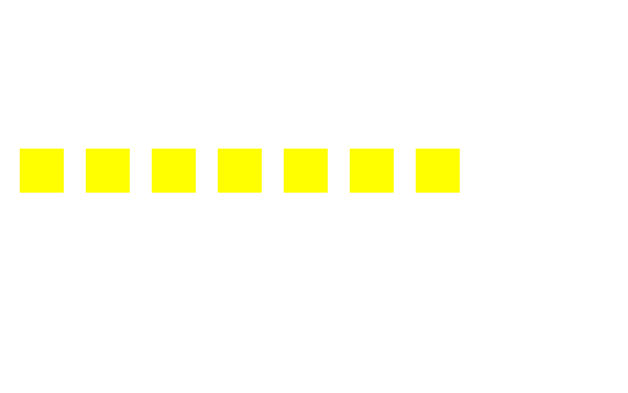
flex-direction:column
<!DOCTYPE html>
<html lang="en">
<head>
   <meta charset="UTF-8">
   <title>test</title>
   <style type="text/css">
       .container{
           display: flex;
           flex-direction: row;
       }
       .container>div{
           background-color: yellow;
           width: 40px;
           height: 40px;
           margin: 10px;
       }
   </style>
</head>
<body>
   <div class="container">
       <div></div>
       <div></div>
       <div></div>
       <div></div>
   </div>
</body>
</html>
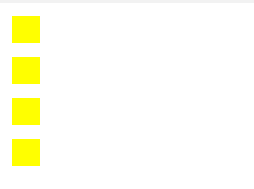
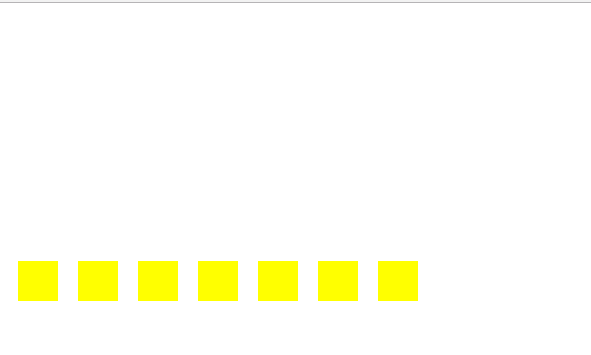
flex-direction:row(默认)
<!DOCTYPE html>
<html lang="en">
<head>
    <meta charset="UTF-8">
    <title>test</title>
    <style type="text/css">
        .container{
            display: flex;
            flex-direction: column;
        }
        .container>div{
            background-color: yellow;
            width: 40px;
            height: 40px;
            margin: 10px;
        }
    </style>
</head>
<body>
    <div class="container">
        <div></div>
        <div></div>
        <div></div>
        <div></div>
    </div>
</body>
</html>
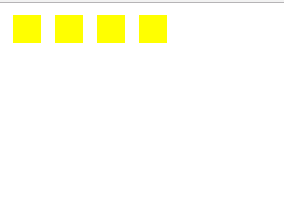
- flex-wrap:决定主轴里的项目是否换行
<!DOCTYPE html>
<html lang="en">
<head>
    <meta charset="UTF-8">
    <title>test</title>
    <style type="text/css">
        .container{
            display: flex;
            flex-direction: row;
            width: 250px;
            /*默认为flex-wrap:nowrap*/
            flex-wrap: wrap;
        }
        .container>div{
            background-color: yellow;
            width: 40px;
            height: 40px;
            margin: 10px;
        }
    </style>
</head>
<body>
    <div class="container">
        <div></div>
        <div></div>
        <div></div>
        <div></div>
        <div></div>
        <div></div>
        <div></div>
    </div>
</body>
</html>
- flex-flow:flex-direction和flex-wrap的集合
- align-items:项目的对齐方式(交叉轴上的对齐)
align-items:flex-end
<!DOCTYPE html>
<html lang="en">
<head>
    <meta charset="UTF-8">
    <title>test</title>
    <style type="text/css">
        .container{
            display: flex;
            flex-direction: row;
            width: 600px;
            height: 300px;
            /*默认为flex-wrap:nowrap*/
            flex-wrap: wrap;
            align-items: flex-end;
        }
        .container>div{
            background-color: yellow;
            width: 40px;
            height: 40px;
            margin: 10px;
        }
    </style>
</head>
<body>
    <div class="container">
        <div></div>
        <div></div>
        <div></div>
        <div></div>
        <div></div>
        <div></div>
        <div></div>
    </div>
</body>
</html>
align-items:center
<!DOCTYPE html>
<html lang="en">
<head>
    <meta charset="UTF-8">
    <title>test</title>
    <style type="text/css">
        .container{
            display: flex;
            flex-direction: row;
            width: 600px;
            height: 300px;
            /*默认为flex-wrap:nowrap*/
            flex-wrap: wrap;
            align-items: center;
        }
        .container>div{
            background-color: yellow;
            width: 40px;
            height: 40px;
            margin: 10px;
        }
    </style>
</head>
<body>
    <div class="container">
        <div></div>
        <div></div>
        <div></div>
        <div></div>
        <div></div>
        <div></div>
        <div></div>
    </div>
</body>
</html>
- justify-content:容器中项目的对齐方式(主轴轴上的对齐)
justify-content:flex-end
<!DOCTYPE html>
<html lang="en">
<head>
    <meta charset="UTF-8">
    <title>test</title>
    <style type="text/css">
        .container{
            display: flex;
            flex-direction: row;
            width: 600px;
            height: 300px;
            /*默认为flex-wrap:nowrap*/
            flex-wrap: wrap;
            align-items: center;
            outline: 1px solid black;
            justify-content: flex-end;
        }
        .container>div{
            background-color: yellow;
            width: 40px;
            height: 40px;
            margin: 10px;
        }
    </style>
</head>
<body>
<div class="container">
    <div></div><div></div> <div></div> <div></div> <div></div> <div></div> <div></div> <div></div> <div></div> <div></div> <div></div> <div></div> <div></div> <div></div> <div></div> <div></div> <div></div>
</div>
</body>
</html>
justify-content: center
<!DOCTYPE html>
<html lang="en">
<head>
    <meta charset="UTF-8">
    <title>test</title>
    <style type="text/css">
        .container{
            display: flex;
            flex-direction: row;
            width: 600px;
            height: 300px;
            /*默认为flex-wrap:nowrap*/
            flex-wrap: wrap;
            align-items: center;
            outline: 1px solid black;
            justify-content: center;
        }
        .container>div{
            background-color: yellow;
            width: 40px;
            height: 40px;
            margin: 10px;
        }
    </style>
</head>
<body>
<div class="container">
    <div></div><div></div> <div></div> <div></div> <div></div> <div></div> <div></div> <div></div> <div></div> <div></div> <div></div> <div></div> <div></div> <div></div> <div></div> <div></div> <div></div>
</div>
</body>
</html>
- align-content:多根轴线的对齐方式(一根轴线无效)
align-content: flex-end
<!DOCTYPE html>
<html lang="en">
<head>
    <meta charset="UTF-8">
    <title>test</title>
    <style type="text/css">
        .container{
            display: flex;
            flex-direction: row;
            width: 600px;
            height: 300px;
            /*默认为flex-wrap:nowrap*/
            flex-wrap: wrap;
            align-items: center;
            outline: 1px solid black;
            justify-content: center;
            align-content: flex-end;
        }
        .container>div{
            background-color: yellow;
            width: 40px;
            height: 40px;
            margin: 10px;
        }
    </style>
</head>
<body>
<div class="container">
    <div></div> <div></div> <div></div> <div></div> <div></div> <div></div> <div></div> <div></div> <div></div> <div></div> <div></div> <div></div>
</div>
</body>
</html>
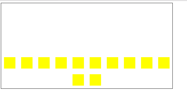
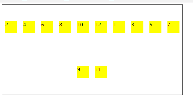
项目:六个属性
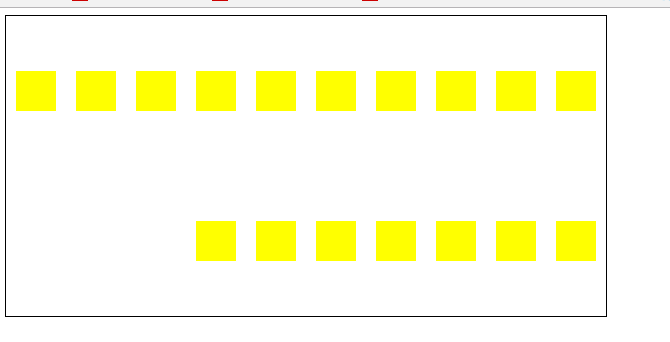
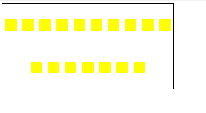
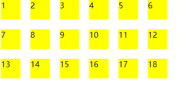
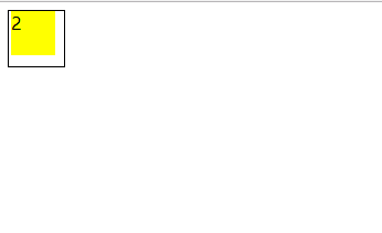
- order:排列顺序
先初始化一个页面如下:
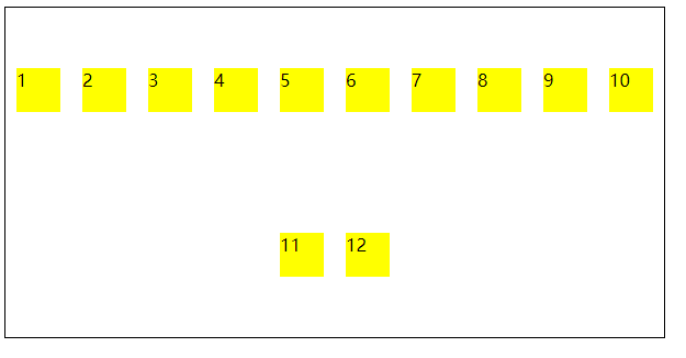
我们将偶数的div排到前面
<!DOCTYPE html>
<html lang="en">
<head>
    <meta charset="UTF-8">
    <title>test</title>
    <style type="text/css">
        .container{
            display: flex;
            flex-direction: row;
            width: 600px;
            height: 300px;
            /*默认为flex-wrap:nowrap*/
            flex-wrap: wrap;
            align-items: center;
            outline: 1px solid black;
            justify-content: center;
            /*align-content: flex-end;*/
        }
        .container>div{
            background-color: yellow;
            width: 40px;
            height: 40px;
            margin: 10px;
        }
        .container>div:nth-child(2n+1){
            order: 3;
        }
    </style>
</head>
<body>
<div class="container">
    <div>1</div> <div>2</div> <div>3</div> <div>4</div> <div>5</div> <div>6</div> <div>7</div> <div>8</div> <div>9</div> <div>10</div> <div>11</div> <div>12</div>
</div>
</body>
</html>
运行效果:
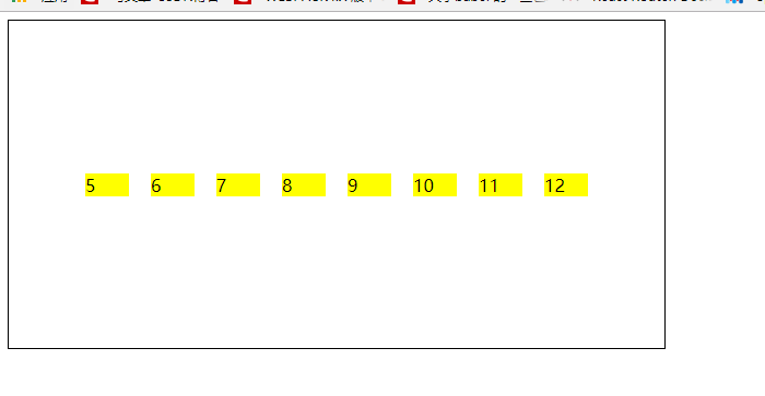
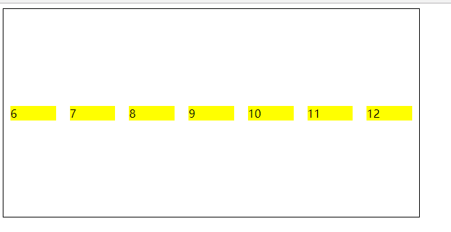
- flex-grow:有剩余空间,决定是否扩张(默认:0)
未占满一个主轴时:
<!DOCTYPE html>
<html lang="en">
<head>
    <meta charset="UTF-8">
    <title>test</title>
    <style type="text/css">
        .container{
            display: flex;
            flex-direction: row;
            width: 600px;
            height: 300px;
            /*默认为flex-wrap:nowrap*/
            flex-wrap: nowrap;
            align-items: center;
            outline: 1px solid black;
            justify-content: center;
            /*align-content: flex-end;*/
        }
        .container>div{
            background-color: yellow;
            flex-basis: 40px;
            margin: 10px;
            flex-grow: 1;
            /*flex-shrink: 0;*/
        }
    </style>
</head>
<body>
<div class="container">
     <div>6</div> <div>7</div> <div>8</div> <div>9</div> <div>10</div> <div>11</div> <div>12</div>
</div>
</body>
</html>
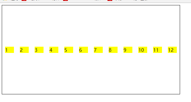
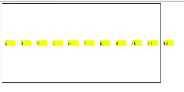
- flex-shrink:太满,决定是否缩小(默认:1)
未占满一个主轴时:
<!DOCTYPE html>
<html lang="en">
<head>
    <meta charset="UTF-8">
    <title>test</title>
    <style type="text/css">
        .container{
            display: flex;
            flex-direction: row;
            width: 600px;
            height: 300px;
            /*默认为flex-wrap:nowrap*/
            flex-wrap: nowrap;
            align-items: center;
            outline: 1px solid black;
            justify-content: center;
            /*align-content: flex-end;*/
        }
        .container>div{
            background-color: yellow;
            flex-basis: 40px;
            margin: 10px;
            /*flex-shrink: 0;*/
        }
    </style>
</head>
<body>
<div class="container">
    <div>1</div> <div>2</div> <div>3</div> <div>4</div> <div>5</div> <div>6</div> <div>7</div> <div>8</div> <div>9</div> <div>10</div> <div>11</div> <div>12</div>
</div>
</body>
</html>
<!DOCTYPE html>
<html lang="en">
<head>
    <meta charset="UTF-8">
    <title>test</title>
    <style type="text/css">
        .container{
            display: flex;
            flex-direction: row;
            width: 600px;
            height: 300px;
            /*默认为flex-wrap:nowrap*/
            flex-wrap: nowrap;
            align-items: center;
            outline: 1px solid black;
            justify-content: center;
            /*align-content: flex-end;*/
        }
        .container>div{
            background-color: yellow;
            flex-basis: 40px;
            margin: 10px;
            flex-shrink: 0;
        }
    </style>
</head>
<body>
<div class="container">
    <div>1</div> <div>2</div> <div>3</div> <div>4</div> <div>5</div> <div>6</div> <div>7</div> <div>8</div> <div>9</div> <div>10</div> <div>11</div> <div>12</div>
</div>
</body>
</html>
- flex-basis:项目的宽度
- flex:flex-grow,flex-shrink,flex-basis
- align-self:项目在交叉轴上的排列
关于雪碧图
雪碧图:background-position 响应式界面下:background-size:定位雪碧图的大小 给定一张图片,我们想象是很多图片的组合
<!DOCTYPE html>
<html lang="en">
<head>
    <meta charset="UTF-8">
    <title>test</title>
    <style type="text/css">
        .container{
            width: 50px;
            height: 50px;
            background-image: url("./test.png");
            background-position: -60px 0px;
            outline: 1px solid black;
        }
    </style>
</head>
<body>
    <div class="container"></div>
</body>
</html>
运行效果:
关于雪碧图的兼容: 1、兼容部分老的IE浏览器:可以使用background-position-x & background-position-y进行兼容 2、兼容部分老版浏览器:使用css hock技术
