

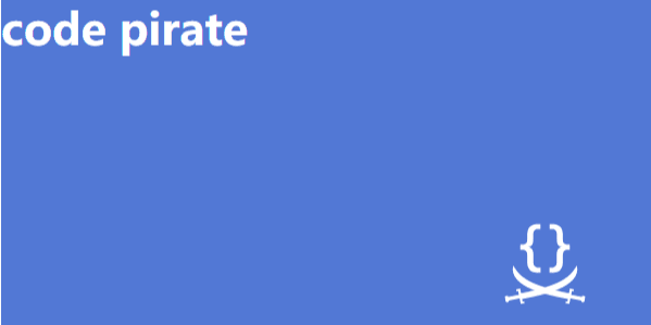
(1) background-position方案
我们可以利用这一属性指定背景图片距离任意角的偏移量。
    div {
            width: 30em;
            height: 15em;
            background: url(http://csssecrets.io/images/code-pirate.svg) no-repeat right bottom #5378d4;
            background-position: right 50px bottom 15px;
        }
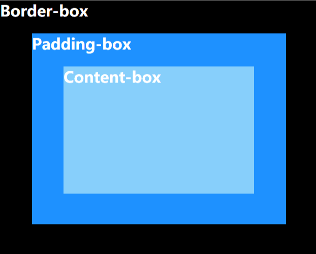
(2) background-origin方案
默认情况下,background-position 是以padding box 为准的,这样边框才不会遮住背景图片。因此,top left 默认指的是padding box 的左上角。
而属性background-origin能够改变这种行为,它的值有三种:border-box/padding-box/content-box。默认情况下,它的值是padding-box。我们使用content-box就可以实现想要的效果了。
盒模型如图:
div {
            width: 30em;
            height: 15em;
            background: url(http://csssecrets.io/images/code-pirate.svg) no-repeat right bottom #5378d4;
            background-origin: content-box;
            padding: 20px;
        }
实现的效果同方案(1)
(3) calc()方案
   div {
            width: 30em;
            height: 15em;
            background: url(http://csssecrets.io/images/code-pirate.svg) no-repeat right bottom #5378d4;
            background-position: calc(100% - 20px) calc(100% - 10px);
        }
注意:calc()函数内部的运算符两侧要加上一个空白符。
