

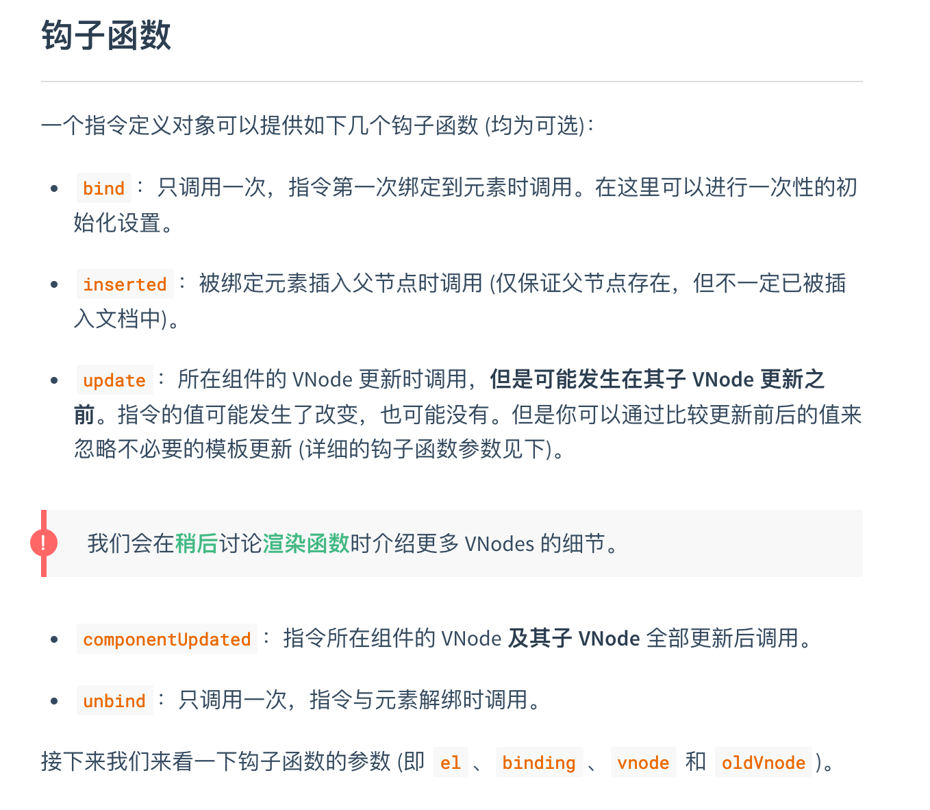
背景
因业务需要,需要一个toolTip替代原生的title。或者需要为文本增加超出范围显示...,鼠标划上去之后显示完整内容。使用的时候直接采用自定义指令的方式而不是组件的方式。
使用场景
1.指定消息,鼠标划上去之后显示自定义的消息
<div v-infotooltip="'提示消息:'+key">{{key}}</div>
2.超出范围显示...
<div v-infotooltip >超出范围显示...的示例</div>
目标
- 实现以上2个使用场景,
- 能够控制tooltip的显示方向
实现
- 目录结构
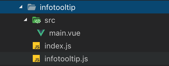
2.源码解析
main.vue
<template>
<transition :name="transition"
@after-leave="doDestroy"
>
    <div class="infotooltip-row-tip"
    :class="{
        'infotooltip-row-tip-top':placement=='top',
        'infotooltip-row-tip-left':placement=='left',
        'infotooltip-row-tip-right':placement=='right',
        'infotooltip-row-tip-bottom':placement=='bottom',
    }"
    v-show="showPopper"
    :id="tooltipId"
    ref="popper"
    >
        {{tooltipContent}}
    </div>

    <!-- ref需要,因为后面需要获取这个元素,id没什么用可以不要 -->

</transition>
</template>

<script>
import Popper from 'element-ui/lib/utils/vue-popper.js'
import { generateId } from 'element-ui/lib/utils/util.js';

export default {
    name: 'infotoolTip',
    props: {

        //动画名称,元素显示隐藏的时候的动画
        transition: {
            type: String,
            default: 'fade-in-linear'
        },

        //定位方向 left|top|right|bottom
        placement:{
            type:String,
            default:'left',
        },
        //poper的设置,具体可参考popper.js
        popperOptions: {
            default () {
                return {
                    boundariesPadding: 10,
                    gpuAcceleration: false
                };
            }
        },
    },
    mixins: [Popper],
    data() {
        return {
            referenceElm: null,     //定位元素
            tooltipContent: '',     //显示内容
        }
    },
    computed: {
        //生产动态的元素ID
        tooltipId() {
            return `el-popover-${generateId()}`;
        }
    },
    beforeCreate() {

    },
    mounted() {
        this.$nextTick(() => {
            //赋值 popperElm,
            this.popperElm = this.$refs.popper;
        })
    },
    methods: {
        //显示tooltip
        handleMouseEnter() {
            //这句要加上,执行了doDestroy后方能够更新referenceElm,不然referenceElm这个不更新
            if(this.popperJS){
                this.doDestroy();
            }
            this.showPopper = true;
        },
        //隐藏tooltip
        handleMouseLeave() {
            this.showPopper = false;
        },
    },
    watch: {}
}
</script>

<style lang="less" scoped>
.infotooltip-row-tip {
    position: fixed;
    width: auto;
    height: auto;
    padding: 5px 10px;
    display: flex;
    align-items: center;
    justify-content: center;
    padding: 10px;
    z-index: 6000 !important;
    font-size: 12px;
    line-height: 1.2;
    min-width: 10px;
    background: #303133;
    color: #fff;
    border-radius: 4px;
}

.infotooltip-row-tip:after {
    content: '';
    display: block;
    width: 0;
    height: 0;
    position: absolute;
}
.infotooltip-row-tip-top:after{
    border-left: 8px solid transparent;
    border-right: 8px solid transparent;
    border-top: 8px solid #303133;
    bottom: -7px;
}

.infotooltip-row-tip-left:after{
    border-top: 8px solid transparent;
    border-bottom: 8px solid transparent;
    border-left: 8px solid #303133;
    right: -7px;
}

.infotooltip-row-tip-right:after{
    border-top: 8px solid transparent;
    border-bottom: 8px solid transparent;
    border-right: 8px solid #303133;
    left: -7px;
}

.infotooltip-row-tip-bottom:after{
    border-left: 8px solid transparent;
    border-right: 8px solid transparent;
    border-bottom: 8px solid #303133;
    top: -7px;
}
</style>
main.vue中主要使用了element-ui中vue-popper.js与util.js,引入方式参见上述代码。
将main.vue重新封装一下就可以作为一个独立的tootip进行显示比如:
注:在使用过程中遇到一个问题,如果直接从node_modules中引入element的相关组件使用,在IE浏览器中会报错。比如扩展运算符不支持,缺少;等错误。后来找到了一个解决方法是将要引入的文件放到项目的其他目录引入
infotooltip.js
import Vue from 'vue'
import infoTooltip from './src/main.vue'

const infotooltip = Vue.extend(infoTooltip)

let vtipInstance = null;

export default function tip () {
  // 如果已经存在 tip 的实例,直接更新属性值
  if (vtipInstance) {
    return vtipInstance
  }
  // 否则创建一个 tip 实例
  vtipInstance = new infotooltip({
        el: document.createElement('div')
    });

  return vtipInstance    //返回这个实例
}
index.js
import Tip from './infotooltip.js'
import {addClass} from 'element-ui/lib/utils/dom.js'
//清空事件
function clearEvent (el) {
if (el._tipHandler) {
el.removeEventListener('mouseenter', el._tipHandler)
}
if (el._tipMouseleaveHandler) {
el.removeEventListener('mouseleave', el._tipMouseleaveHandler)
}
}
export default {
install (Vue, options) {
// tip 的展示方向
const allPlacements = ['top', 'right', 'bottom', 'left'];
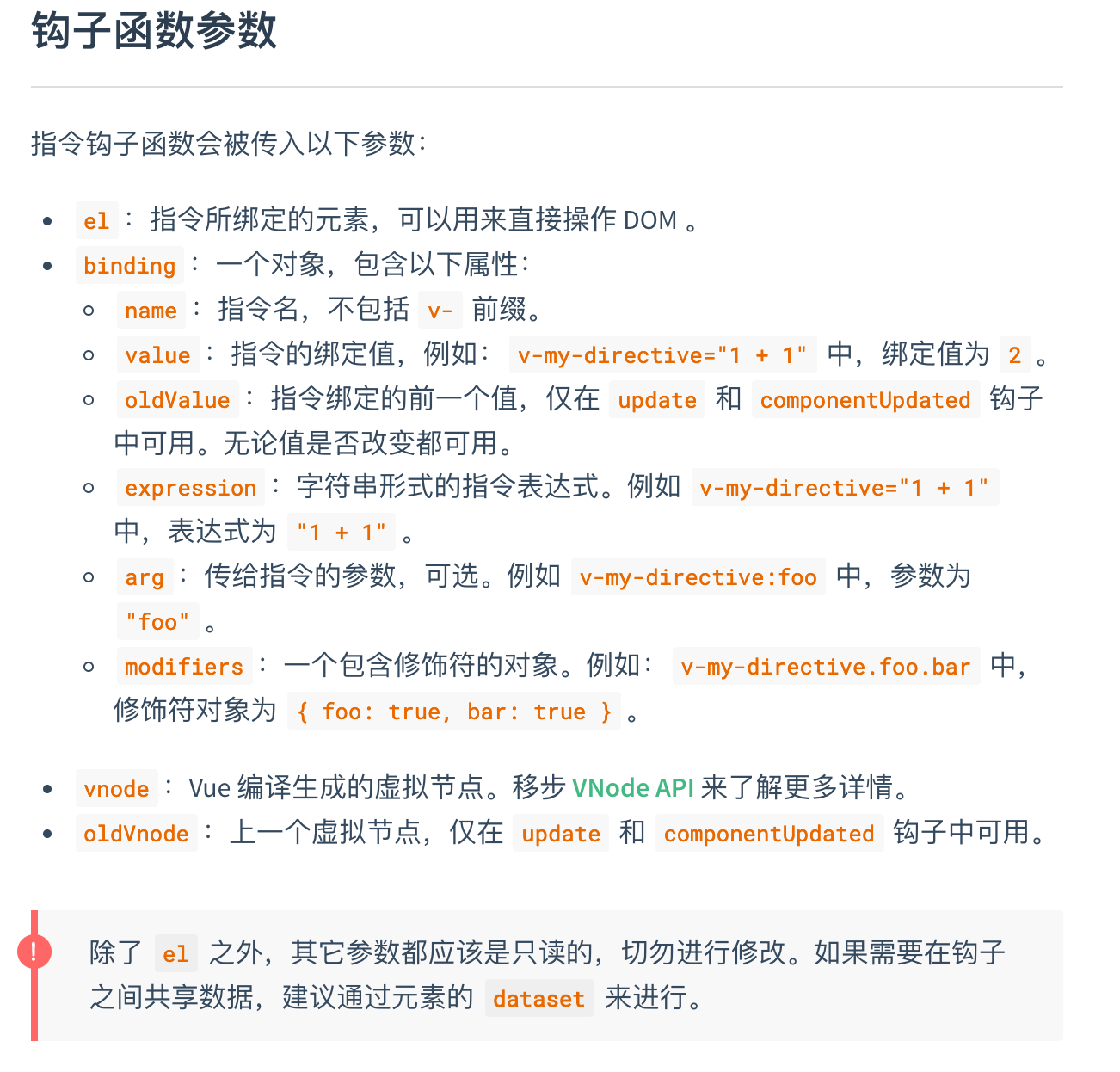
Vue.directive('infotooltip', {
bind (el, binding) {
clearEvent(el);
el._tipInstance=Tip();
el._binding=binding;
el._tipHandler=function(e){
e.stopPropagation();
const tooltip=el._tipInstance;
const binding=el._binding;
const cellChild = e.target;
const limitPlacementQueue = allPlacements.filter(placement => binding.modifiers[placement]);
//设置显示位置,默认为top
tooltip.placement = limitPlacementQueue.length? limitPlacementQueue[0] : 'top';
//如果指定了tooltip要显示的内容
if(binding.value){
tooltip.tooltipContent=binding.value; //显示内容及为设置的内容
tooltip.referenceElm = cellChild; //定位元素
tooltip.handleMouseEnter(); //显示tooltip
return
}
//判断是否有...
if (cellChild.scrollWidth > cellChild.offsetWidth && tooltip) {
tooltip.tooltipContent =cellChild.textContent.replace(/[' ']/g, ''); //替换显示文本中的空格
tooltip.referenceElm = cellChild; //定位元素
tooltip.handleMouseEnter(); //设置显示
}
}
//鼠标移除执行的函数
el._tipMouseleaveHandler=function(e){
e.stopPropagation();
if(el._tipInstance){
el._tipInstance.handleMouseLeave(); //隐藏元素
}
}
//添加鼠标移上,移除事件
el.addEventListener('mouseover',el._tipHandler);
el.addEventListener('mouseout',el._tipMouseleaveHandler)
},
inserted(el,binding){
//如果没有默认的value值,为原元素增加超出显示...的样式
if(!binding.value){
addClass(el,'g-text-ellipsis');
}
},
update (el, binding) {
//如果传的value值是一个变量,在更新的时候也会及时更新
el._binding=binding;
},
unbind (el) {
//在卸载的时候注销相关事件
const instance = el._tipInstance;
instance.handleMouseLeave();
if (instance && instance.doDestroy) {
instance.doDestroy();
}
clearEvent(el)
}
})
}
}
vue 自定义指令 参考:vue自定义指令
全局的class样式g-text-ellipsis
.g-text-ellipsis {
  overflow: hidden;
  text-overflow: ellipsis;
  white-space: nowrap;
}
注册自定义指令
// 在index.js中
import Vue from 'vue';
import infoTooltip from './infotooltip/index.js'

Vue.use(infoTooltip);
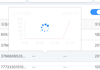
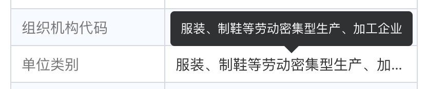
实现效果
    <span v-infotooltip >服装、制鞋等劳动密集型生产、加工企业</span>

    <span v-infotooltip.top >服装、制鞋等劳动密集型生产、加工企业</span>
<!--省略了其他代码,只保留了主要代码-->
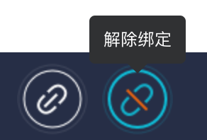
<div v-infotooltip="'解除绑定'"></div>
