

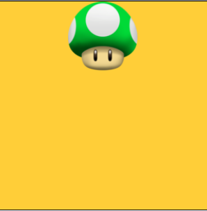
1.水平居中: margin: 0 auto;
水平居中最常用的一种方法,作用于子元素
        <style>
		* {
			padding: 0;
			margin: 0;
		}

		.box {
			width: 300px;
			height: 300px;
			background: #ffce38;
			border: 1px solid black;
			position: relative;
		}

		img {
			display: block;
			width: 100px;
			height: 100px;
			margin: 0 auto;
		}
	</style>

	<body>
		<div class="box">
			<img src="img/head.png" />
		</div>
	</body>
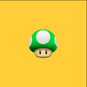
2.水平居中: text-align:center
作用于父元素,对display:block不生效
        <style>
		* {
			padding: 0;
			margin: 0;
		}

		.box {
			width: 300px;
			height: 300px;
			background: #ffce38;
			border: 1px solid black;
			text-align: center;
		}

		img {
			width: 100px;
			height: 100px;
		}
	</style>

	<body>
		<div class="box">
			<img src="img/head.png" />
		</div>
	</body>

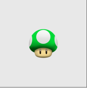
3.垂直水平居中:用position: absolute 与margin
此方法需要知道垂直居中元素的宽高,left跟top都设置成50%,然后margin-top与margin-left分别设置成宽高一半的负值
        <style>
		* {
			padding: 0;
			margin: 0;
		}

		.box {
			width: 300px;
			height: 300px;
			background: #ffce38;
			border: 1px solid black;
			position: relative;
		}

		img {
			width: 100px;
			height: 100px;
			position: absolute;
			left: 50%;
			top: 50%;
			margin-top: -50px;
			margin-left: -50px;
		}
	</style>

	<body>
		<div class="box">
			<img src="img/head.png" />
		</div>
	</body>
4.垂直水平居中:还是用absolute与margin
与上个方法相比,优点是无需知道元素的宽高
        <style>
		* {
			padding: 0;
			margin: 0;
		}

		.box {
			width: 300px;
			height: 300px;
			background: #ffce38;
			border: 1px solid black;
			position: relative;
		}

		img {
			width: 100px;
			height: 100px;
			position: absolute;
			left: 0;
			top: 0;
			right: 0;
			bottom: 0;
			margin: auto;
		}
	</style>

	<body>
		<div class="box">
			<img src="img/head.png" />
		</div>
	</body>

5.垂直水平居中:用absolute与transform
transform属性可以对元素进行2D/3D转换,旋转,移动,缩放,倾斜
设置left、top为50%后,然后利用transform的translate属性进行位移
        <style>
		* {
			padding: 0;
			margin: 0;
		}

		.box {
			width: 300px;
			height: 300px;
			background: #e8e8e8;
			border: 1px solid black;
			position: relative;
		}

		img {
			width: 100px;
			height: 100px;
			position: absolute;
			left: 50%;
			top: 50%;
			transform: translate(-50%, -50%);
		}
	</style>

	<body>
		<div class="box">
			<img src="img/head.png" />
		</div>
	</body>
6.垂直水平居中:display:table-cell
display:table-cell是父元素变成表格样式,然后再用表格样式居中
vertical-align设置元素的垂直对齐方式,为middle 就是把子元素放在父元素中部
        <style>
		* {
			padding: 0;
			margin: 0;
		}

		.box {
			display: table-cell;
			width: 300px;
			height: 300px;
			background: #e8e8e8;
			border: 1px solid black;
			text-align: center;
			vertical-align: middle;
		}

		img {
			width: 100px;
			height: 100px;
		}
	</style>

	<body>
		<div class="box">
			<img src="img/head.png" />
		</div>
	</body>

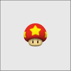
7.垂直水平居中:display: flex
把父元素设置为display:flex
在此前提下,align-items属性用于设置子元素在父元素纵轴上的对齐方式
justify-content属性用于设置子元素在父元素横轴上的对齐方式
此种方法在移动端可以很好使用,在PC上有兼容性问题
        <style>
		* {
			padding: 0;
			margin: 0;
		}

		.box {

			width: 300px;
			height: 300px;
			background: #e8e8e8;
			border: 1px solid black;
			display: flex;
			align-items: center;
			justify-content: center;
		}

		img {
			width: 100px;
			height: 100px;
		}
	</style>

	<body>
		<div class="box">
			<img src="img/mogu2.png" />
		</div>
	</body>
