

垂直居中是布局中十分常见的效果之一,为实现良好的兼容性,PC端实现垂直居中的方法一般是通过绝对定位,table-cell,负边距等方法。有了css3,针对移动端的垂直居中就更加多样化;在面试中也是经常问到的考点,现在我们一起来复习一下这些垂直居中的方法;
方法一 :table-cell
<style>
    html,body{
        width: 100%;
        height: 100%;
    }
    .parent{
        width: 500px;
        height: 500px;
        background: red;
        display: table-cell;
        text-align: center;
        vertical-align: middle;
    }

</style>
<body>
    <div class="parent">
        <span class="child">我是内容</span>
    </div>
</body>
此方法Internet Explorer 8 (以及更高版本)以及主流浏览器均支持
方法二:display:flex;
.parent{
    display: flex;
    justify-content: center;
    align-content: center;
}
对于PC端,一般chrome(测试版本:49.0.2623.110 m)和火狐(测试版本:49.0.2)都能很好地支持。ie不支持,显示的是顺序排列下来的宽度100%的模块。
对于移动端:
(1)上述代码iOS的原生safari浏览器是支持的;UC浏览器支持的很好;微信浏览器不支持(测试机型:苹果4s)
(2)安卓的原生浏览器不支持,能够正常显示模块,文档流依次排列;UC浏览器不支持,显示为空白;微信浏览器不支持(测试机型:华为荣耀6 Plus,Android4.4.2)
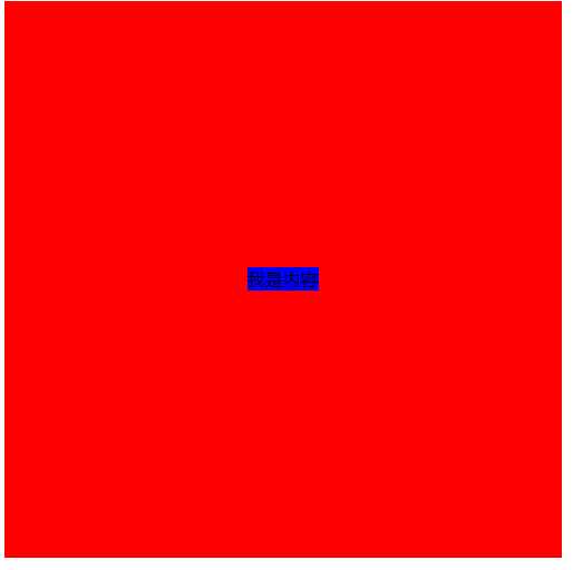
方法三:定位和负边距
.parent{
    width: 100%;
    height: 100%;
    background: red;
    position: relative;
}
.child{
    background: blue;
    position: absolute;
    left: 50%;
    top: 50%;
    width: 100px;
    height: 100px;
    margin-left: -50px;
    margin-top: -50px;
}
此方法对子节点没固定宽高不适用;兼容性较好
方法四: 定位和transform
.parent{
     width: 100%;
     height: 100%;
     background: red;
     position: relative;
 }
.child{
    background: blue;
    position: absolute;
    left: 50%;
    top: 50%;
    transform: translate(-50%,-50%);
}
此方法适用子节点没有固定宽高;
ie 10、Firefox、Opera 、Chrome支持 transform 属性。
Internet Explorer 9 支持替代的 -ms-transform 属性(仅适用于 2D 转换)。
Safari 和 Chrome 支持替代的 -webkit-transform 属性(3D 和 2D 转换)。
所以再用这个方法的时候最好是加上浏览器前缀
方法五 :绝对定位和0
.parent{
     width: 100%;
     height: 100%;
     background: red;
     position: relative;
 }
.child{
    height: 50%;
    width: 50%;
    background: blue;
    margin: auto;
    position: absolute;
    top: 0; left: 0; bottom: 0; right: 0;
}
此方法要求子节点有宽高,兼容性较好
方法六:display:flex和margin:auto
.parent{
     width: 100%;
     height: 100%;
     background: red;
    display: flex;
 }
.child{
    background: blue;
    margin: auto;
}
此方法兼容性跟方法二一样
方法七:display:-webkit-box
.parent{
     width: 100%;
     height: 100%;
     background: red;
    display: -webkit-box;
    -webkit-box-pack:center;
    -webkit-box-align:center;
    -webkit-box-orient: vertical;
    text-align: center;
 }
.child{
    background: blue;
}关于display:-webkit-box可以参考这篇文章
也可以参考这篇文章
欢迎大家补充指正!!
