

Color management for the web: the challenges from iPhone to Chrome
Latest trends and best practices for optimum image and video colors in web and ecommerce workflows

During the last world football cup, few people knew that only the flags of Argentina and France out of the top 10 teams could be accurately displayed on a standard HDTV. All the remaining flags colors were clearly out of gamut. That is, standard displays were not capable of reproducing the colors properly. Only those fans using wide gamut sets could see their colors in a 4K HDR broadcast.
As for a web workflow, it is much more involved than the display properties. Textures, saturation, hue or brightness may be far more important in other industries than in football — just think of fashion or the art imagery in ecommerce. In such cases, clean color management is key to deploying healthy and reliable image and video processing and optimization pipelines.
However, color management in ecommerce and in general in web workflows may unfold as a tricky issue. My recent experience with complex ecommerce teams involving photographers, retouchers and devops to debug and deploy image and video optimization solutions only reinforces this idea.
In this article, I shortly revise the basic concepts involved in color management, the best practices, and the challenges posed by the latest trends in display technology.
Color in the human eye
Humans with healthy color vision have three types of color detectors in the retina. Each of these types of detectors respond with different strengths to spectral colors, from red to violet. As a result, any physical color that we perceive can be represented as the combination of three chromatic primaries.
This fact allowed us — nearly 90 years ago — to define the first colorimetry standard to convert the physical magnitudes of light into a numeric representation uniquely related to colors. It set the basis to accurately represent any color (of light reaching the eye) by a simple array of three numbers.
Cameras and displays
Digital cameras and displays were designed to convey images of scenes that a human eye is able to see as if it were right there looking at them. So, cameras capture a trichromatic representation of the scene and code it in a digital file.
To do this, cameras simply :) have three types of light detectors (R, G, and B) like our retina has. Likewise, displays transform digital values in trichromatic signals that drive the generation of light to recreate the image stored in a digital file. To do it, displays simply :) have three types of light emitters (R, G and B).
It seems easy: The camera mimics the eye and the display projects light to mimic the scene, finally conveying it to the eye, anytime, anywhere.
But there are…
Some fundamental problems
Some related to the physics and some related to perception.
Need to calibrate
Just to start with, the spectral sensitivities of the three detectors of a camera sensor are different — very different indeed — from our eye’s light detectors (our eye’s detectors are not R, G, and B). Moreover, different camera sensors exhibit quite different behaviors (their R, G, and B are different). Color perception is clearly non-linear with physical magnitudes like the intensity of light. But sensors are typically linear with light intensity.
In the end, this means that to provide accurate color representations, cameras should be calibrated. Calibration is done by shooting an image of a pattern of colors. A color profile is then created that transforms the sensor response into a standard representation of color. But this should be done for different lighting.
Put in simple words, if we seek true color fidelity we would need to calibrate to correct color for each new scene! And any slight change of lighting means that the scene has changed as well. Fortunately, depending on the specific need of accuracy and the flexibility of the workflow, the requirements of calibration can be relaxed.
Something similar happens to displays, but the other way. They translate the colors coded within image files into light emitted. Slight changes in the amount of light emitted have an impact on the color effectively displayed.
That’s why professional displays need to be calibrated from time to time. The light emitted for some primaries is checked and a display color profile is created. This profile is used to transform the stored pixel values to actual light with the intended color. Needless to say, user displays are not calibrated, but they usually have a factory color profile instead.
We should acknowledge that current LED technology has greatly limited the variation of color properties among different units of the same display model and also in the same display through time.
Still… perception tricks
If all this were not enough, our brain excels in assuring color constancy under different lighting conditions. To do it, a variety of mechanisms are constantly adjusting perception in order to match the expected color based on the scene context. This is done regardless true values of the physical color. You may pick the digital RGB values in A and B in this classic illusion (check the original here, since Medium alters the image).
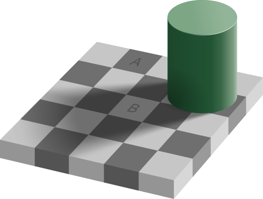
They are exactly the same: The display sends the same light from each of them. Even after knowing so, you will see A darker than B. I see it as I’m writing this. Such a tricky perception is a powerful reason for many photographers to adjust colors by hand rather than using a calibrated scene reference.
Color management
However, things may still get worse, much worse. At this point, we should have noticed that speaking about color with the same language is important if we want to keep consistent. To accomplish this need, we should manage color. In other words, our software should be color managed. A failure to manage color in a web workflow will undermine the consistency of the user experience.
With this aim, different color spaces have been developed. Each color space aims to support a use case in the best possible way. Three examples of use cases are:
- average display technology
- printing of photos
- 4K HDR video and cinema
Each color space has an associated color profile to interpret the stored RGB values in a file. There are many handy tools out there to check the color space of an image. For instance, the inspector tool of Preview in Mac.
