

Charting the waters (pt. 2): a comparison of JavaScript charting libraries
A deep dive into D3.js, Dygraphs, Chart.js, and Google Charts

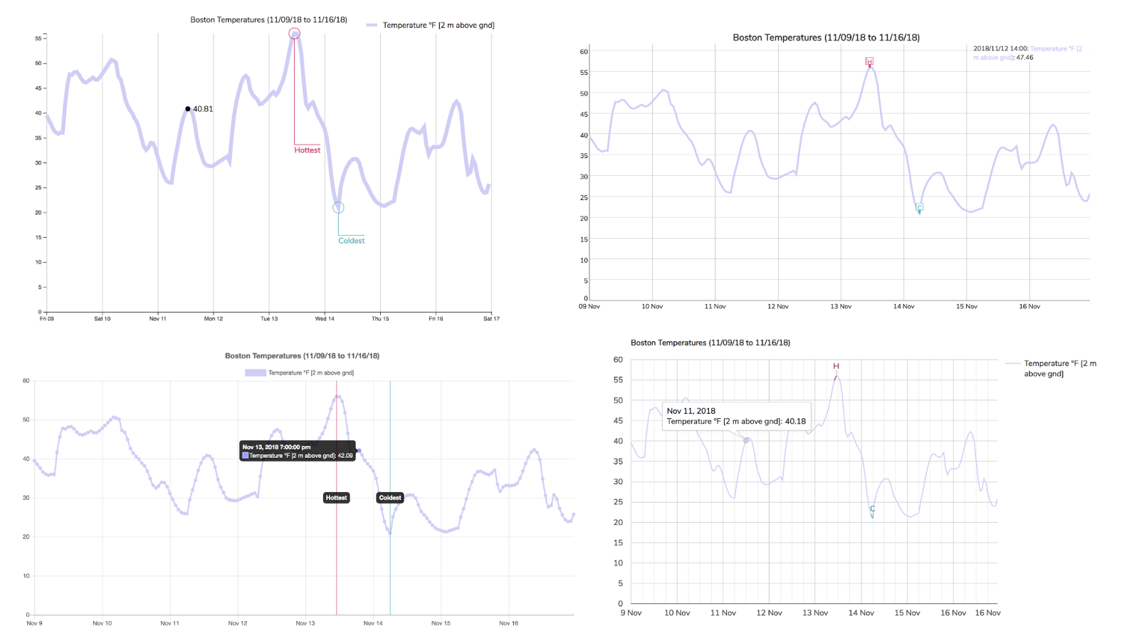
The code for the charts I created in the header image is up on GitHub.
When I began creating charts and visualizing data, the only things I knew were “Consider Canvas for large datasets” and “D3 is magic”. I had no idea that there existed an entire ecosystem of charting libraries. These libraries are free, available, and complete with examples and documentation.
More importantly, each library has its own pros and cons with regards to the variety of charts, learning curve, level of customization, and out-of-the-box interactivity. So how does one decide?
I’ll compare a few popular JavaScript charting libraries in this article, specifically D3.js, Dygraphs, Chart.js, and Google Charts. Expect to learn how to create a JavaScript chart, a high-level comparison across libraries of the aforementioned factors (variety of charts, customization, etc.), and the use case I perceive to be best suited to each charting library.
But first, a quick introduction to why visualizing data is becoming increasingly important. You’re welcome to skip to the side-by-side comparison (Ctrl+F “Let’s compare!”).
