

什么是BFC
BFC(Block formatting context)直译为"块级格式化上下文"。它规定了内部的Block-level Box如何布局,并且与这个区域外部毫不相干。 简单来说,BFC就是用来格式化块级盒子的。
通俗一点的方式解释:
BFC 可以简单的理解为某个元素的一个 CSS 属性,只不过这个属性不能被开发者显式的修改,拥有这个属性的元素对内部元素和外部元素会表现出一些特性,这就是BFC。
参考:[布局概念] 关于CSS-BFC深入理解
如何触发BFC
满足下列条件之一就可触发BFC
- 根元素,即HTML元素
- float的值不为none
- overflow的值不为visible
- display的值为inline-block、table-cell、table-caption
- position的值为absolute或fixed
BFC的使用场景
浮动
先了解一下常见的浮动情况
- 正常情况下的显示
<style>
    #test1{
        height: 100px;
        width: 100px;
        background-color: red;
    }
    #test2{
        height: 120px;
        width: 120px;
        background-color: blue;
    }
</style>

<div id="root">
    <div id="test1"></div>
    <div id="test2"></div>
</div>
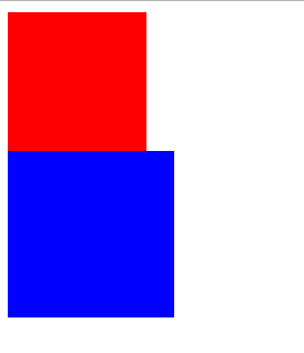
因为两个都是块级元素,各自占满一行
如果设置了盒子的宽度,剩下的就是来补满。如果没有设置盒子宽度,盒子将占满一行。
<style>
    #root{
            border: 2px solid black;
            overflow: hidden;
        }
    #test1{
            height: 100px;
            background-color: red;
        }
</style>

<div id="root">
        <div id="test1"></div>
</div>
- 浮动情况下的显示
<style>
        #test1{
            height: 100px;
            width: 100px;
            background-color: red;
            float: left;
        }
        #test2{
            height: 120px;
            width: 120px;
            background-color: blue;
        }
</style>

<div id="root">
        <div id="test1"></div>
        <div id="test2"></div>
</div>
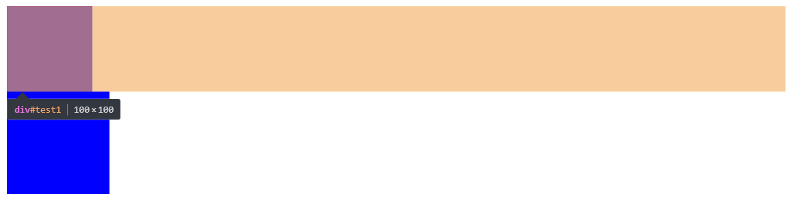
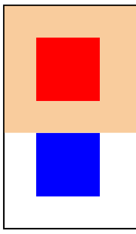
红色块浮动,脱离了文档流,上升到了浮动流(浮动流的顶部是文档流中元素的底部)。因为当前文档流没有内容了,蓝色块就成为了文档流第一个内容,取代了原来红色块的位置。
如果改一下相对位置
<div id="root">
        <div id="test1"></div>
        <div id="test2"></div>
</div>
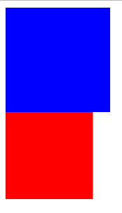
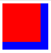
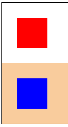
虽然浮动,但是上面被文档流中的蓝色块顶住了
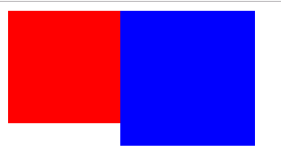
避免覆盖
只要将蓝色块设置为BFC,那么就不会被红色块覆盖了
BFC的区域不会与float box重叠
<style>
        #test1{
            height: 100px;
            width: 100px;
            background-color: red;
            float: left;
        }
        #test2{
            height: 120px;
            width: 120px;
            background-color: blue;
            overflow: hidden;
        }
    </style>

    <div id="root">
        <div id="test1"></div>
        <div id="test2"></div>
    </div>
清除浮动
<style>
        #root{
            border: 2px solid black;
        }
        #test1{
            height: 100px;
            width: 100px;
            background-color: red;
            float: left;
        }
    </style>

    <div id="root">
        <div id="test1"></div>
    </div>
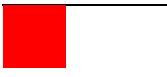
父元素在计算高度的时候,不会计算浮动流的元素,所以父元素没有被子元素撑开。只要为父元素设置BFC即可。
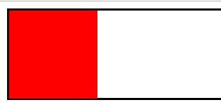
计算BFC的高度时,浮动元素也参与计算
<style>
        #root{
            border: 2px solid black;
            overflow: hidden;
        }
        #test1{
            height: 100px;
            width: 100px;
            background-color: red;
            float: left;
        }
    </style>

    <div id="root">
        <div id="test1"></div>
    </div>
避免margin重叠
<style>
        #root{
            border: 2px solid black;
            overflow: hidden;
        }
        #test1{
            height: 100px;
            width: 100px;
            background-color: red;
            margin: 50px;

        }
        #test2{
            height: 100px;
            width: 100px;
            background-color: blue;
            margin: 50px;
        }
    </style>

    <div id="root">
        <div id="test1"></div>
        <div id="test2"></div>
    </div>
红色块和蓝色块四周的margin都是50px,但是它们接壤的部分,也只是50px,我们只要让它们属于不同的BFC即可。(注意:直接为它们设置BFC是无效的)
属于同一个BFC的两个相邻Box的margin会发生重叠
<style>
        #root{
            border: 2px solid black;
        }
        #test1{
            height: 100px;
            width: 100px;
            background-color: red;
            margin: 50px;
        }
        #test2{
            height: 100px;
            width: 100px;
            background-color: blue;
            margin: 50px;
        }
    </style>

    <div id="root">
        <div style="overflow:hidden">
            <div id="test1"></div>
        </div>
        <div style="overflow:hidden">
            <div id="test2"></div>
        </div>
    </div>
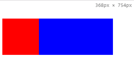
两栏自适应
如果想实现左边定宽,右边自适应的布局,可以使用BFC
BFC的区域不会与float box重叠
BFC不会和浮动元素重叠,所以只要右边是BFC,且没有设定宽度即可。因为它会在不和浮动元素重叠的情况下,占满一行
<style>
        #test1{
            height: 100px;
            width: 100px;
            background-color: red;
            float: left;
        }
        #test2{
            height: 100px;
            background-color: blue;
            margin: 50px;
            overflow: hidden;
        }
    </style>

    <div id="root">
        <div id="test1"></div>
        <div id="test2"></div>
    </div>
三栏自适应
<style>

        #test1{
            height: 100px;
            width: 100px;
            background-color: red;
            float: left;
        }
        #test2{
            height: 100px;
            background-color: blue;
            margin: 50px;
            overflow: hidden;
        }
        #test3{
            height: 100px;
            width: 100px;
            background-color: green;
            float: right;
        }
    </style>

    <div id="root">
        <div id="test1"></div>
        <div id="test3"></div>
        <div id="test2"></div>

    </div>
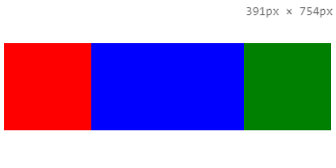
因为上面也说了,如果浮动元素写在蓝色块下面的话,会被蓝色元素顶下去。所以红色和绿色元素都写在蓝色块上面。 它们往两边浮动之后,蓝色块就是当前文档流第一个元素,会在保持不和两边重叠的前提下,占满一行。
