解决Echarts中多条markLine的Label重叠问题

Echarts中设置markLine[参考线]
const option = {
title: {
text: 'markLine Test'
},
series: {
name: '行驶里程(KM)',
type: 'bar',
data: [...],
markLine: {
data: [
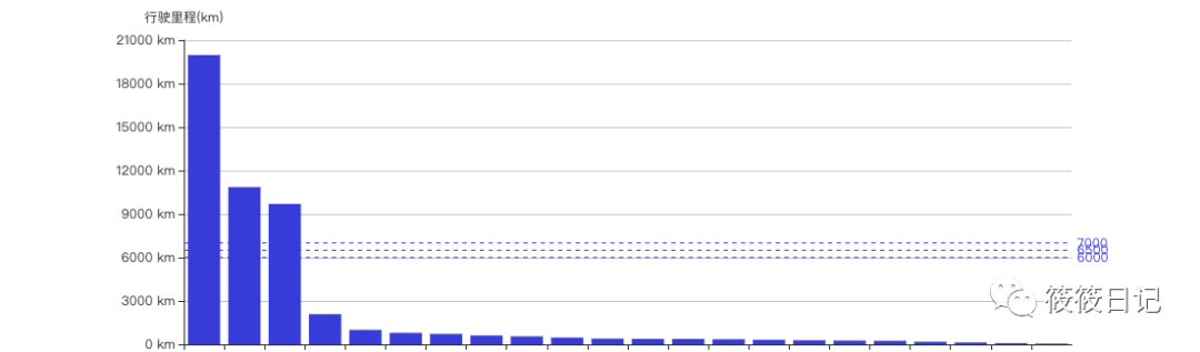
{ yAxis: 3000 },
{ yAxis: 6000 },
{ yAxis: 10000 },
]
}
}
}

为markLine的Label设置不同的位置
在Echarts中,我们可能会为图表设置参考线。当多个参考线的值差距比较大的时候,为参考线设置Label展示是没有问题的。但是当多个参考线的value值接近,设置Label时就会出现重叠的问题。
const option = {
title: {
text: 'markLine Test'
},
series: {
name: '行驶里程(KM)',
type: 'bar',
data: [...],
markLine: {
data: [
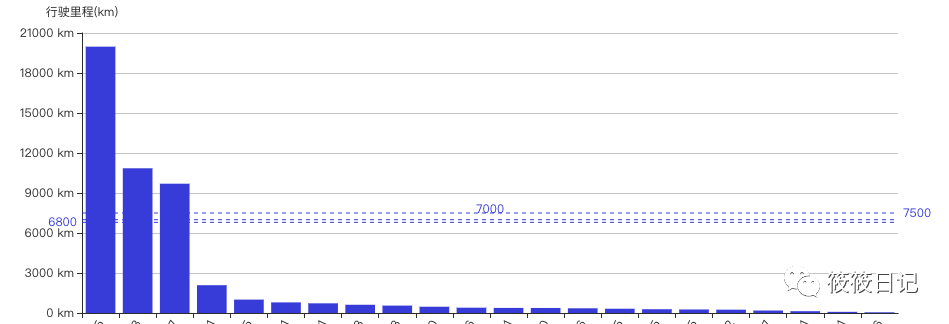
{ yAxis: 6800 },
{ yAxis: 7000 },
{ yAxis: 7500 },
]
}
}
}
可以看出这样的交互体验是很不乐观的。
Label下的position属性为Label指定位置信息。
position: 'start' | 'middle' | 'end'这三个属性
const option = {
    title: {
        text: 'markLine Test'
    },
    series: {
        name: '行驶里程(KM)',
        type: 'bar',
        data: [...],
        markLine: {
            data: [
                {
                    yAxis: 6800,
                    label: {
                        position: 'start',
                    },
                 },
                {
                    yAxis: 7000,
                    label: {
                        position: 'middle',
                    },
                },
                {
                    yAxis: 7500,
                    label: {
                        position: 'end',
                    },
                },
            ]
        }
    }
}
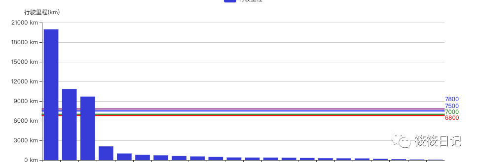
三条标准线的Label都完美的展示出来了。
Echarts中设置多条(>3)参考线的Label
上面使用markLine设置参考线,如果需要完美的展示出Label信息,我们可以使用position属性。但是这个position属性只有3个值,当我们的参考线>3条怎么办呢?
使用markArea
const option = {
    title: {
        text: 'markLine Test'
    },
    series: {
        name: '行驶里程(KM)',
        type: 'bar',
        data: [...],
        markLine: {
            data: [
                [
                    {
                        yAxis: 6800,
                    },
                    {
                        yAxis: 6800,
                        name: '6800',
                        itemStyle: {
                            borderColor: 'red',
                        },
                        label: {
                            show: true,
                            position: ['100%', '0'],
                            color: 'red',
                        },
                    },
                ],
                [
                    {
                        yAxis: 7000,
                    },
                    {
                        yAxis: 7000,
                        name: '7000',
                        itemStyle: {
                            borderColor: 'green',
                        },
                        label: {
                            show: true,
                            color: 'green',
                            position: ['100%', '-10'],
                        },
                    },
                ],
                [
                    {
                        yAxis: 7500,
                    },
                    {
                        yAxis: 7500,
                        name: '7500',
                        itemStyle: {
                            borderColor: 'blue',
                        },
                        label: {
                            show: true,
                            color: 'blue',
                            position: ['100%', '-15'],
                        },
                    },
                ],
                [
                    {
                        yAxis: 7800,
                    },
                    {
                        yAxis: 7800,
                        name: '7800',
                        itemStyle: {
                            borderColor: 'purple',
                        },
                        label: {
                            show: true,
                            color: 'blue',
                            position: ['100%', '-25'],
                        },
                    },
                ],
            ],
            ]
        }
    }
}
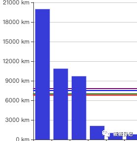
看一下效果,可以看出,通过这样的设置就可以完整的展示出每一个参考线的Label,
这里需要注意的就是Label下的position属性。markArea的position属性比markLine的position属性好用的多,

可以有固定的属性值,也可以是自己设置的%;
但是使用markArea的缺点就是,他的线条会被图表给遮住。
如果说你对这个不介意的话可以使用markArea进行绘制参考线。如果不能接受那就只能寻求别的好方法了。
如果你有更好的实现方法,欢迎留言。欢迎关注公众号