

什么是Sticky footers
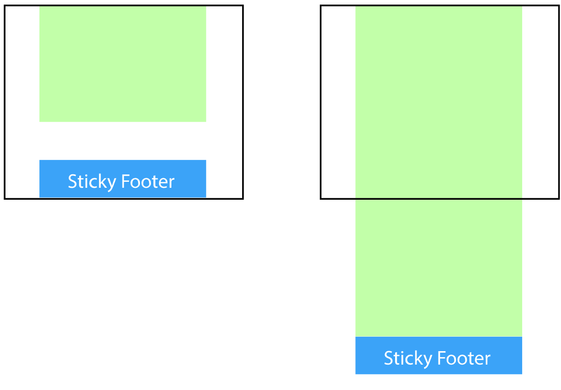
在网页设计中,Sticky footers设计是最古老和最常见的效果之一,大多数人都曾经经历过。它可以概括如下:如果页面内容不够长的时候,页脚块粘贴在视窗底部;如果内容足够长时,页脚块会被内容向下推送。
实现它最简单三种方式
1. 利用margin(推荐,不用担心兼容性问题)
<body>
    <div class="content">我是内容</div>
    <div class="footer"></div>
</body>
        html,
        body {
            width: 100%;
            height: 100%;
            margin: 0;
        }

        .content {
            min-height: 100%;
            padding-bottom: 50px;
            box-sizing: border-box;
            background-color: antiquewhite;
            text-align: center;
        }

        .footer {
            margin-top: -50px;
            height: 50px;
            background-color: aquamarine;
        }
2. 使用flex弹性布局
<body>
    <div class="content">我是内容</div>
    <div class="footer"></div>
</body>
        html,
        body {
            width: 100%;
            height: 100%;
            margin: 0;
        }
        body{
            display: flex;
            flex-direction: column;
        }
        .content {
            flex: 1;
            background-color: antiquewhite;
            text-align: center;
        }

        .footer {
            flex: 0 0 50px;
            height: 50px;
            background-color: aquamarine;
        }
3. 使用calc函数
<body>
    <div class="content">我是内容</div>
    <div class="footer"></div>
</body>
        html,
        body {
            width: 100%;
            height: 100%;
            margin: 0;
        }

        .content {
            min-height: calc(100% - 50px);
            background-color: antiquewhite;
            text-align: center;
        }

        .footer {
            height: 50px;
            background-color: aquamarine;
        }
