

本文是我在学习过程中遇到的常用Flutter组件,是官方文档的中文翻译,采用意译的方式并且忽略了一下我认为的不重要的地方。
PreferredSizeWidget
它是一个Widget的接口,如果Widget没有指定约束,它可以返回Widget倾向于的size。 实施该接口必须实现preferredSize方法 场景: 对于一些案例,尤其是AppBar和TabBar,如果不希望被限制size,需要提供preferredSize或默认值。
Scaffold
Impletments the basic material design visual layout structure.
实施基本的材料设计视觉布局结构。
This class provides APIs for showing drawers, snack bars, and bottom sheets.
这个类为显示drawers、snack bars和bottom sheets提供API。
To display a snackbar or a persistent bottom sheet, obtain the ScaffoldState for the current BuildContext via Scaffold.of and use the ScaffoldState.showSnackBar and ScaffoldState.showBottomSheet functions.
为了显示一个snackbar或者一个持久的bootm sheet,可以通过Scaffold.of为当前的构建上下文BuildContext获取ScaffoldState,然后通过调用ScaffoldState.showSnackBar和ScaffoldState.showBottomSheet显示它们。
@override
Widget build(BuildContext context) {
  return Scaffold(
    appBar: AppBar(
      title: Text('Demo')
    ),
    body: Builder(
      // Create an inner BuildContext so that the onPressed methods
      // can refer to the Scaffold with Scaffold.of().
      builder: (BuildContext context) {
        return Center(
          child: RaisedButton(
            child: Text('SHOW A SNACKBAR'),
            onPressed: () {
              Scaffold.of(context).showSnackBar(SnackBar(
                content: Text('Hello!'),
              ));
            },
          ),
        );
      },
    ),
  );
}
AppBar
A material design app bar.
一个符合材料设计的app bar。
An app bar consists of a toolbar and potentially other widgets, such as a TabBar and a FlexibleSpaceBar. App bars typically expose one or more common actions with IconButtons which are optionally followed by a PopupMenuButton for less common operations (sometimes called the "overflow menu").
一个app bar由一个toolbar和一些潜在可能的其它Widget组成,例如一个TabBar和一个FlexibleSpaceBar。
APP bars通常使用IconButtons暴露一个或者多个常用动作,也可以根据需要在它后边跟弹出菜单PopupMenuButton来展示不常用的动作。
App bars are typically used in the Scaffold.appBar property, which places the app bar as a fixed-height widget at the top of the screen. For a scrollable app bar, see SliverAppBar, which embeds an AppBar in a sliver for use in a CustomScrollView.
App bars通常用作Scaffold的appBar属性,这个属性把一个app bar作为固定高度的widget放在屏幕的顶部。
如果要使用一个可以滚动的App bar,可以使用SliverAppBar, 它把AppBar组件嵌入到一个CustomeScrollView中。
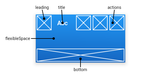
The AppBar displays the toolbar widgets, leading, title, and actions, above the bottom (if any). The bottom is usually used for a TabBar. If a flexibleSpace widget is specified then it is stacked behind the toolbar and the bottom widget. The following diagram shows where each of these slots appears in the toolbar when the writing language is left-to-right (e.g. English):
AppBar组件在它的底部bottom区域之上显示toolbar组件,如leading、title和actions,而底部区域通常用来显示TabBar组件。
如果指定了一个flexibleSpace组件,则该组件显示在toolbar和bottom组件后面。
具体见下面的示意图:
If the leading widget is omitted, but the AppBar is in a Scaffold with a Drawer, then a button will be inserted to open the drawer. Otherwise, if the nearest Navigator has any previous routes, a BackButton is inserted instead. This behavior can be turned off by setting the automaticallyImplyLeading to false. In that case a null leading widget will result in the middle/title widget stretching to start.
如果没有指定leading组件,并且AppBar组件被放在一个包含抽屉Drawer的Scaffold中,那么将会有一个button组件来替代leading区域用于打开抽屉组件,否则,如果最近的导航Navigator中有任何向前的路由,则会使用一个BackButton组件来替代leading区域用于返回到上一个路由。 这个行为可以通过设置automaticallyImplyLeading为false来关闭
FocusNode
A leaf node in the focus tree that can receive focus.
Focus树中的一个叶子节点,它可以接收focus
The focus tree keeps track of which widget is the user's current focus. The focused widget often listens for keyboard events.
焦点树持续跟踪树种哪个组件是用户的当前焦点。焦点组件通常监听键盘事件。
To request focus, find the FocusScopeNode for the current BuildContext and call the FocusScopeNode.requestFocus method:
为了请求焦点,需要找到FocusScopeNode并调用它的requestFocus方法。可以使用FocusScope.of(context)方法得到FocusScopeNode
FocusScope.of(context).requestFocus(focusNode);
If your widget requests focus, be sure to call FocusScope.of(context).reparentIfNeeded(focusNode); in your build method to reparent your FocusNode if your widget moves from one location in the tree to another.
假如你的组件从树中的一个位置移向了另一个位置来获取节点,你必须确保在组件的build方法中使用FocusScope.of(context).reparentIfNeeded(focusNode) reparent你的FocusNode
Lifetime
Focus nodes are long-lived objects. For example, if a stateful widget has a focusable child widget, it should create a FocusNode in the State.initState method, and dispose it in the State.dispose method, providing the same FocusNode to the focusable child each time the State.build method is run. In particular, creating a FocusNode each time State.build is invoked will cause the focus to be lost each time the widget is built.
生命周期
Focus nodes有很长的生命周期。例如一个有状态的组件有一个可以获得焦点的子组件,它需要在State.initState中先创建一个FocusNode(注:在constructor中也可以),并且需要在State.dispose方法中将它销毁。在每次构建State.build方法中需要将该FocusNode提供给它的这个子组件。
实际上,如果在State.build中创建一个FocusNode则会导致这个组件在每次构建时丢失焦点。
FocusScope
Establishes a scope in which widgets can receive focus.
建立一个能够接受焦点的组件们的范围。
The focus tree keeps track of which widget is the user's current focus. The focused widget often listens for keyboard events.
A focus scope does not itself receive focus but instead helps remember previous focus states. A scope is currently active when its node is the first focus of its parent scope. To activate a FocusScope, either use the autofocus property or explicitly make the node the first focus in the parent scope:
一个focus scope自身不会接受焦点,但它可以帮助记住上一个焦点的状态。
当一个节点在它的父范围内第一次获得焦点,则会有一个scope处于激活状态。为了激活一个FocusScope,可以使用autofocus属性或者显式的使节点在父范围内第一次激活。
FocusScope.of(context).setFirstFocus(node);
When a FocusScope is removed from the tree, the previously active FocusScope becomes active again.
当一个FocusScope被移除,则先前激活的FocusScope会重新编程激活状态。
FocusScopeNode
An interior node in the focus tree.
一个FocusScopeNode是焦点树的一个内部节点。
The focus tree keeps track of which widget is the user's current focus. The focused widget often listens for keyboard events.
The interior nodes in the focus tree cannot themselves be focused but instead remember previous focus states. A scope is currently active in its parent whenever isFirstFocus is true. If that scope is detached from its parent, its previous sibling becomes the parent's first focus.
书中的内部节点自身不会成为焦点但它们可以记住前一个焦点状态。当一个scope的isFirstFocus设置为true时它会在它的父scope内会及时激活。加入这个scope从它的父范围分离,则它的前一个兄弟节点会变成父亲的第一个焦点。
A FocusNode has the overall focus when the node is focused in its parent FocusScopeNode and FocusScopeNode.isFirstFocus is true for that scope and all its ancestor scopes.
TextEditingController
A controller for an editable text field.
Whenever the user modifies a text field with an associated TextEditingController, the text field updates value and the controller notifies its listeners. Listeners can then read the text and selection properties to learn what the user has typed or how the selection has been updated.
当用户修改了一个关联了TextEditingController的可编辑文本框,这个controller会通知它的监听者文本框的值已发生变化。
监听者可以读取文本和selection属性以知道用户输入了什么或者selection是如何被更新的。
Similarly, if you modify the text or selection properties, the text field will be notified and will update itself appropriately.
A TextEditingController can also be used to provide an initial value for a text field. If you build a text field with a controller that already has text, the text field will use that text as its initial value.
TextEditingController可以用来给文本框提供一个初始值。假如你的文本框关联的controller已经有一个值,则文本框会用这个值作为它的初始值。
TextField
A material design text field.
A text field lets the user enter text, either with hardware keyboard or with an onscreen keyboard.
TextField可以让用户输入文本,无论是通过无论键盘还是虚拟键盘
The text field calls the onChanged callback whenever the user changes the text in the field. If the user indicates that they are done typing in the field (e.g., by pressing a button on the soft keyboard), the text field calls the onSubmitted callback.
当用户改变了TextField的文本时TextField会调onChanged回调函数。假如用户指示已经完成了输入,TextField会调用onSubmitted回调函数
To control the text that is displayed in the text field, use the controller. For example, to set the initial value of the text field, use a controller that already contains some text. The controller can also control the selection and composing region (and to observe changes to the text, selection, and composing region).
可以用controller去控制呈现在TextField的文本。
By default, a text field has a decoration that draws a divider below the text field. You can use the decoration property to control the decoration, for example by adding a label or an icon. If you set the decoration property to null, the decoration will be removed entirely, including the extra padding introduced by the decoration to save space for the labels.
默认的,TextField被装饰为底部有一条分割线。你可以使用decoration属性去控制decoration,例如给TextField加一个标签或者图标。
If decoration is non-null (which is the default), the text field requires one of its ancestors to be a Material widget. When the TextField is tapped an ink splash that paints on the material is triggered, see ThemeData.splashFactory.
To integrate the TextField into a Form with other FormField widgets, consider using TextFormField.
InputDecorator
Defines the appearance of a Material Design text field.
定义text field的外观
InputDecorator displays the visual elements of a Material Design text field around its input child. The visual elements themselves are defined by an InputDecoration object and their layout and appearance depend on the baseStyle, textAlign, isFocused, and isEmpty parameters.
TextField uses this widget to decorate its EditableText child.
InputDecorator can be used to create widgets that look and behave like a TextField but support other kinds of input.
Requires one of its ancestors to be a Material widget.
