

一. 页面布局
1. 题目
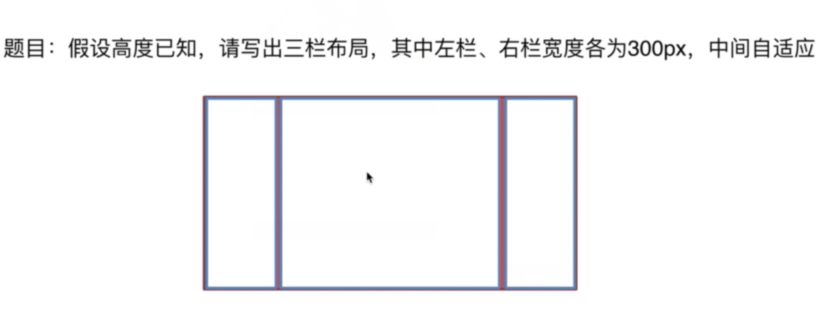
2.解决方案
- 浮动 float
<section class="layout float">
    <style>
        .layout.float .left {
            float: left;
            width: 300px;
            background: red;
        }
        .layout.float .right {
            float: right;
            width: 300px;
            background: blue;
        }
        .layout.float .center {
            background: yellow;
        }
    </style>
    <article class="left-right-center">
        <div class="left"></div>
        <div class="right"></div>
        <div class="center">
            <h1>浮动解决方案</h1>
            1.这是三栏布局的中间部分
            2.这是三栏布局的中间部分
        </div>
    </article>
</section>
- 绝对定位 absolute
<section class="layout absolute">
    <style>
        .layout.absolute .left-right-center >div{
            position: absolute;
        }
        .layout.absolute .left {
            left: 0;
            width: 300px;
            background: red;
        }
        .layout.absolute .right {
            right: 0;
            width: 300px;
            background: blue;
        }
        .layout.absolute .center {
            left: 300px;
            right: 300px;
            background: yellow;
        }
    </style>
    <article class="left-right-center">
        <div class="left"></div>
        <div class="right"></div>
        <div class="center">
            <h1>绝对定位解决方案</h1>
            1.这是三栏布局的中间部分
            2.这是三栏布局的中间部分
        </div>
    </article>
</section>
- flexbox布局
<section class="layout flexbox">
    <style>
        .layout.flexbox{
            margin-top: 200px;
        }
        .layout.flexbox .left-right-center{
            display: flex;
        }
        .layout.flexbox .left {
            width: 300px;
            background: red;
        }
        .layout.flexbox .right {
            width: 300px;
            background: blue;
        }
        .layout.flexbox .center {
            flex: 1;
            background: yellow;
        }
    </style>
    <article class="left-right-center">
        <div class="left"></div>
        <div class="center">
            <h1>flexbox解决方案</h1>
            1.这是三栏布局的中间部分
            2.这是三栏布局的中间部分
        </div>
        <div class="right"></div>
    </article>
</section>
- table布局
<section class="layout table">
    <style>
        .layout.table .left-right-center{
            display: table;
            width: 100%;
        }
        .layout.table .left-right-center >div{
            display: table-cell;
        }
        .layout.table .left {
            width: 300px;
            background: red;
        }
        .layout.table .right {
            width: 300px;
            background: blue;
        }
        .layout.table .center {
            background: yellow;
        }
    </style>
    <article class="left-right-center">
        <div class="left"></div>
        <div class="center">
            <h1>table布局解决方案</h1>
            1.这是三栏布局的中间部分
            2.这是三栏布局的中间部分
        </div>
        <div class="right"></div>
    </article>
</section>
- grid布局
<section class="layout grid">
    <style>
        .layout.grid .left-right-center{
            display: grid;
            width: 100%;
            /* grid-template-rows: 100px; */
            grid-template-columns: 300px auto 300px;
        }
        .layout.grid .left {
            background: red;
        }
        .layout.grid .right {
            background: blue;
        }
        .layout.grid .center {
            background: yellow;
        }
    </style>
    <article class="left-right-center">
        <div class="left"></div>
        <div class="center">
            <h1>网格</h1>
            1.这是三栏布局的中间部分
            2.这是三栏布局的中间部分
        </div>
        <div class="right"></div>
    </article>
</section>
3.问题拓展
-
五个方案优缺点
float
  优点:兼容性好
  缺点:脱离文档流,有局限性
absolute
  优点:快捷
  缺点:脱离文档流,有局限性
flexbox
  优点:完美
  缺点:兼容性稍差
table
  优点:兼容性好
  缺点:操作繁琐
grid
优点:最新技术 缺点:兼容性差 -
高度不确定时那种方案不适用了
float absolute grid (解决方案: 创建BFC) -
兼容性
二. CSS盒模型
1. 题目
- 题目:谈谈你对CSS盒模型的认识
2.回答
- 基本概念:
盒模型的组成由里向外content,padding,border,margin。盒模型是有两种标准的,一个是标准模型,一个是IE模型。
- 标准模型和IE模型的区别
在标准模型中,盒模型的宽高只是内容(content)的宽高,而在IE模型中盒模型的宽高是
内容(content)+填充(padding)+边框(border)的总宽高。
- css如何设置这两种模型
box-sizing: content-box; //标准模型 (默认)
box-sizing: border-box; //IE模型
-
JS如何设置获取盒模型对应的宽和高
1) dom.style.width/height
这种方式只能取到dom元素内联样式所设置的宽高,也就是说如果该节点的样式是在style标签中
或外联的CSS文件中设置的话,通过这种方法是获取不到dom的宽高的。
2) dom.currentStyle.width/height
这种方式获取的是在页面渲染完成后的结果,就是说不管是哪种方式设置的样式,都能获取到。
  但这种方式只有IE浏览器支持。
3) window.getComputedStyle(dom).width/height
这种方式的原理和2是一样的,这个可以兼容更多的浏览器,通用性好一些。4) dom.getBoundingClientRect().width/height
这种方式是根据元素在视窗中的绝对位置来获取宽高的5) dom.offsetWidth/offsetHeight
这个就没什么好说的了,最常用的,也是兼容最好的。 -
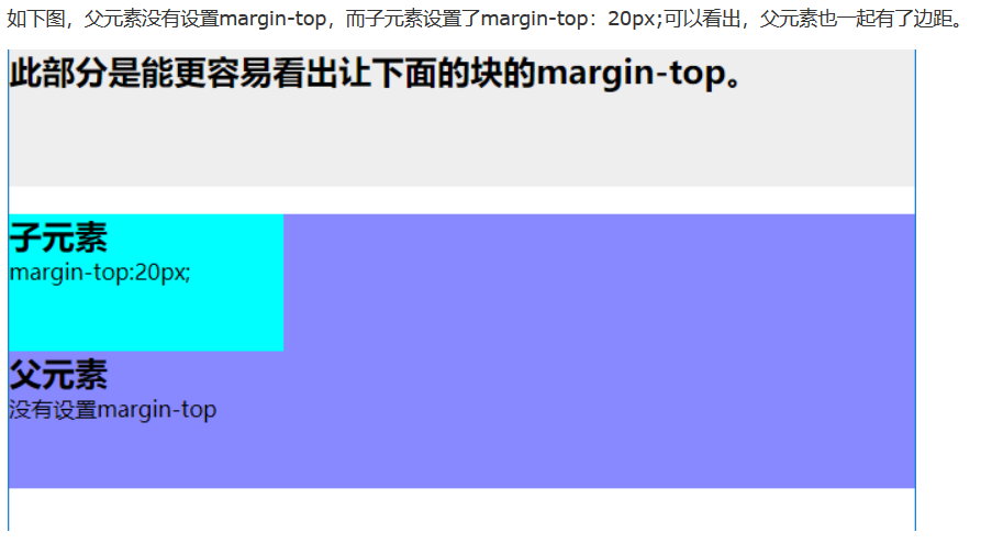
实例题(根据盒模型解释边距重叠)
-
BFC(边距重叠解决方案)
1) BFC的基本概念
全英文拼写为 Block Formatting Context 直译为“块级格式化上下文”2) BFC的原理
1. 内部的box会在垂直方向,一个接一个的放置
2. 每个元素的margin box的左边,与包含块border
3. box的左边相接触(对于从做往右的格式化,否则相反)
4. box垂直方向的距离由margin决定,属于同一个bfc的两个相邻box的margin会发生重叠
5. bfc的区域不会与浮动区域的box重叠
6. bfc是一个页面上的独立的容器,外面的元素不会影响bfc里的元素,反过来,里面的也不会影响外面的
7. 计算bfc高度的时候,浮动元素也会参与计算
3) 如何创建BFC
1. float属性不为none(脱离文档流)
2. position为absolute或fixed
3. display为inline-block,table-cell,table-caption,flex,inine-flex
4. overflow不为visible
5. 根元素
4) BFC的使用场景
1. 自适应两栏布局
2. 清除内部浮动
3. 防止垂直margin重叠
