

前言
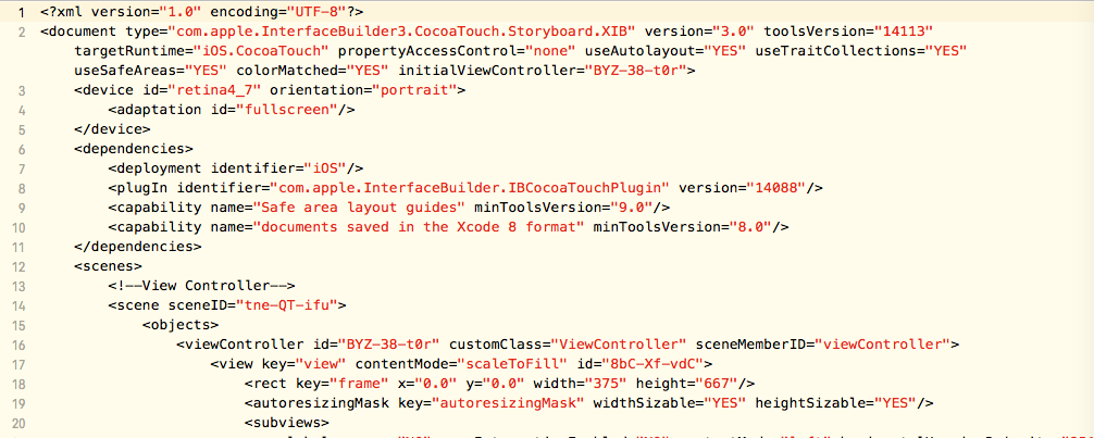
熟悉iOS中StoryBoard开发方式的,接触Android界面部分的开发时,会有一种熟悉感。Android在res/layout文件夹下定义了一系列的xml格式的专门的布局文件,用来描述UI.而iOS的StoryBoard本质也是xml格式的文件,只不过对大部门人来说不具有阅读性。来两张图大致感受下吧。
ViewGroup
和iOS中不同,Android中UI组件和容器类是明确区分的,不能类似在UIButton按钮中再放入一个UILabel文本标签,UI组件只能放置在专门的View容器中,这个View容器就是ViewGroup.
ViewGroup的核心作用就是对容器内的View组件进行布局.
ViewGroup从继承体系上和Button等UI组件一样,都继承于View。但ViewGroup是抽象类,不能直接使用。系统提供了6种实现,即所谓6大布局。
LinerLayout(线性布局)
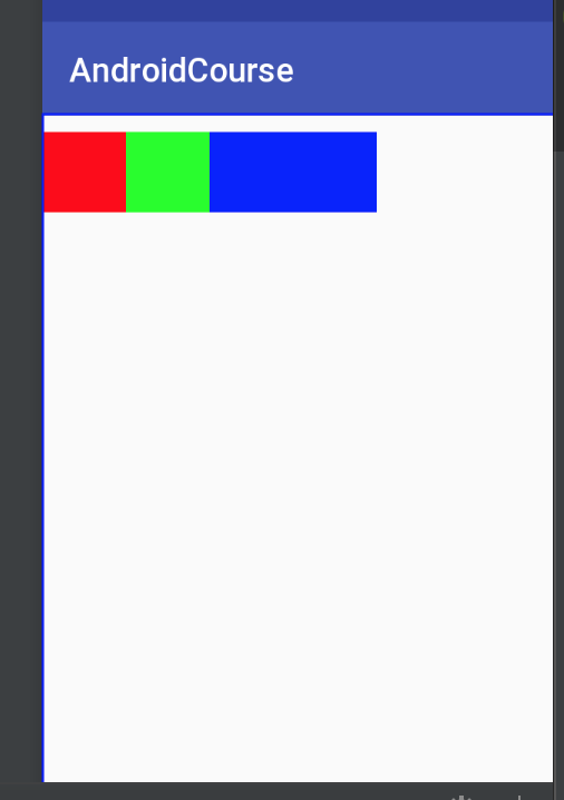
LinerLayout可以控制各组件横向或纵向排列,核心属性为 android:orientation ,可设置为horizontal(水平排列)、vertical(垂直排列);layout_weight,权重
线性布局示例
<?xml version="1.0" encoding="utf-8"?>
<LinearLayout xmlns:android="http://schemas.android.com/apk/res/android"
    android:layout_width="match_parent"
    android:layout_height="match_parent"
    android:orientation="vertical">
    <LinearLayout
        android:layout_width="match_parent"
        android:layout_height="0dp"
        android:layout_weight="1"
        android:orientation="horizontal"
        >
        <View
            android:layout_width="0dp"
            android:layout_height="match_parent"
            android:layout_weight="1"
            android:background="#0F0"/>
        <View
            android:layout_width="0dp"
            android:layout_height="match_parent"
            android:layout_weight="1"
            android:background="#FF0"/>
        <View
            android:layout_width="0dp"
            android:layout_height="match_parent"
            android:layout_weight="1"
            android:background="#0FF"/>
    </LinearLayout>
    <View
        android:layout_width="match_parent"
        android:layout_height="0dp"
        android:layout_weight="1"
        android:background="#F00"/>
    <View
        android:layout_width="match_parent"
        android:layout_height="0dp"
        android:layout_weight="1"
        android:background="#00F"/>
</LinearLayout>
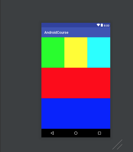
可以看到整个页面由两个LinerLayout容器组成,主容器设置了3个属性,宽高充满屏幕,方向是垂直排列。主容器包含了3个元素,一个LinerLayout类型的容器和两个View。子容器包含了3个View,并设置为水平排列。
此外,主容器下的3个元素都设置了android:layout_weight = 1,表示3个元素垂直平分父容器的空间。假如,分别设置为2,1,1,那么子容器占据一半的空间。
RelativeLayout(相对布局)
相对布局主要分两类,相对于父容器和相对于兄弟组件。
相对于父容器的属性关键字有上下左右layout_alignParentTop、layout_alignParentBottom、layout_alignParentLeft、layout_alignParentRight,和居中layout_centerInParent.之后,可以通过margin边距来进行具体数值的微调。
相对于兄弟组件需要通过id来指定具体的组件,主要属性有layout_above,layout_below,layout_alignLeft和layout_alignRight。
相对布局示例
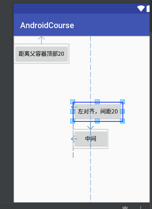
<?xml version="1.0" encoding="utf-8"?>
<RelativeLayout xmlns:android="http://schemas.android.com/apk/res/android"
    android:layout_width="match_parent"
    android:layout_height="match_parent">

    <Button
        android:id="@+id/btn-center"
        android:layout_width="wrap_content"
        android:layout_height="wrap_content"
        android:layout_centerInParent="true"
        android:text="中间"
        />
    <Button
        android:layout_width="wrap_content"
        android:layout_height="wrap_content"
        android:layout_alignParentTop="true"
        android:layout_marginTop="20dp"
        android:text="距离父容器顶部20"
        />
    <Button
        android:layout_width="wrap_content"
        android:layout_height="wrap_content"
        android:layout_above="@id/btn-center"
        android:layout_marginBottom="20dp"
        android:layout_alignLeft="@+id/btn-center"
        android:text="左对齐,间距20"
        />
</RelativeLayout>
FrameLayout(帧布局)
所有添加到这个布局中的元素都以层叠的方式显示,第一个添加的控件被放在最底层,最后一个添加到最顶层,上一层的控件会覆盖下一层控件显示的内容,这种方式类似于堆栈。帧布局适用有类游戏场景。
帧布局示例
<?xml version="1.0" encoding="utf-8"?>
<FrameLayout xmlns:android="http://schemas.android.com/apk/res/android"
    android:layout_width="match_parent"
    android:layout_height="match_parent">

    <Button
        android:layout_width="100dp"
        android:layout_height="wrap_content"
        android:layout_marginTop="10dp"
        android:background="#F00"
        />
    <Button
        android:layout_width="100dp"
        android:layout_height="wrap_content"
        android:layout_marginLeft="50dp"
        android:layout_marginTop="10dp"
        android:background="#0F0"
        />
    <Button
        android:layout_width="100dp"
        android:layout_height="wrap_content"
        android:layout_marginLeft="100dp"
        android:layout_marginTop="10dp"
        android:background="#00F"
        />
</FrameLayout>
如图所示,除了最后一个蓝色视图可以完整显示,前面的视图都有一半被上一级的视图覆盖。
AbsoulateLayout(绝对布局)
绝对布局就是直接设置控件的x,y坐标。这个不展开了。
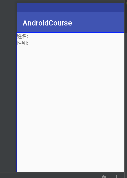
TableLayout(表格布局)
表格布局类似于HTML的表格语法,使用TableRow关键字来代表一行。
表格布局示例
<?xml version="1.0" encoding="utf-8"?>
<TableLayout xmlns:android="http://schemas.android.com/apk/res/android"
    android:layout_width="match_parent"
    android:layout_height="match_parent">

    <TableRow>
        <TextView
            android:layout_width="wrap_content"
            android:layout_height="wrap_content"
            android:text="姓名:"
            />
    </TableRow>
    <TableRow>
        <TextView
            android:layout_width="wrap_content"
            android:layout_height="wrap_content"
            android:text="性别:"
            />
    </TableRow>
</TableLayout>
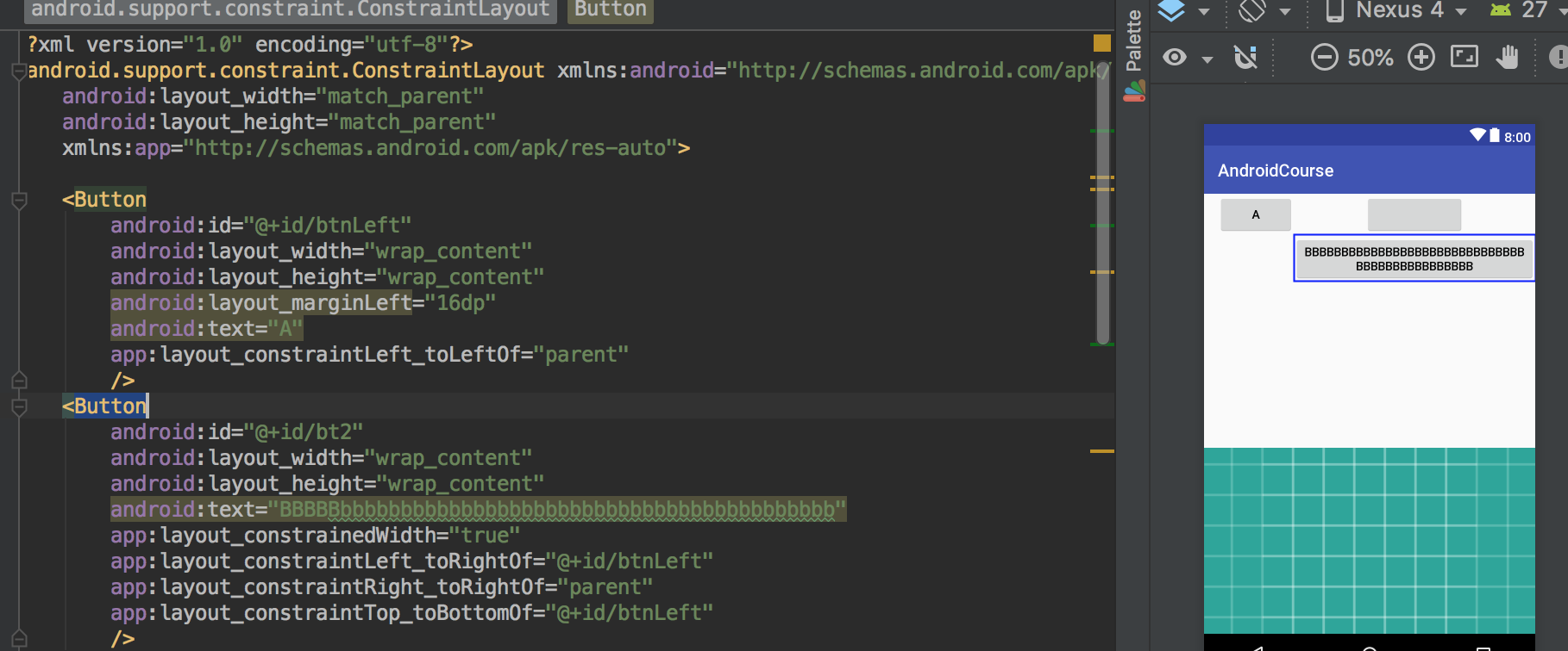
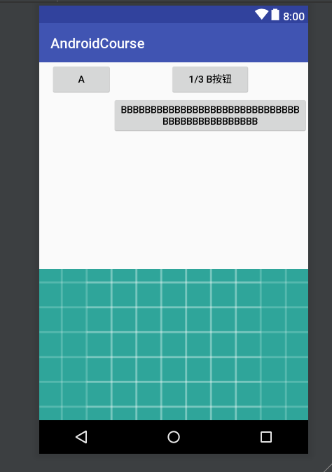
ConstraintLayout(约束布局)
约束布局,也被称为增强型的相对布局,集LinerLayout、RelativeLayout、百分比布局等功能于一身,逐渐成为主流布局样式。当然,作为iOS开发人员,约束布局的概念早已烂熟于心。直接分析示例代码。
<?xml version="1.0" encoding="utf-8"?>
<android.support.constraint.ConstraintLayout xmlns:android="http://schemas.android.com/apk/res/android"
    android:layout_width="match_parent"
    android:layout_height="match_parent"
    xmlns:app="http://schemas.android.com/apk/res-auto">

    <Button
        android:id="@+id/btnA"
        android:layout_width="wrap_content"
        android:layout_height="wrap_content"
        android:layout_marginLeft="16dp"
        android:text="A"
        app:layout_constraintLeft_toLeftOf="parent"
        />
    <Button
        android:id="@+id/btnB"
        android:layout_width="wrap_content"
        android:layout_height="wrap_content"
        android:text="BBBBBbbbbbbbbbbbbbbbbbbbbbbbbbbbbbbbbbbbbbbbbb"
        app:layout_constrainedWidth="true"
        app:layout_constraintLeft_toRightOf="@+id/btnA"
        app:layout_constraintRight_toRightOf="parent"
        app:layout_constraintTop_toBottomOf="@+id/btnA"
        />
    <Button
        android:text="1/3 B按钮"
        android:layout_width="0dp"
        android:layout_height="wrap_content"
        app:layout_constraintLeft_toLeftOf="@+id/btnB"
        app:layout_constraintRight_toRightOf="@+id/btnB"
        app:layout_constraintWidth_percent="0.3"
        />
    <ImageView
        android:layout_width="0dp"
        android:layout_height="0dp"
        android:src="@drawable/ic_launcher_background"
        android:scaleType="centerCrop"
        app:layout_constraintDimensionRatio="H,16:9"
        app:layout_constraintLeft_toLeftOf="parent"
        app:layout_constraintRight_toRightOf="parent"
        app:layout_constraintBottom_toBottomOf="parent"
        />
</android.support.constraint.ConstraintLayout>
按钮A通过layout_constraintLeft_toLeftOf="parent"指定参照对象为父容器并且左对齐。配合layout_marginLeft设置具体向左偏离的距离。
同理,按钮B通过layout_constraintLeft_toRightOf="@+id/btnA"指定左边和按钮A的右边对齐,layout_constraintRight_toRightOf="parent"指定右边和父容器的右边对齐,layout_constraintTop_toBottomOf="@+id/btnA"顶部和按钮A的底部对齐。app:layout_constrainedWidth="true"是强制约束,因为我们设置B按钮的宽是包裹文本的,但文本太长和约束冲突,设置这行可以强制保证约束优先,文本会换行。
底部的图片,通过layout_constraintDimensionRatio="16:9"保证宽高比为16:9,其他设置雷同,不再赘述。约束布局详情可参考 www.jianshu.com/p/a74557359…
