

思路:
首先以一个div作为红绿灯的黑色部分,然后使用after伪元素画出一个黄色的圆并将其垂直水平居中到div中作为中间的灯,最后给after元素设置红色和绿色的box-shadow并设置box-shadow的 x-offset将其移动到合适的位置,即可完成.
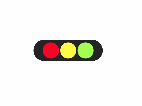
实现效果如下:
style:
    .div {
      position: relative;
      width: 200px;
      height: 60px;
      border-radius: 30px;
      background: rgb(27, 27, 27);
    }
    .div::after {
      content: '';
      position: absolute;
      left: 50%;
      top: 50%;
      transform: translate(-50%, -50%);
      width: 46px;
      height: 46px;
      background: yellow;
      border-radius: 50%;
      box-shadow: -50px 0 0 0 red, 50px 0 0 0 greenyellow;
    }

html:
    <div class="div"></div>
