

三栏式布局
float
主要是利用浮动元素脱离文档流,导致后面的元素可以流动到前面
<style>
    div {
      height: 300px;
    }
    .left, .right {
      width: 200px;
    }
    .left {
      background-color: pink;
      float: left;
    }
    .center {
      background-color: gray;
    }
    .right {
      background-color: red;
      float: right;
    }
    .center {
      margin-left: 200px;
      margin-right: 200px;
    }
</style>
<body>
   <div class="left"></div>
   <div class="right"></div>
   <div class="center"></div>
</body>
position
和 float 同一个道理
<style>
    body {
      position: relative;
    }
    div {
      height: 300px;
    }
    .left, .right {
      width: 200px;
      position: absolute;
      top: 0;
    }
    .left {
      background-color: pink;
      left: 0;
    }
    .center {
      background-color: gray;
    }
    .right {
      background-color: red;
      right: 0;
    }
    .center {
      margin-left: 200px;
      margin-right: 200px;
    }
</style>
<body>
   <div class="left"></div>
   <div class="right"></div>
   <div class="center"></div>
</body>
flex
<style>
    body {
      display: flex;
    }
    div {
      height: 300px;
    }
    .left, .right {
      flex: 0 0 200px;
    }
    .left {
      background-color: pink;
    }
    .center {
      flex: 1;
      background-color: gray;
    }
    .right {
      background-color: red;
    }
</style>
<body>
   <div class="left"></div>
   <div class="center"></div>
   <div class="right"></div>
</body>
margin 负值法
先来看一个margin等于负值的demo
<style>
    body {
      width: 350px;
    }
    div {
      width: 100px;
      height: 100px;
      float: left;
    }
    .blue {
      background-color: blue;
    }
    .green {
      background-color: green;
    }
    .orange {
      background-color: orange;
    }
    .pink {
      background-color: pink;
      <!--margin-left: -50px;-->
    }
</style>
<body>
  <div class="blue"></div>
  <div class="green"></div>
  <div class="orange"></div>
  <div class="pink"></div>
</body>
效果如下图所示,body只给了350px 放不下4 * 100px,所以最后一项被挤到了第二排。
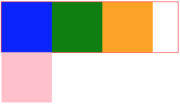
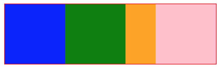
,那么如何才能让最后一项上去呢?先来算一下还差多少像素,400 - 350 = 50。这时如果给最后一项设置margin-left: -50px;那么四个div的总宽度就是100 + 100 + 100 + 100 -50(左外边距)= 350px; 效果如下:
要点就是先利用padding留出左右距离,然后两端分别利用margin负值移动到第一排,对于左端,还需要进行position定位移动到padding位置,而对于右端,我们将margin-right值设置为负的元素宽度,这时这个元素在文档流中的计算宽度等于 -100px(margin-right)+ 100px(元素宽度) = 0, 所以也会定位到padding的位置
注意此处有一个最小宽度的限制值 100(左padding) * 2 + 100(右padding) = 300
<style>
    body {
      min-width: 100px;
      padding: 0 100px;
    }
    .blue {
      background-color: blue;
    }
    .green {
      background-color: green;
    }
    .orange {
      background-color: orange;
    }
    div {
      height: 100px;
      float: left;
    }
    .left, .right {
      width: 100px;
    }
    .center {
      width: 100%;
    }
    .left {
      position: relative;
      right: 100px;
      margin-left: -100%;
    }
    .right {
      margin-right: -100px;
    }
</style>
<body>
  <div class="center green"></div>
  <div class="left blue"></div>
  <div class="right orange"></div>
</body>
双飞燕布局
与前一个相比多了一个div,在center上设置margin留出左右两栏的空间,而且不在需要relative定位,没有了最小宽度的限制
<style>
    .blue {
      background-color: blue;
    }
    .green {
      background-color: green;
    }
    .orange {
      background-color: orange;
    }
    div {
      height: 100px;
    }
    .left, .right {
      width: 100px;
      float: left;
    }
    .center {
      width: 100%;
      float: left;
    }
    .inner {
      margin: 0 100px;
    }
    .left {
      margin-left: -100%;
    }
    .right {
      margin-left: -100px;
    }
</style>
<body>
  <div class="center">
    <div class="inner green"></div>
  </div>
  <div class="left blue"></div>
  <div class="right orange"></div>
</body>
