

这段时间以前的UI回来了,我比较喜欢她的设计,哈哈~这次她设计了几个图表,感觉还是很好看的,所以我写好代码就想分享上来~
这里主要分享四个,先放上效果图,感兴趣的可以继续往下看哦,后面会分别放上效果图以及代码哦~


以下为每个效果对应的代码:
1.横向多种颜色的柱状图
<!DOCTYPE html>
<html lang="en">
<head>
<meta charset="utf-8">
<script type="text/javascript" src="jq.js"></script>
<script type="text/javascript" src="echarts.min.js"></script>
</head>
<body>
<style type="text/css">
html {
background: #19254f;
}
</style>
<div id="main" style="width: 800px;height:400px;"></div>
<script type="text/javascript">
// 基于准备好的dom,初始化echarts实例
var myChart = echarts.init(document.getElementById('main'));
option = {
tooltip : {
trigger: 'axis',
axisPointer : { // 坐标轴指示器,坐标轴触发有效
type : 'shadow' // 默认为直线,可选为:'line' | 'shadow'
}
},
legend: {
data: ['I~II类', 'III类','IV类','V类','劣V类'],
textStyle: {
color: '#fff'
}
},
grid: {
left: '3%',
right: '4%',
bottom: '3%',
containLabel: true
},
xAxis: {
type: 'value',
axisLabel: {
textStyle: {
color: '#71c9d7'
}
},
axisLine: {
show: true,
lineStyle: {
color: '#304c71',
}
},
splitLine: {
show: true,
lineStyle: {
color: '#304c71 ',
}
},
},
yAxis: {
type: 'category',
data: ['白马河站','省电大站','五四河站','风河站','德国站','法国站','中立站'],
axisLabel: {
formatter: '{value}',
textStyle: {
color: '#ced9d5'
}
},
axisLine: {
show: true,
lineStyle: {
color: '#47809b',
}
},
splitLine: {
show: true,
lineStyle: {
color: '#304c71 ',
}
},
},
series: [
{
name: 'I~II类',
type: 'bar',
stack: '总量',
label: {
normal: {
show: false,
position: 'insideRight'
}
},
itemStyle: {
normal: {
barBorderRadius: [0,300,300,0],
color: '#54e5fa'
}
},
data: [0, 302, 301, 334, 0, 330, 320],
barWidth: 10,
},
{
name: 'III类',
type: 'bar',
stack: '总量',
label: {
normal: {
show: false,
position: 'insideRight'
}
},
itemStyle: {
normal: {
barBorderRadius: [0,300,300,0],
color: '#fff962'
}
},
data: [0, 0, 101, 134, 90, 230, 210]
},
{
name: 'IV类',
type: 'bar',
stack: '总量',
label: {
normal: {
show: false,
position: 'insideRight'
}
},
itemStyle: {
normal: {
barBorderRadius: [0,300,300,0],
color: '#6fd975'
}
},
data: [220, 182, 191, 234, 290, 330, 310]
},
{
name: 'V类',
type: 'bar',
stack: '总量',
label: {
normal: {
show: false,
position: 'insideRight'
}
},
itemStyle: {
normal: {
barBorderRadius: [0,300,300,0],
color: '#e4b158'
}
},
data: [150, 212, 201, 154, 190, 330, 410]
},
{
name: '劣V类',
type: 'bar',
stack: '总量',
label: {
normal: {
show: false,
position: 'insideRight',
}
},
itemStyle: {
normal: {
barBorderRadius: [0,300,300,0],
color: '#e87379'
}
},
data: [120, 232, 301, 134, 129, 133, 120]
}
]
};
// 使用刚指定的配置项和数据显示图表。
myChart.setOption(option);
</script>
</body>
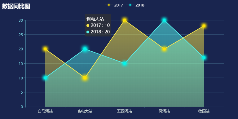
</html>2.渐变折线图

<!DOCTYPE html>
<html lang="en">
    <head>
        <meta charset="utf-8">
        <script type="text/javascript" src="jq.js"></script>
        <script type="text/javascript" src="echarts.min.js"></script>
    </head>
    <body>
        <style type="text/css">
            html {
                background: #19254f;
            }
        </style>
        <div id="main" style="width: 800px;height:400px;"></div>
        <script type="text/javascript">
            // 基于准备好的dom,初始化echarts实例
            var myChart = echarts.init(document.getElementById('main'));

            option = {
                tooltip: {
                    trigger: 'axis',
                    position: function (pt) {
                        return [pt[0], '10%'];
                    }
                },
                title: {
                    left: '0',
                    text: '数据同比图',
                    textStyle: {
                        color: '#fff'
                    }
                },
                legend: {
                    data:['2017','2018'],
                    textStyle: {
                        color: '#fcfbf9'
                    }
                },
                xAxis: {
                    type: 'category',
                    // boundaryGap: false,
                    data: ['白马河站','省电大站','五四河站','风河站','德国站'],
                    axisLabel: {
                        textStyle: {
                            color: '#ced9d5'
                        }
                    },
                    axisLine: {
                        show: true,
                        lineStyle: {
                            color: '#304c71',
                        }
                    },
                },
                yAxis: {
                    type: 'value',
                    axisLabel: {
                        formatter: '{value}',
                        textStyle: {
                            color: '#71c9d7'
                        }
                    },
                    axisLine: {
                        show: true,
                        lineStyle: {
                            color: '#47809b',
                        }
                    },
                    splitLine: {
                        show: true,
                        lineStyle: {
                            color: '#304c71 ',
                        }
                    },
                },
                series: [
                    {
                        name:'2017',
                        type:'line',
                        // smooth:true,
                        symbol: 'image://yellow.png',
                        symbolSize: 30,
                        sampling: 'average',
                        itemStyle: {
                            normal: {
                                color: '#fae84a',
                            }
                        },
                        areaStyle: {
                            normal: {
                                color: new echarts.graphic.LinearGradient(0, 0, 0, 1, [{
                                    offset: 0,
                                    color: 'rgba(250, 232, 74, 0.8)'
                                }, {
                                    offset: 1,
                                    color: 'rgba(250, 232, 74, 0.4)'
                                }])
                            }
                        },
                        data: [20,10,30,20,28]
                    },
                    {
                        name:'2018',
                        type:'line',
                        // smooth:true,
                        symbol: 'image://blue.png',
                        symbolSize: 30,
                        sampling: 'average',
                        itemStyle: {
                            normal: {
                                color: '#54f3ee'
                            }
                        },
                        areaStyle: {
                            normal: {
                                color: new echarts.graphic.LinearGradient(0, 0, 0, 1, [{
                                    offset: 0,
                                    color: 'rgba(84, 243, 238, 0.8)'
                                }, {
                                    offset: 1,
                                    color: 'rgba(84, 243, 238, 0.4)'
                                }])
                            }
                        },
                        data: [10,20,15,30,17]
                    }
                ]
            };

            // 使用刚指定的配置项和数据显示图表。
            myChart.setOption(option);
        </script>
    </body>
</html>
3.渐变尖角柱状图

<!DOCTYPE html>
<html lang="en">
<head>
<meta charset="utf-8">
<script type="text/javascript" src="jq.js"></script>
<script type="text/javascript" src="echarts.min.js"></script>
</head>
<body>
<style type="text/css">
html {
background: #19254f;
}
</style>
<div id="main" style="width: 800px;height:400px;"></div>
<script type="text/javascript">
// 基于准备好的dom,初始化echarts实例
var myChart = echarts.init(document.getElementById('main'));
option = {
tooltip: {
trigger: 'axis',
axisPointer: {
type: 'cross',
crossStyle: {
color: '#999'
}
}
},
legend: {
data:['蒸发量','降水量'],
textStyle: {
color: '#fcfbf9'
}
},
xAxis: [
{
type: 'category',
data: ['1月','2月','3月','4月','5月','6月','7月','8月','9月','10月','11月','12月'],
axisPointer: {
type: 'shadow'
},
axisLabel: {
textStyle: {
color: '#ced9d5'
}
},
axisLine: {
show: true,
lineStyle: {
color: '#304c71',
}
},
}
],
yAxis: [
{
type: 'value',
name: '降水量',
min: 0,
max: 250,
interval: 50,
axisLabel: {
formatter: '{value} ml',
textStyle: {
color: '#71c9d7'
}
},
axisLine: {
show: true,
lineStyle: {
color: '#47809b',
}
},
splitLine: {
show: true,
lineStyle: {
color: '#304c71 ',
}
},
},
{
type: 'value',
name: '蒸发量',
min: 0,
max: 25,
interval: 5,
axisLabel: {
formatter: '{value}类',
textStyle: {
color: '#71c9d7'
}
},
axisLine: {
show: true,
lineStyle: {
color: '#47809b',
}
},
splitLine: {
show: true,
lineStyle: {
color: '#304c71 ',
}
},
}
],
series: [
{
name:'降水量',
type:'bar',
data:[26, 59, 90, 26.4, 28.7, 70.7, 175.6, 182.2, 48.7, 18.8, 6.0, 2.3],
itemStyle: {
normal: {
show: true,
color: new echarts.graphic.LinearGradient(0, 0, 0, 1, [{
offset: 0,
color: '#75ddc6'
}, {
offset: 1,
color: '#6fcfdd'
}]),
barBorderRadius: [0,0,0,300],
borderWidth: 0,
}
},
barWidth: 10,
},
{
name:'蒸发量',
type:'bar',
yAxisIndex: 1,
data:[5, 5, 10, 13, 13, 14, 15, 16, 14, 13, 4, 3],
itemStyle: {
normal: {
show: true,
color: new echarts.graphic.LinearGradient(0, 0, 0, 1, [{
offset: 0,
color: '#5969f2'
}, {
offset: 1,
color: '#97a7fe'
}]),
barBorderRadius: [0,0,300,0],
borderWidth: 0,
}
},
barWidth: 10,
},
]
};
// 使用刚指定的配置项和数据显示图表。
myChart.setOption(option);
</script>
</body>
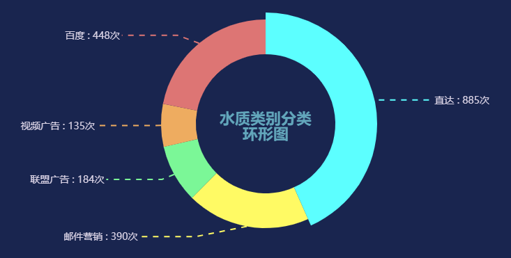
</html>4. 折线饼图
<!DOCTYPE html>
<html lang="en">
    <head>
        <meta charset="utf-8">
        <script type="text/javascript" src="jq.js"></script>
        <script type="text/javascript" src="echarts.min.js"></script>
    </head>
    <body>
        <style type="text/css">
            html {
                background: #19254f;
            }
        </style>
        <div id="main" style="width: 800px;height:400px;"></div>
        <script type="text/javascript">
            // 基于准备好的dom,初始化echarts实例
            var myChart = echarts.init(document.getElementById('main'));

            option = {
                title: {
                    text: '水质类别分类\n环形图',
                    left: 'center',
                    top: '44%',
                    textStyle: {
                        color: '#62a6bb',
                        fontSize: 22,
                        align: 'center',
                    },
                },
                toolbox: {
                    show : true,
                    right: '30%',
                    feature : {
                        saveAsImage : {show: true}
                    }
                },
                calculable : false,
                series : {
                    name:'访问来源',
                    type:'pie',
                    radius : [100, 150],
                    x: '60%',
                    width: '35%',
                    funnelAlign: 'left',
                    max: 1048,
                    label: {
                        normal: {
                            textStyle: {
                                fontSize: 16,
                                color: '#666'
                            }
                        }
                    },
                    data:[
                        {value:885, name:'直达',itemStyle:{normal:{color:'#54e9ff'}}},
                        {value:390, name:'邮件营销',itemStyle:{normal:{color:'#fffa64'}}},
                        {value:184, name:'联盟广告',itemStyle:{normal:{color:'#7bf797'}}},
                        {value:135, name:'视频广告',itemStyle:{normal:{color:'#eeac60'}}},
                        {value:448, name:'百度',itemStyle:{normal:{color:'#dd7574'}}},
                    ],
                    labelLine: {
                        normal:{
                            length2: 80,
                            lineStyle: {
                                width: 2,
                                type: 'dashed'
                            }

                        }
                    },
                    label: {
                        normal: {
                            show: true,
                            formatter: function(params){
                                return params.name + ' : ' + params.value + '次';
                            },
                            textStyle: {
                                color: '#dbd4e6',
                                fontSize: 14,
                                lineHeight: 30
                            },
                        }
                    },
                }
            };

            // 使用刚指定的配置项和数据显示图表。
            myChart.setOption(option);
        </script>
    </body>
</html>